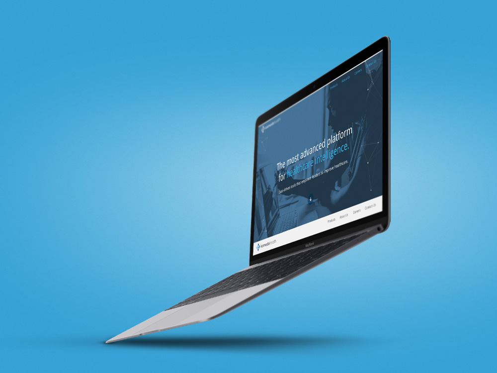
"Komodo Health" fourth review


Gregor Ojstersek
Crafting beautiful things from design phase and all the way to finished and developed phase.
Gregor Ojstersek
Like that Industry Knowledge + Technology Expertise section. Seems like you have put a lot of effort into those svg animations.
The overall site is on point. Will give you some feedback regarding UI and UX.
First the UI:
- You have various different line-heights. Line-heights should be proportionally to the font-size. The most common usage is: line-height = font-size (px) * 1.5. Some use: > 1.5, others: < 1.5. But the point is that all of the content parts are consistent. The headings could be different, depending on what you want to achieve. I personally like a little more line-height, so that the content feels more breathable.
- That "If you see yourself as one".. on the first page is not aligned to center.
UX:
- You could prevent that first time blocky loading of hero images with a preloader. That would make the first impression better.
- Back to top button would be useful on the mobile view :)
Good job on the content part.
Comments 1


LINK Creative
LINK Creative is a full service design and technology firm with locations in both San Francisco and Santa Rosa. For over 15 years, we have produced websites and business tools that are impeccable in both form and function. Our work is the ultimate blending of technology and craftsmanship.
LINK Creative
Gregor,
Thank you for the review. The client has made a few tweaks as of recent and so I am getting permission from them to go in and iron out the inconsistencies you state with the line-heights.
That said, we typically design with a slightly tighter line-height of 1.4 as our clients usually have a bit more verbose copy and we try to offset the amount of vertical real estate a bit. Also, good catch on the center of the, "If you see.." on the home page. Not sure how I missed that. Will change soon as we get the go ahead from client.
Thank you for all your feedback into consideration. I appreciate you taking the time to review.
Thanks,
Wayne
"Komodo Health" third review


Vincent
I'm a French UX Designer and Art Director, originating from Poland and currently living in Canada. I see every project I am involved in as an opportunity to go further, providing my clients and employers with quality materials and a great working relationship.
Vincent Przybyla
I noticed inconsistencies in the visual design that kind of bother me:
- The sizes of the font throughout the sections of a same page
- The use of white spaces (sometimes not enough, sometimes too much under a heading, it's like each section has different paddings...)
- The colors: I feel like if you choose to "theme" each page with a different color, then this page should use this color and some shades of it, only.
Otherwise, I think that among many other UI concerns, the choice, and the contrast of the font could be improved, and the color palette too. Also, if you want to tint an image with a page color, you should first convert it to grayscale, and then apply the color tint on it ;)
Comments 1


LINK Creative
LINK Creative is a full service design and technology firm with locations in both San Francisco and Santa Rosa. For over 15 years, we have produced websites and business tools that are impeccable in both form and function. Our work is the ultimate blending of technology and craftsmanship.
LINK Creative
Vincent,
Thank you for the review. The client has made a few tweaks as of recent and so I am getting permission from them to go in and iron out the inconsistencies you state. That said, I will definitely take all your feedback into consideration. I appreciate you taking the time to review.
As for the images, we tried grayscaling them originally, but they felt too washed out and lacking personality that the hint of color retains (the page felt almost 'too much' of said color). Though, we may mute them a little more, as that is a good point.
Thanks,
Wayne
"Komodo Health" second review

Janet Wong
Full time job at iflix. Currently exploring UI/UX. http://www.janetwong.net
Janet Wong
I would say this site is well designed. Messaging and information are well delivered. Clean and straightforward.
Just one tiny comment on this page:
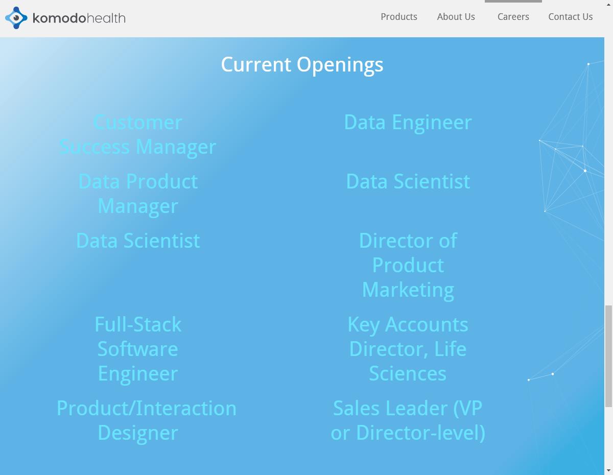
It will be super if you can adjust the spacing between job openings so they all looked equal.
Keep it up!
Comments 2


Janet Wong
Full time job at iflix. Currently exploring UI/UX. http://www.janetwong.net
Janet Wong
No problem, Wayne. Anytime!


LINK Creative
LINK Creative is a full service design and technology firm with locations in both San Francisco and Santa Rosa. For over 15 years, we have produced websites and business tools that are impeccable in both form and function. Our work is the ultimate blending of technology and craftsmanship.
LINK Creative
Janet,
Thank you for the review. The client has made a few tweaks as of recent, especially to this section and so I am getting permission from them to go in and iron out the inconsistencies you state. That said, thank you for taking the time to review and offering feedback, I appreciate it.
Thank You,
Wayne
"Komodo Health" first review


oninross
I'm Niño Ross Rodriguez (oninross), a Senior User Experience (UX) Developer with nine years of industry experience, specializing in developing pixel perfect websites quickly without sacrificing code quality and ensuring that users have the best UX they can get in a site.
As a Senior UX Developer, I love being challe...
Nino Ross Rodriguez
Nicely done! Its neat and clean and reflects of what they offer. Just a minor hiccup (though dismissable), is in the homepage (Industry Knowledge section), where one of the nodes happen to overlap the text. Another thing is that there is a horizonal scrollbar on mobile devices. Other than that, its a well crafted site.
Comments 2


oninross
I'm Niño Ross Rodriguez (oninross), a Senior User Experience (UX) Developer with nine years of industry experience, specializing in developing pixel perfect websites quickly without sacrificing code quality and ensuring that users have the best UX they can get in a site.
As a Senior UX Developer, I love being challe...
Nino Ross Rodriguez
Hi,
Using Google Chrome 59.0.3071.115 (Official Build) (64-bit). It happens if the screen is bigger than 1366px.


LINK Creative
LINK Creative is a full service design and technology firm with locations in both San Francisco and Santa Rosa. For over 15 years, we have produced websites and business tools that are impeccable in both form and function. Our work is the ultimate blending of technology and craftsmanship.
LINK Creative
Thank you oninross for the compliments and the feedback, we will definitely check that out. Could you please let us know what browser and version you are seeing that on so we can try and replicate the issue(s) you are seeing?
