"Gregor Ojstersek Portfolio" second review

Janet Wong
Full time job at iflix. Currently exploring UI/UX. http://www.janetwong.net
Janet Wong
Couple of cool stuff going on your site, little here and little there! Saw what you did to your page title :)
Love the way you use your initial name G as your main design element.
One suggestion. On Projects page, would be great if all the background images are in monotone. So it won't clash with the project numbering and View Project. And also your design element(initial G!) can have a strong brand presence across all pages. As I think this design element is quite the main charm of your site.
Keep it up
Comments 2


Janet Wong
Full time job at iflix. Currently exploring UI/UX. http://www.janetwong.net
Janet Wong
Ooops haha thanks for that secret message.
Stay cool :)


Gregor Ojstersek
Crafting beautiful things from design phase and all the way to finished and developed phase.
Gregor Ojstersek
Check the console of the site for another G (logo). It has a secret message hidden inside of it (select it). Oops, now it's not a secret anymore. Anyway, appreciate the feedback and the suggestion Janet, Thanks :)
"Gregor Ojstersek Portfolio" first review


Vincent
I'm a French UX Designer and Art Director, originating from Poland and currently living in Canada. I see every project I am involved in as an opportunity to go further, providing my clients and employers with quality materials and a great working relationship.
Vincent Przybyla
I like a lot of things, yet, some other things should be revised in my opinion. Let's start with the "thumbs down" :)
I'm not sure the navigation should be displayed the way it is: 2 links only. That may me think the information architecture could be improved. Speaking of which, I was a bit confused with the project page. Would be cool actually if I didn't have to click a second time on the tiny "view project" link to display the full project (put the link on the project number too).
Are the home and about page really necessary (as they are)? I think they could be merged and each project should be accessible directly through the home page (as there are only 4). Last but not least, sometimes the navigation is almost invisible because of the contents beneath.
Now the thumbs up:
I like the simplicity of the visual aesthetic, I like the way this simplicity and the main colors (blue and red) are introduced via your logo, I like the contrast of the font you use, I like the way your works are presented (variety of devices / full screen screenshots), I like the fact that you show the colors and the fonts used in each project (even if the colors don't need such BIG circles, and I would have appreciated the name of the fonts), and I like the consistency of the design and transition throughout the pages.
Overall, a pretty (very) good job :P
Comments 1


Gregor Ojstersek
Crafting beautiful things from design phase and all the way to finished and developed phase.
Gregor Ojstersek
Thanks for the review Vincent. Appreciate it :)
Comments 4
Maxim Aginsky
accidental ꩜ initiates ꩜ serendipitous
arrowww.space
Maxim Aginsky
Gregor, this is one of my personal favorite works. Seems like the site is not online. Is everything is OK?
Maxim Aginsky
accidental ꩜ initiates ꩜ serendipitous
arrowww.space
Maxim Aginsky
Thank you 3G :)
Gregor Ojstersek
Crafting beautiful things from design phase and all the way to finished and developed phase.
Gregor Ojstersek
Thanks Maxim. Can't even express how unique your design studio site is. And the community here at cssfox is really great. Thanks for existing and keep up the good work!
Maxim Aginsky
accidental ꩜ initiates ꩜ serendipitous
arrowww.space
Maxim Aginsky
I love the work.
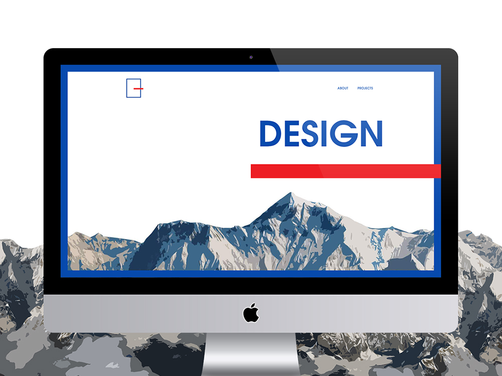
The G inside G, right away introducing you as a great composer (composition user). The presentation of the "Design" and "Development" at the main screen is laconic, but absolutely correct. Very courageously - in my opinion - the use of the mountain BG at the Design scene, this is only one realistic image and I think it is not an easy decision when all other elements are "digital", great - without compromise!
"Hey! Where are you going..." is unique, fresh and surprising! Very height attention to the details.
3G (the secret message included) - I am definitely your fan.