Followers 21


Maxim Aginsky
accidental ꩜ initiates ꩜ serendipitous
Maxim Aginsky

Marina Pashkova
Hey there! I'm Marina, a web designer with 12 years' background as a small-business analyst, this achieve the best possible result for commercial websites. My mission? To make a website look amazing and easy to use! I believe that good design shouldn't sacrifice functionality, which is why I aim to create websites that are both aesthetically pleasing and user-friendly.
iMarketina
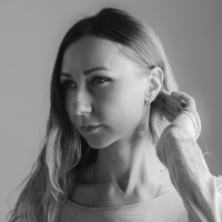
Hey, I'm Valentina. As a Web & UI/UX freelance designer I specialize in web design and creating websites from scratch.

Vladimir Timokhanov
Vladimir Timokhanov is a professional artist. The author of illustrations and design of many natural history books that were published in Kazakhstan, UK, Switzerland, Netherlands and other countries. He has presented his works at several personal exhibitions, has taken part in a few UNESCO and IUCN projects, and has prepared illustrations for a number of academic and popular journals and Internet sites. Recipient of the 2022 NYC Big Book Award in the nomination "Children's Education" with the book "Visual Biology. Animals: An Illustrated Study Guide".

Rlogical Techsoft Pvt Ltd
Rlogical is top-notch custom Web & Mobile Application development company in India with its global presence in UK, USA, Australia and Japan. We provide Development Services in different fields such as Web Development, Ecommerce Development, Custom Application Development, Software Product Development, Custom SharePoint Development as well as Mobile & Smart Phone Application Development for iPhone, Android, Symbian, Windows Mobile and many other Smart Phone Operating systems and devices.

Sgwebdigital
Innovation, technical know-how, sensitivity, and attention to detail are the ingredients of our work.
Davidemascioli
Hi there, my name is Davide Mascioli. Im a Digital Designer based in Rome, IT.
I love Art, Tech, and Deep space exploration.
Taking care of the smallest details is the key element of all my arts & crafts.
My work ethics and philosophy both fit the "A thousand no's for every yes" mindset.
When it comes to what I do, I am a strong believer of eclecticism: Finding inspiration and resources within a wide range of fields and environments is the most essential propellant for my creative process as well as for my growth and expansion both as an individual and a professional.
Gregori Loui
ANYTHING CAN SUBJECT TO ART WHEN IT COME
As a multifaceted Art Director and Photographer for the last 20 years, Gregori Loui serves brands by building a global proposition for local and worldwide audience.
He imagines multiform content to stage a brand or product.
His signature relies on his multicultural sensibility combined with a French esthetic.
Image - Content - Design - Branding - Event - Scenography - SetDesign - Photography - Video
kirk Whayman
Being dyslexic has created my biggest strength - visual communication through design. I am a Design Director & UI Designer focused on motion, 3D & achieving results through user centred experience.


