"F5 Studio" first review


Maxim Aginsky
accidental ꩜ initiates ꩜ serendipitous
Maxim Aginsky
Very well developed homepage entering desktop viewport. Great work!
Home page
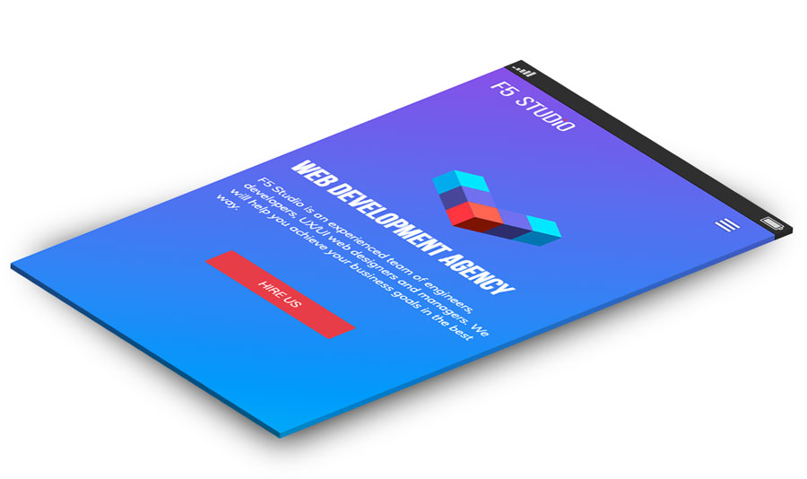
Clear and informative message (head line).
Great work with the responsiveness and small animations!
Definitely, the impression of this first section is welcoming to explore more site's content.
However the Hire Us button kinda tells you - "OK, you have seen everything. Do not need to explore more of the site content. Hire us now. You are ready".
I have a feeling that the button presented to the visitor too soon. It is like barrier that separates the rest of the site content.
It is getting worse on mobile, where nothing else shown below this button. On mobile it is remind me overlays/popups which appears at some point, where you need to press the button if you want to continue the site exploration.
On desktop the vertical 3D logo, which ends up below the browser window age (before scroll) is a great and natural way to guide visitor to scroll. Kudos for this detail, very well planned.
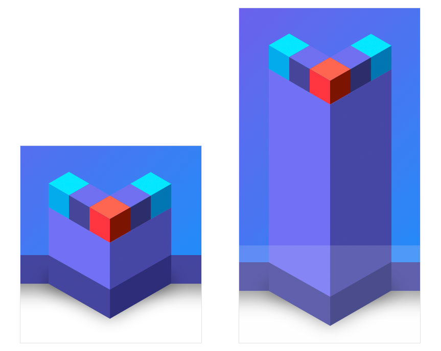
All the sections of the home page which are using the 3D decorations are very well done. The homepage definitely has unique visual appearance. Footer's logo animation is a great way to finalize the story of this particular page, at same time you find you want to see more of the site content. Great!
However some elements do not follow the main visual appearance guidelines. Featured works is one of the elements I found, can be done with more love. This is your treasure and main tool to get the future work.
I read this final sentence at the bottom of the page and could not figure out what do you want to say - "Creativity with us and Inspiration". I know that potential customer will probably not get to this point, but you never know. I think details are important and every small element of the site needs to be planned and developed carefully.
Cookies Policy page
Clean and welcoming to continue browsing the site, Cookies Policy page.
The Go Top button is covered with the "We use coolies..." panel. Small detail, but good UX is all about small details.
Thanks for creating,
Maxim
Comments 2


Maxim Aginsky
accidental ꩜ initiates ꩜ serendipitous
Maxim Aginsky
Most welcome.
