"FRIENDS" second review

I love simple and beautiful Above the Fold!
Kudos for the choose of the headline font.
The home page visually - very appealing.
Behavior standards 1
When hovering the hero title of the home screen, an arrow indicates, that user will be taken somewhere else. Same time when hovering on the hero image of single case study, nothing show you that there something going to happen if you will click on it, noting but cursor-pointer.
When you at the entrance explained to user that on hover you do something, you should do it anytime user will hover an element. This is intuitive.
Behavior standards 2
When first entering the site the small animations occur at the Above the Fold.
Same on scroll, little animations of the sections are beneficial, they showing your sensitivity to details.
However, when from home page clicking on, for example, first case study, new page shows up without similar to the home page effects (animations). The consistency is one of the keys for the Door that called great design.
The UX should be consistent, unless you planed opposite.
Probably for similar reasons, when entering the single case study page not clear what to do. I have waited for something, that will show me that the page is ready.
In this case entering animations, when finished, indicates that the page is ready and you can scroll.
Even though the part of the content is always visible at the bottom of the Above the Fold, feels to me not enough to get users attention and show user what you want him to do.
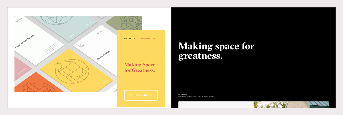
Presentation similarity
Case studies on home, presented with two objects: image and information block with unique BG color each.
I have a feeling that the UX would benefit from using one of this two elements for the single case study page.
I was very surprised, when I clicked on the yellow (first case study) and get the black page with white title. It feels like different website!
When I bay a bicycle online, I would be surprised if I will receive mobile phone instead.
Summary and single Case study pages.
Primary trigger of the section. Home
Karan mentioned little eyeball icons:
I especially liked the little eyeball icons responding to directional mouse movement...
I like it too, but it is secondary in my opinion. It is also why I did not recognize it at the first place.
The primary would be the title and the image, I would probably say that the main trigger should be the image.
I think that you have also thought about it, it is why you have added the link to the image.
Section pattern. Home
It feels wrong to use same pattern you are using for the case studies, for the other sections of your home page.
What is looks same should behave similar. Took me some time to understand that it is not another case study at your portfolio.
That is it for today. Thanks for creating,
Maxim