"Chip&Byte" first review

The image whether it is a 3d object or any other type of visuals are the first thing users focusing on when any website opens. In my opinion the quality objects presented above the fold (the first interaction of the user with the website) play very important role in translating the message to the user, since the time to convey the right message is limited and most of the visitors, won't even scroll if the designer unable to provide the right content to catch their attention.
The Chip&Byte is a great example of how to do that right. The visual objects along with light animations on load and after, translate something different and provide the feeling that the experience is going to be exciting.
The message which is a second portion of the information you are noticing is very clear and communicative. Overall the vitrine is very engaging.
Each section of the landing page organized with great care to micro details, whether it button animation or illustration objects which accompany each block.
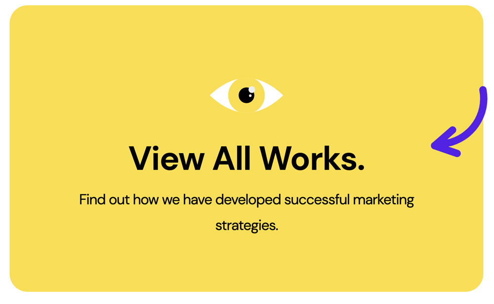
Section of the landing page organized with great care to micro details.
The transform of the Subscribe block is a great example of how to engage the visitor providing him with small toys. Just a small comment - just before the mouse interacts with the Subscribe block, you can notice how the block jumps, but when inside the block the experience is great. Also I noticed that sometimes the Name input is not activated when you try to click on it.
Big and clear type, balancing and in the same time contrast choice of the text colors, great logomark, different approach for the button and menu items animation, make the landing page a classic example of the good, modern website.
Contrast choice of the text colors.
The Services and News pages continue to surprise you with great retention to details, it is a work of master! Micro animations of the elements on load are impressive - continue to show you how everything was thought out. The UX is very smooth and pleasant, you want to move from one page to another, again and again to enjoy the experience. Very well done.
I have found that transition between the pages would be a benefit. Also when you zoom the page, the horizontal scrollbar appears, which would be a benefit, in this case, to have the overflow-x: hidden for the .body class.
.body {overflow-x: hidden;}