"Gabiano holding" first review

An empty Word document opened and ready to be spoiled with the black lines of text - emotions ("The review is an emotions in textual state.").
This is going to be fun!
The first impression is absolutely great.
Well-crafted intro animations taking the visitors full attention and creating trust from the really first moments of the visitors interaction with the company website.
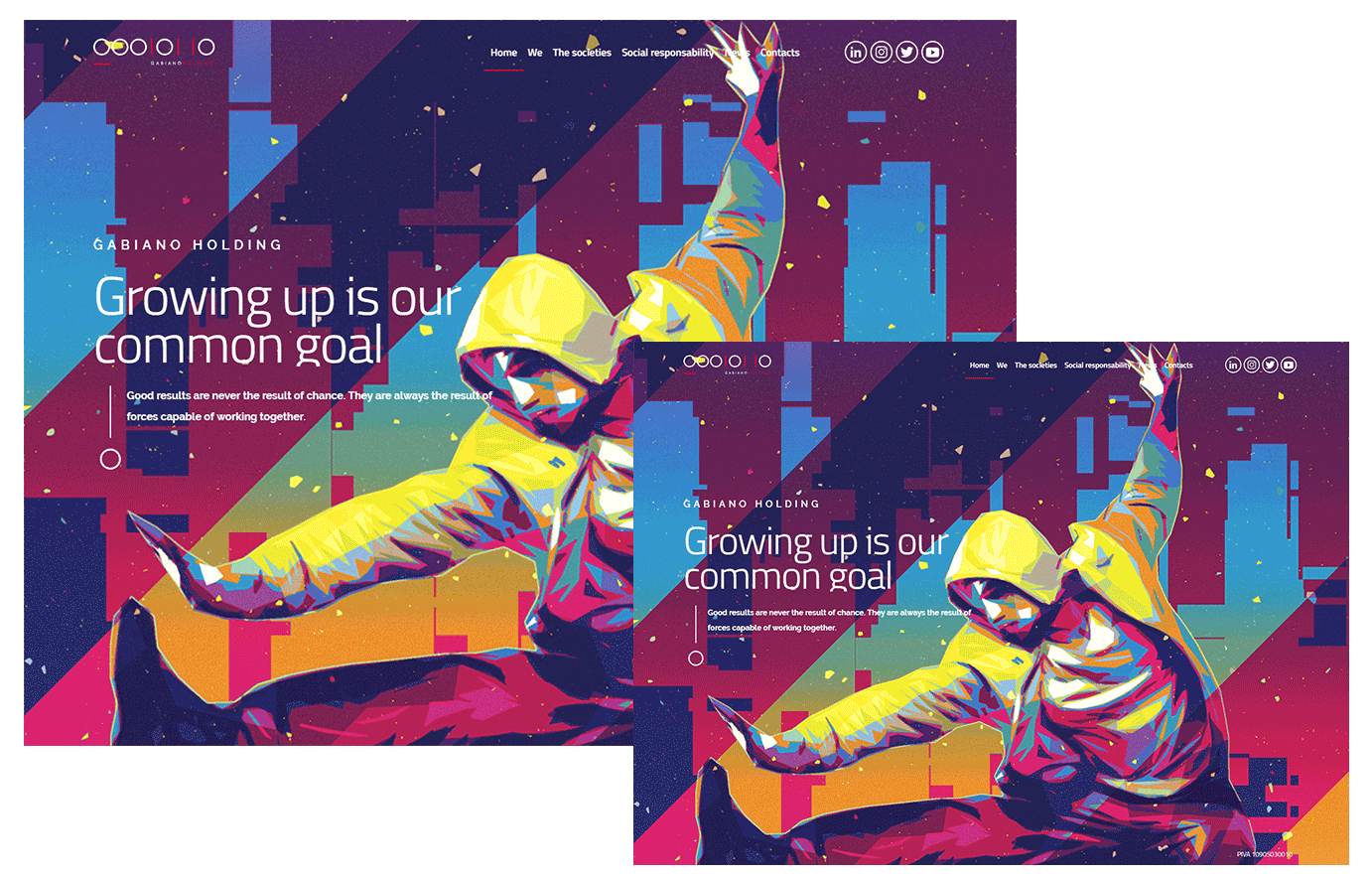
Home screen
Before talking about the Home screen, I should mention, that I was not able to understand what is exactly the Holding do and did in the past.
I have looked thru all the sections of the website and could not find more specific information about the Holding and it's experience.
So, now about the Home screen :)
The main tagline "Growing up is our common goal", illustrated with video of the town filmed from the top. Growing up from my perspective would not be necessary related to what I can observe in that video.
Very basic associations along with poor detailed video not giving right informational message about the Company and it's promises to their users.
The tagline is also way too generic and does not tells about what you will benefited from continue to browse the website of the company.
Here are a few random picked images. The effects is same for me, the message is still not clear, just better quality images will have better effect on the visitor.
Quality and beauty play important role in the information communications.
Hero BG images. Mood and message
I could continue, but I think this is enough for today.
Best if you have developed clear strategy and brand guidelines, which will help you to design your own world.
Thanks for creating,
Maxim