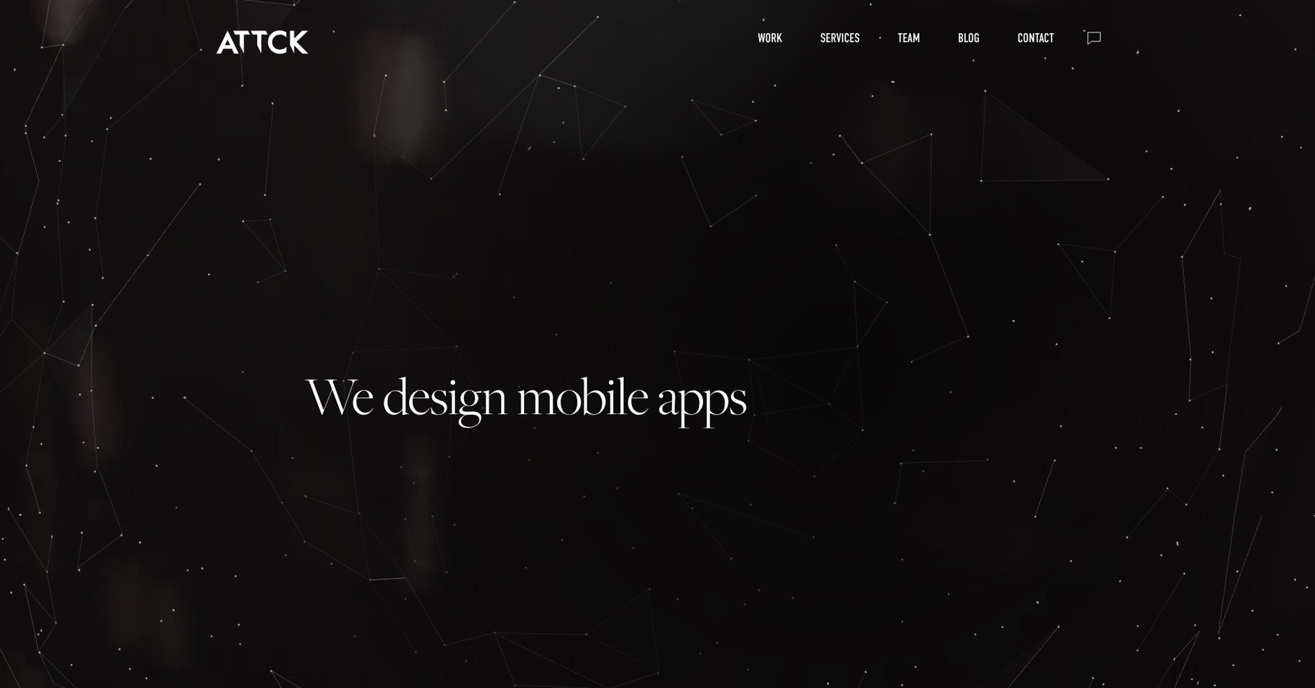
"ATTCK" first review


Maxim Aginsky
accidental ꩜ initiates ꩜ serendipitous
Maxim Aginsky
Home page
When the site opened first time, means the assets is not cashed yet, the content loads in front of the user first you can see the header nav, than animated text at the center and only after you BG image. At the very first moments you lose the points (and visitor's respect). This is of course very small thing and visitor may not see, but will definitely feel something.
The home page experience will have great impact on the visitor's journey on your site. In some cases enough to explore just one page to make the decision regarding whether to contact the agency or not.
I found hard to understand that you can scroll down, as there no sign which should guide you and that when you automatically start scrolling it is kinda surprising to find some content where you did not expecting it.
Viewport 1260x949px. The icon at the right top corner cropped by the edge of the browser window.
Home page
Team page
When page opened you can see some very nice images of the team members. On dark BG it is looks very good. I had different feelings about changing images in groups on hover. Finally I can say that the way you using it, I kinda lost the focus.
BIMBLE case study page
The white navigation completely gone on white BG image.
P.S.
It feels like you have a great team and I believe you can do much, much better. So good luck and thanks for creating!

