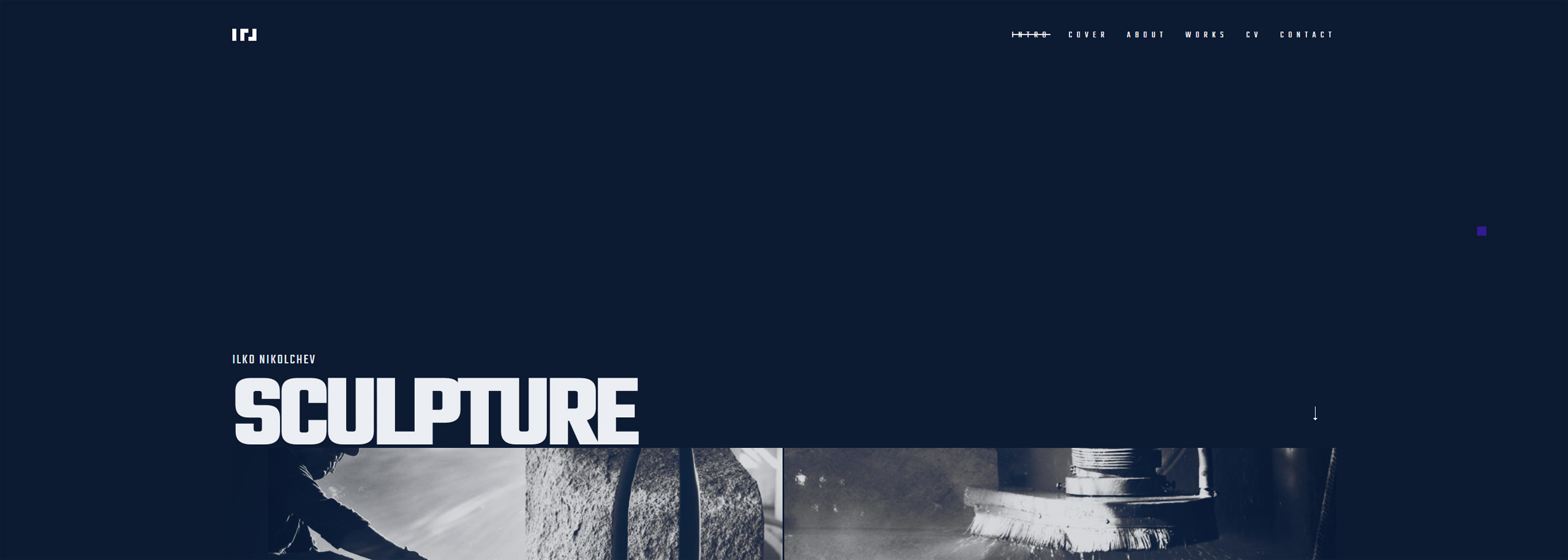
"Ilko Nikolchev - sculpture" first review

Maxim Aginsky
accidental ꩜ initiates ꩜ serendipitous
Maxim Aginsky
Ok. Let's do this!
I am at the home page. The page loads well. Spinning loader is good. Animated overlay is working nice and finally I can see the page content - great start!
Hmmm... When clicking on the site logo get - 404 https://ilko-art.com/index.html
When hovering over active menu item Intro - I would expect the cursor + div behave as if you select non active menu element (cursor default).
We are still at the home page landing viewport. I kinda have a feeling, that on small screens, too much of the empty space between the header and main content area, but this is not critical I think.
Very nice logo, which is balancing the left side very well. However I could not figure out the concept behind it. I am curious - how the logo related to ILKO NIKOLCHEV?
The
translate3d
for the header, very nice done!
The smooth scroll on the mobile better be disabled, as there is no need for it. You have decided to put lots of content on that page and I have a feeling that the scroll experience on mobile will be better without smooth scroll. Ah I just figure out that this is a one page site :)
When mouse at same place and you scroll, the div which follows cursor jumps.
Font and colors feed the purpose I think.
I have a feeling that the collage method is may be not best solution to present this type of monochrome images, especially first portion of it.
Interesting approach to have the line which indicates how much left of the scroll.
Good and creative work. Keep going!
Comments 4


Maxim Aginsky
accidental ꩜ initiates ꩜ serendipitous
Maxim Aginsky
I see now. Simple and creative. Great! Thanks for sharing.


I-Creativ Studio
I-creativ studio is a small creative team of designers and web developers that can bring in the spotlight the best of every business. The strength of I-creativ web studio is the elaboration of complete projects from the concept, visual identity, photo shooting to web design, web development and promotion. The studio...
Yohannes Artinyan
For the logo ... the concept is pretty simple. I love simplicity :-). I started with a font. Then I built the grate and the module. Then I removed the excess and this is :-) an illustration here


Maxim Aginsky
accidental ꩜ initiates ꩜ serendipitous
Maxim Aginsky
I it a pleasure to be helpful Yohannes. Your joint projects are very unusual :)
What concept the logo based on? If you not mind please explain.


I-Creativ Studio
I-creativ studio is a small creative team of designers and web developers that can bring in the spotlight the best of every business. The strength of I-creativ web studio is the elaboration of complete projects from the concept, visual identity, photo shooting to web design, web development and promotion. The studio...
Yohannes Artinyan
Hi Maxim,
thanks for the time spent and the exact analysis.
I fixed some bugs - the logo, the behaviour of the active buttons ...
With Ilko Nikolchev we are colleagues and friends from the Academy of Arts :-) I graduated in sculpture too.
We also work on joint projects https://openartfiles.bg/en/people/2523-7-1-art-group
This website is a present for him.
