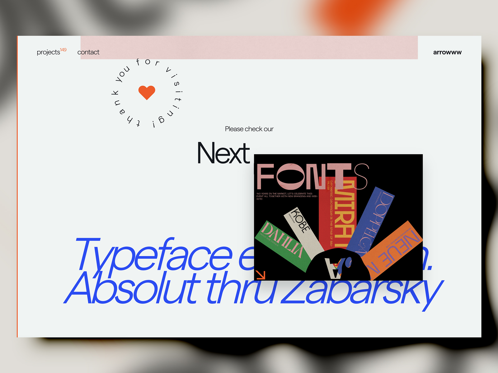
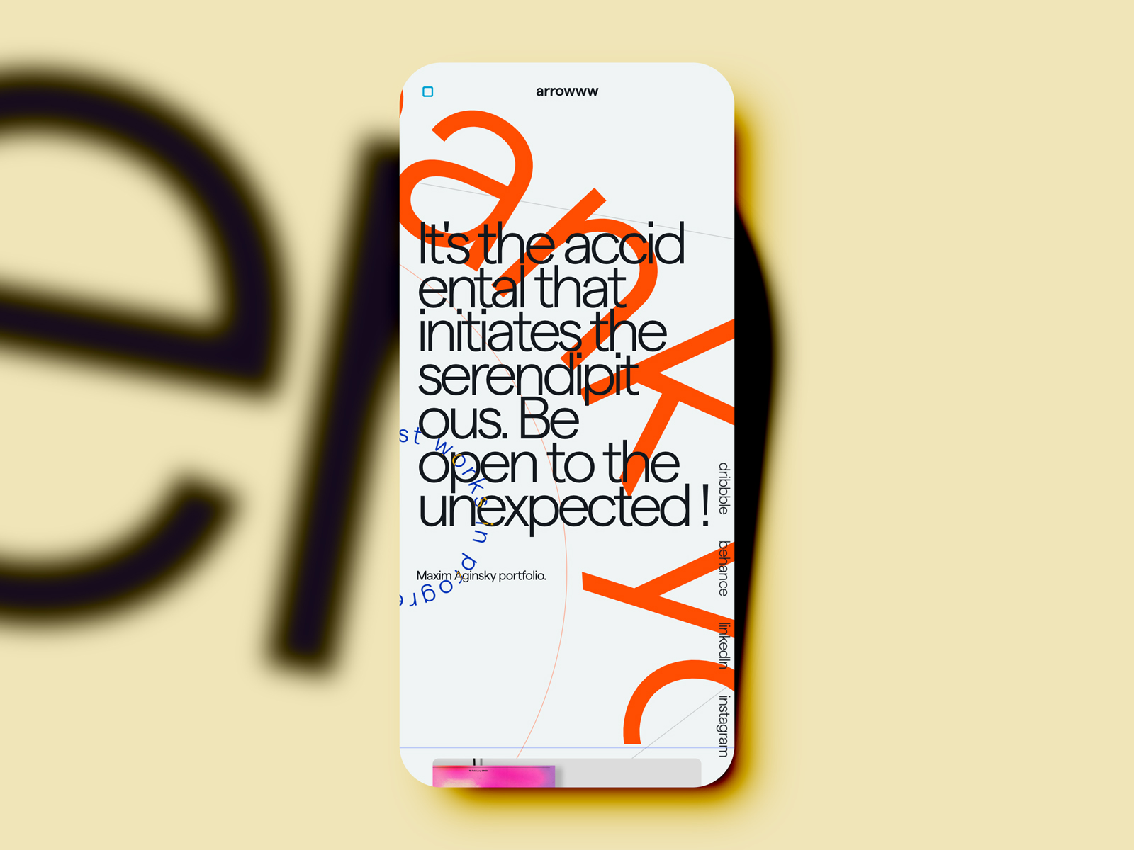
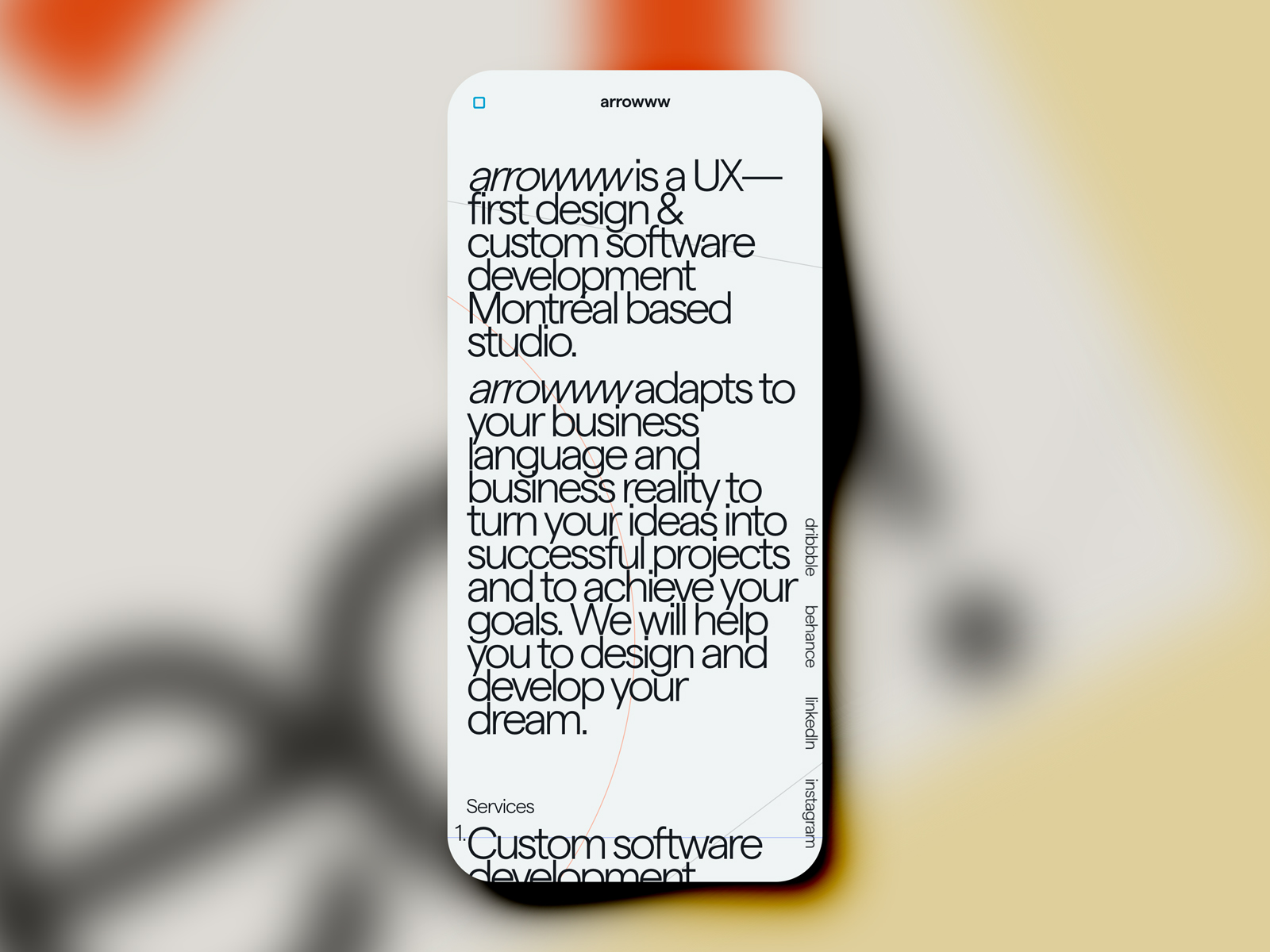
The case study above-the-fold like other pages reserved for the project metadata. The content is below the fold and will be accessed when the user will scroll down the page.
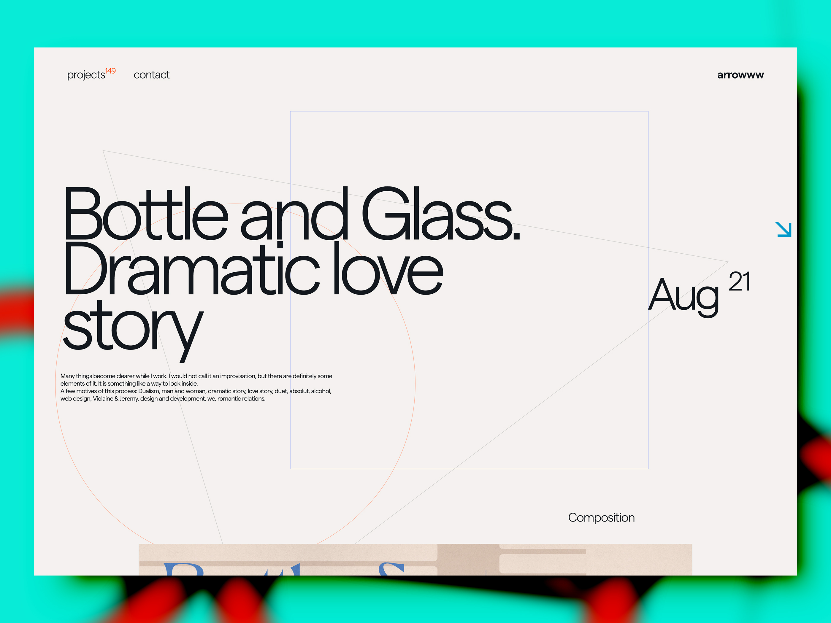
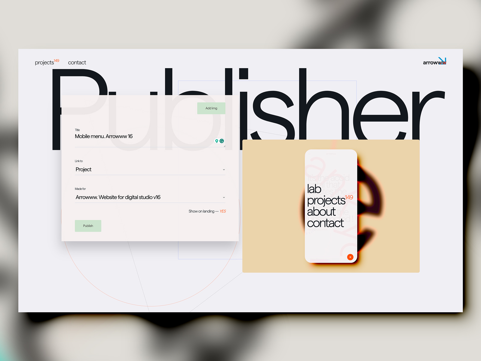
This is where I can add and publish a new Lab image that will be shown on the News (home) page of the website. Initially, I was sure that it's better to show the very last image instead of the last project or even selected projects, as the latest image is almost always more interesting than the previous ones. For that reason, the home page is News instead of selected works.
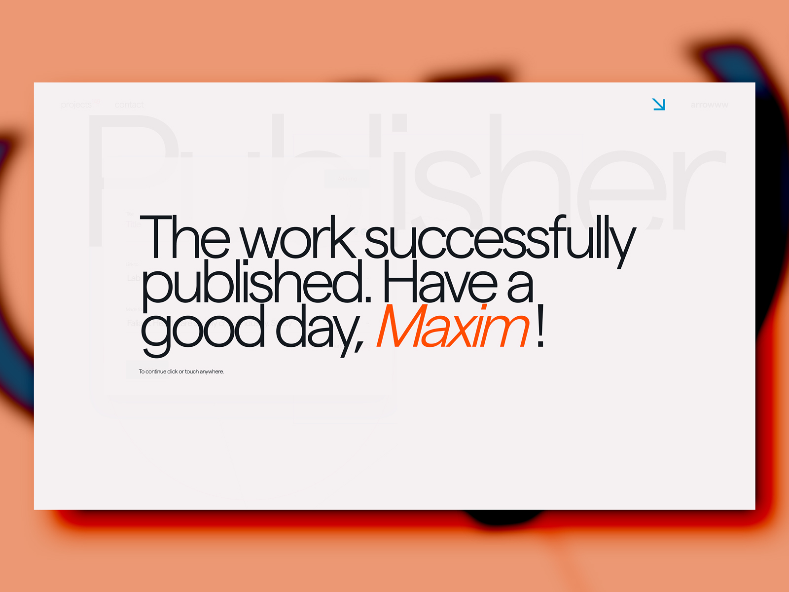
Every time I a publishing a new image in the Lab, this is a message that shows me that everything went well. However, usually, it's not stopping me from opening the News page to see how it actually looks there.
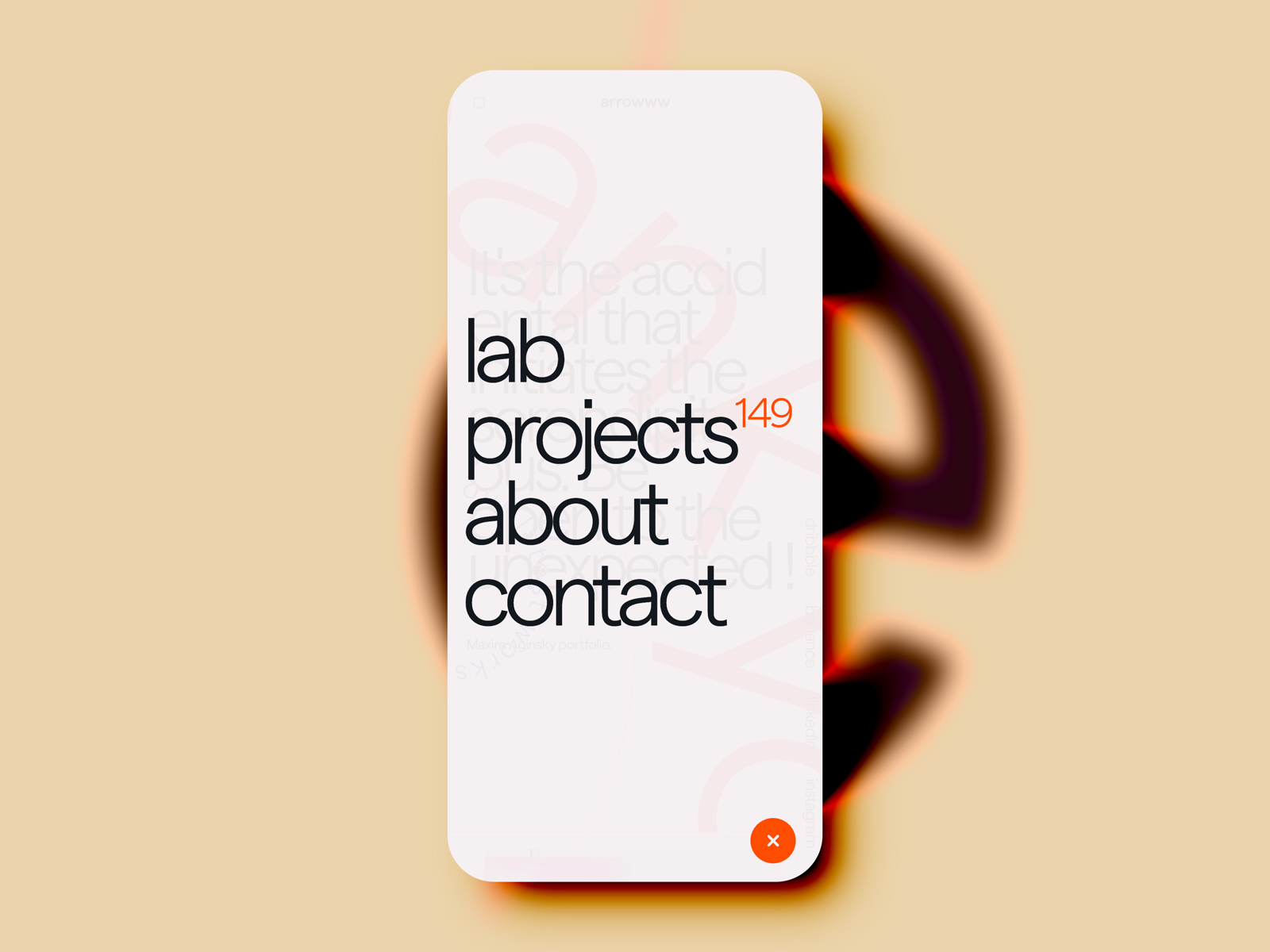
All the UI texts are following the same patterns - first letter lowercase. A slightly transparent background intended to give a clue about where the user is coming from - give a context.
Arrowww v16 website was designed and developed between Sep 2019 and Jan 2020. Arrowww is a UX-first design and custom software development Montreal based studio. We will help you to design and develop your dreams.
Being dyslexic has created my biggest strength - visual communication through design. I am a Design Director & UI Designer focused on motion, 3D & achieving results through user centred experience.
Comments 2
Maxim Aginsky
accidental ꩜ initiates ꩜ serendipitous
arrowww.space
Maxim Aginsky
Yah.. Thank you Kiri ;)
kirk Whayman
Being dyslexic has created my biggest strength - visual communication through design. I am a Design Director & UI Designer focused on motion, 3D & achieving results through user centred experience.
Kirk Whayman
Mastery of typography, transitions and micro interaction