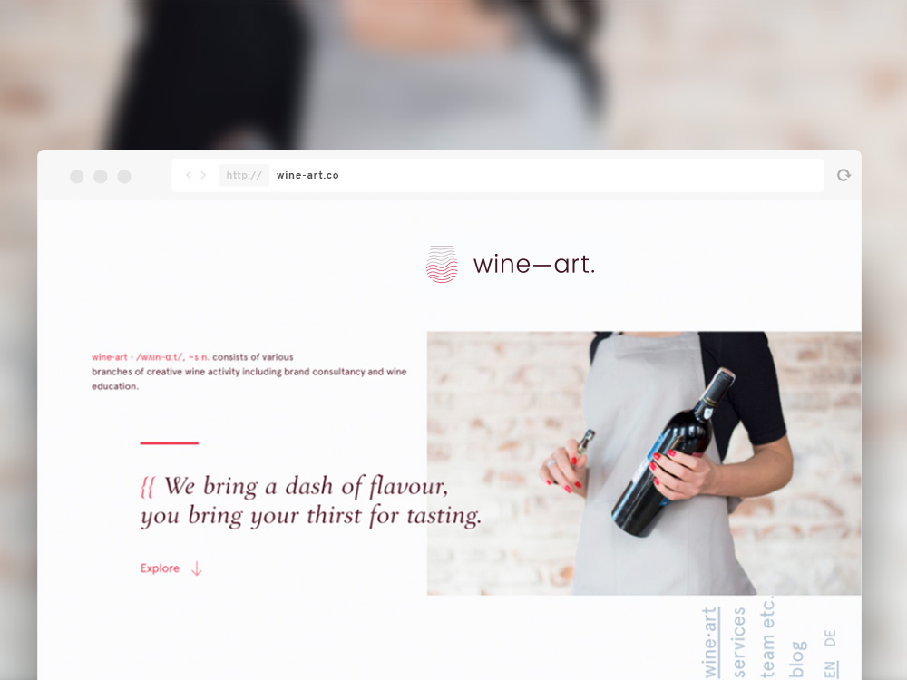
"wine—art" second review


oninross
I'm Niño Ross Rodriguez (oninross), a Senior User Experience (UX) Developer with nine years of industry experience, specializing in developing pixel perfect websites quickly without sacrificing code quality and ensuring that users have the best UX they can get in a site.
As a Senior UX Developer, I love being challe...
Nino Ross Rodriguez
The site served its purpose, delivering information to the users. There is a hint or two in the site that suggests its for wine enthusiasts but it still lacked character and branding. There is no omph factor.
The navigation doesnt work for me. At first glance, I wouldnt event notice that there is a navigation. It is a bit distracting also for mobile users as it is overlapping with the body content. The logo is also not clickable.
The heading animation tends to be irritating after a few pages in the site.
Overall, the site seems buggy and not tested properly. For someone who is not that tech savvy, it can be frustrating for them to navigate around the site using their mobile phones.
Comments 2


oninross
I'm Niño Ross Rodriguez (oninross), a Senior User Experience (UX) Developer with nine years of industry experience, specializing in developing pixel perfect websites quickly without sacrificing code quality and ensuring that users have the best UX they can get in a site.
As a Senior UX Developer, I love being challe...
Nino Ross Rodriguez
Hi Daniel,
Trying to make the navigation not noticable is bad practice. That is the second thing the user usually find after skimming through the page. If I can't find my way around the website, I will hot the close button. At first, I thought it was a bug.
It's the main header at each page that slides from right to left at every page load.
The logo is clickable is you doing scroll down. Try scrolling down then scroll all the way back up. Then click the logo.
Bugs
- navigation is overlapping content on mobile and desktop
- logo is not clickable after being scrolled
ldaniel.eu
ldaniel.eu
Hello,
Thanks for the review; although you mention positive and negative aspects, it's good to get an external look on things. I'm actually glad you didn't notice the navigation right away; it is meant to not attract attention. Did it make you dive into the content more?
What do you mean with the heading animation?
The logo is in fact clickable, as I also mentioned to your colleague reviewer — just not on the home page since you are already there. But for consistency's sake I've just added the link there too.
Could you be more specific about 'buggy'? We did test on several devices and conditions, but of course it is tough to catch everything. Please let me know if you found something specific.
Cheers
Daniel
"wine—art" first review


Vincent
I'm a French UX Designer and Art Director, originating from Poland and currently living in Canada. I see every project I am involved in as an opportunity to go further, providing my clients and employers with quality materials and a great working relationship.
Vincent Przybyla
The visual design is not bad, but everything here misses a big idea, some character...
This whole site was designed for a small screen, and doesn't fit big ones very well: images don't scale well, each section is too spaced out from each other, the way the text is stuck to the image vs plenty of space on its right/left looks a bit weird. The logo in the header is not even centered (and not clickable).
The choice of fonts is good, yet, the overall redish / greyish / brownish colors are being boring throughout every single pages.
Some sections look disabled, but.... Allright, ok, got it after I clicked them..........
Concerning the contents, it definitely lacks imagery
I don't get the 90 degrees rotated menu in the bottom right, and seems to have been designed that way for the sole purpose of appearing trendy. Could have been cool, but the rest doesn't follow...
Comments 1
ldaniel.eu
ldaniel.eu
Hello,
Thanks for the review; I appreciate your honest opinion, even though it seems the character of the design does not seem to fit you too wel.
Just a correction: the logo is in fact clickable, just not on the homepage because you're already there. But I've just added fixed that, for the sake of consistency.
The menu is designed to be not actively present, to encourage reading the content. We were happy with it's current appearance; it's a pity you don't feel the same.
Anyway, thank you again for reviewing; even though I don't agree with all your opinions, this keeps us sharp as designers/developers!
Cheers
Daniel

Comments 4
ldaniel.eu
ldaniel.eu
?
Maxim Aginsky
accidental ꩜ initiates ꩜ serendipitous
arrowww.space
Maxim Aginsky
Much nicer like this :) Do not forget to fix it on other pages of the site: /education & /services.
At the /blog page Nav is scrollable.
ldaniel.eu
ldaniel.eu
Hi!
Good catch thanks; I've just fixed the bug.
Best
Daniel
Maxim Aginsky
accidental ꩜ initiates ꩜ serendipitous
arrowww.space
Maxim Aginsky
Just a heads up, viewport units include scrollbars. If you use width: 100vw; instead width: 100%; (.nav-wrapper { width: 100%;width: 100vw;}) you will have the horizontal scrollbar.