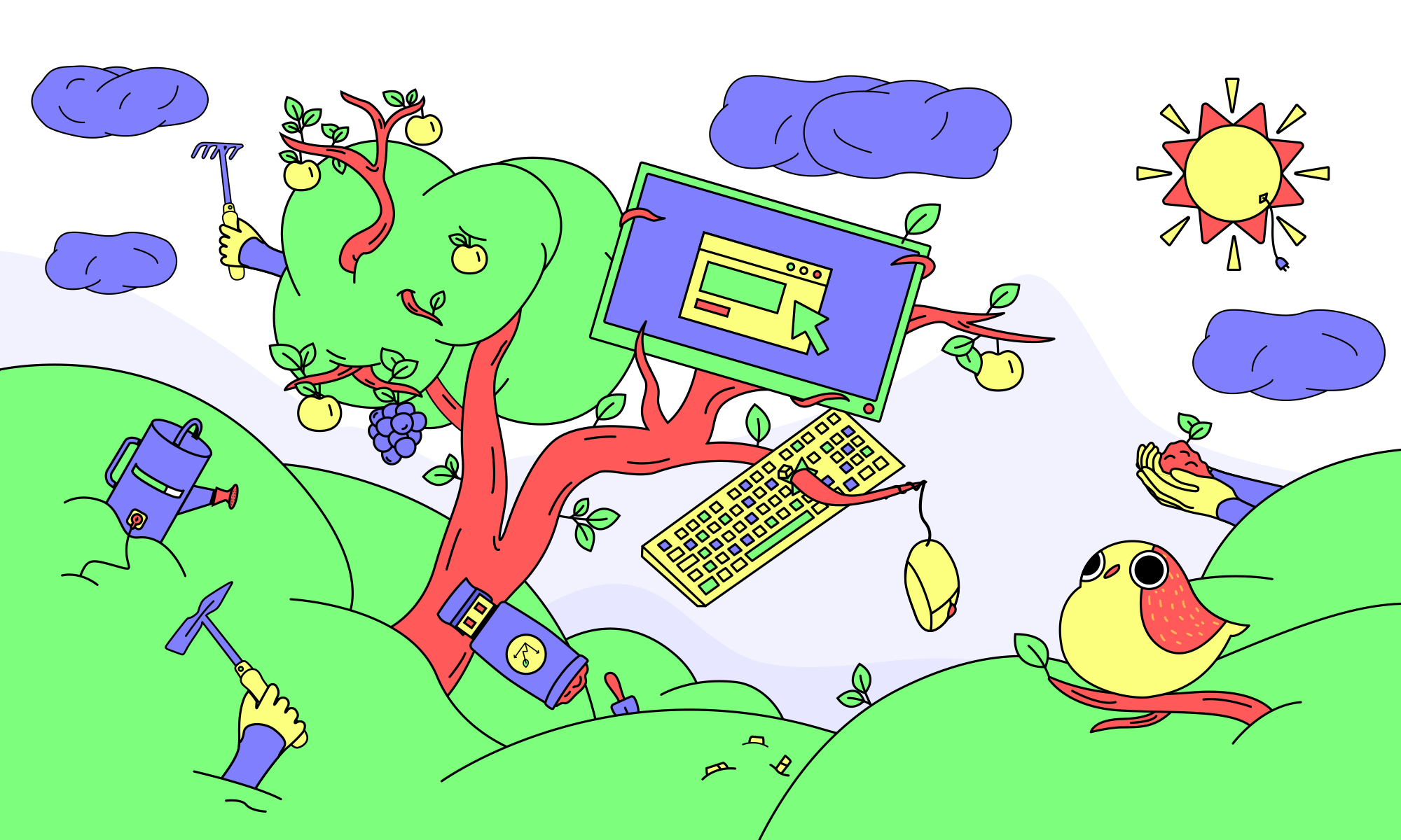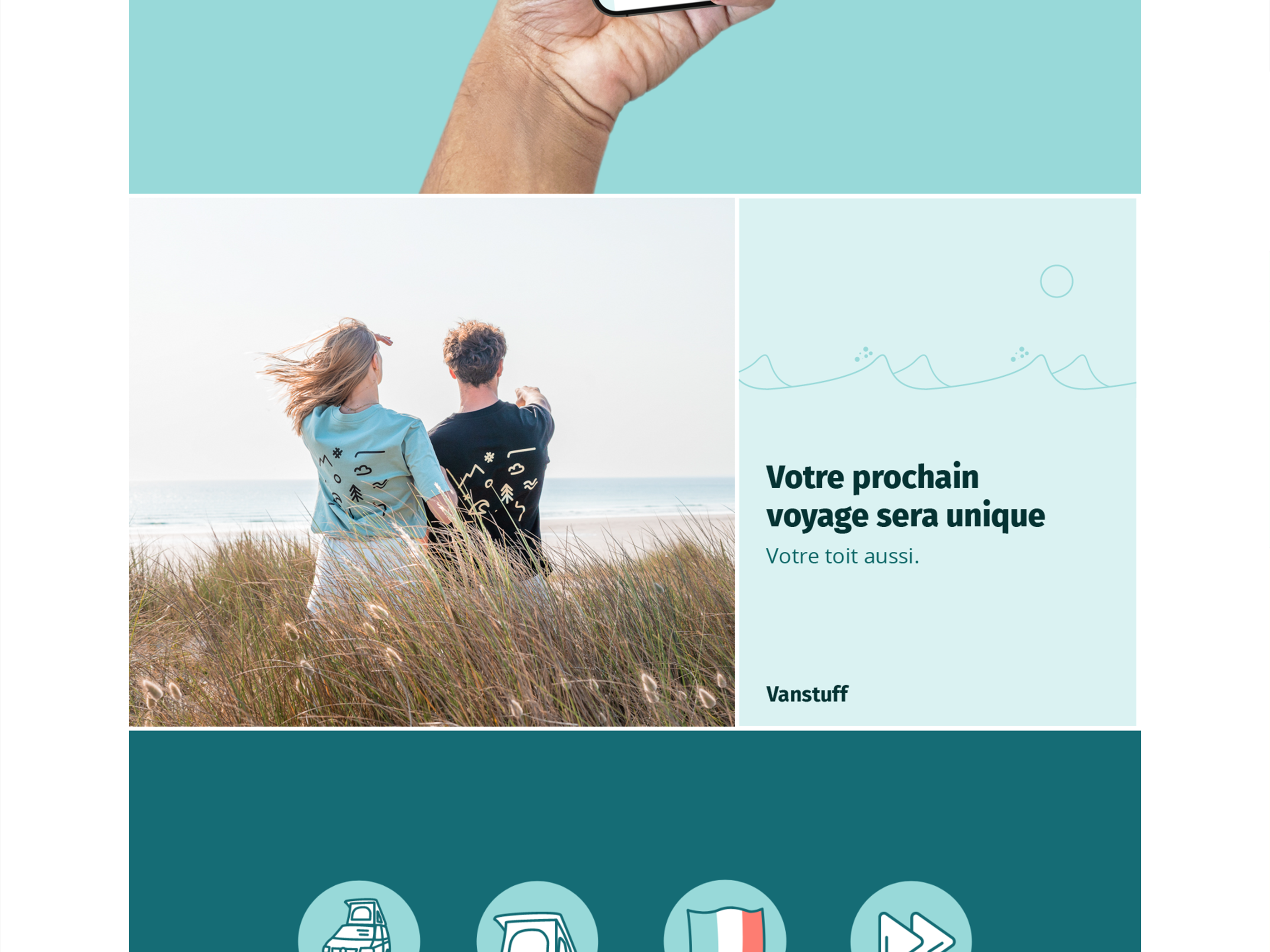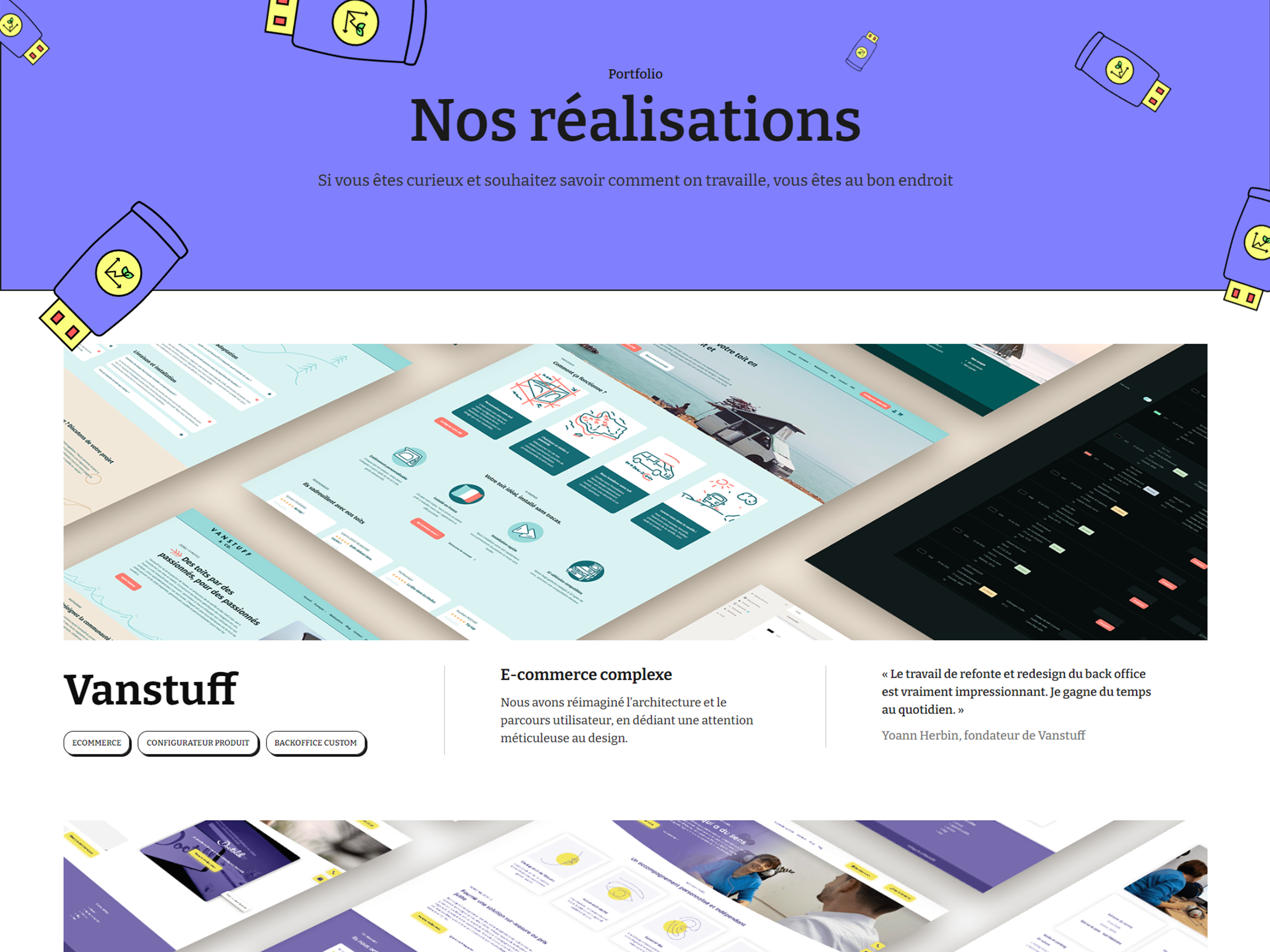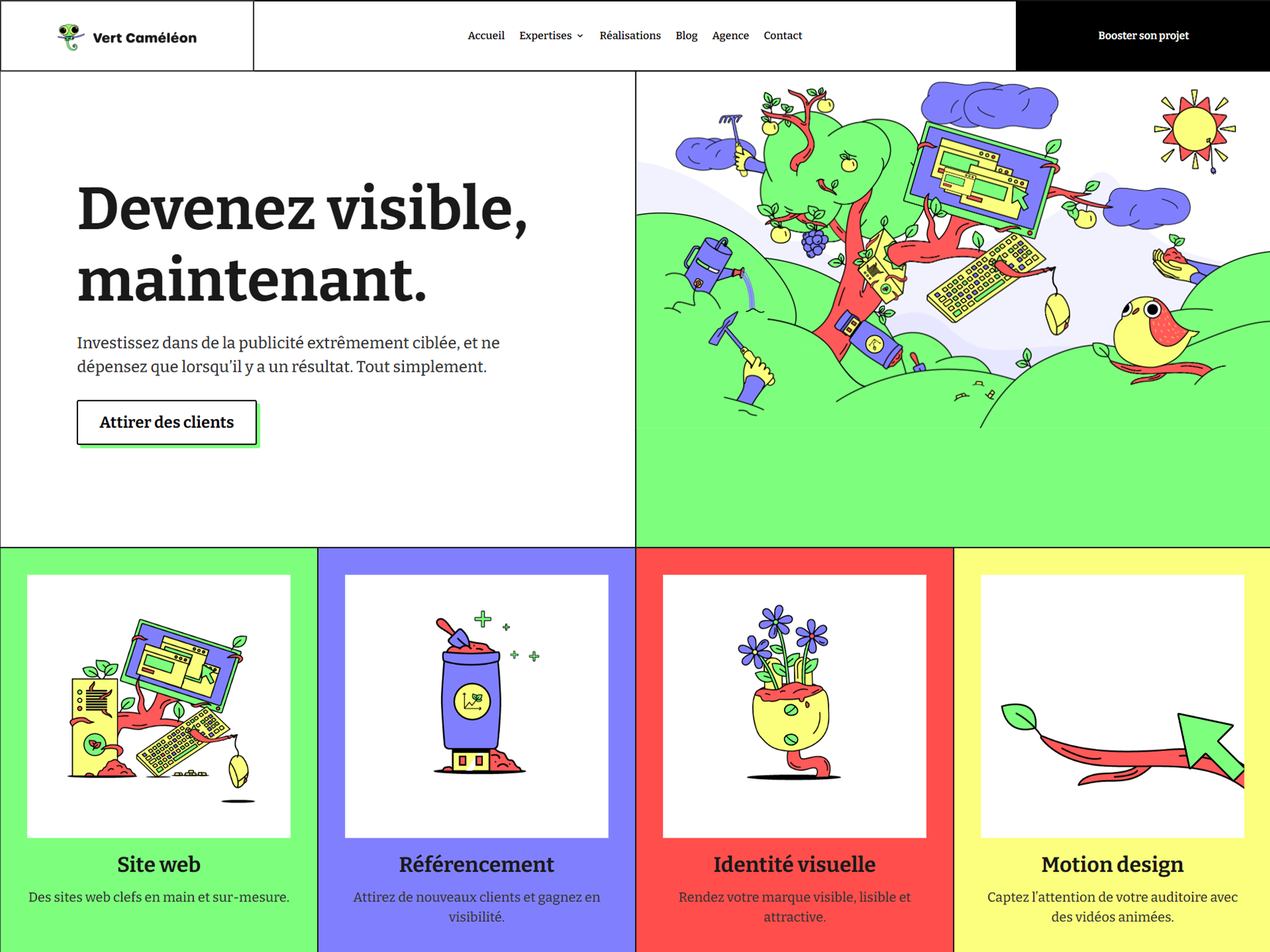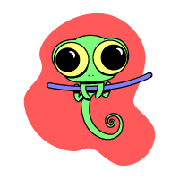
Vert Caméléon is a design studio that focuses on transparency and eco-responsibility to guide its clients through the jungle of the web.
Vert Caméléon is a design studio that focuses on transparency and eco-responsibility to guide its clients through the jungle of the web.

Nicely done. The neumorphism style works really well when used in context and this is a great example. I really liked the muted colour scheme and simple fonts which fit the neumorphic design style ...