"ResIM: User Experience Research, Design, and Consulting." second review


Gregor Ojstersek
Crafting beautiful things from design phase and all the way to finished and developed phase.
Gregor Ojstersek
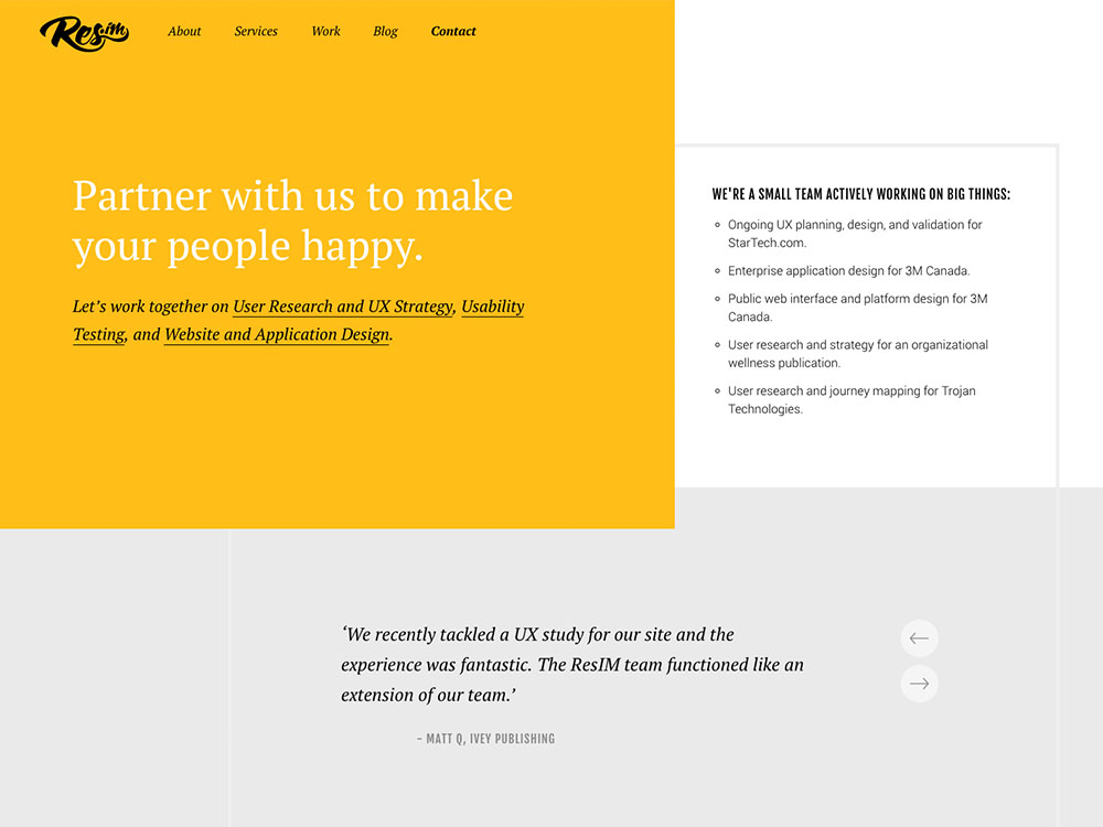
The site seems good regarding UX and content, but I am sensing problems with UI.
It's not a common layout for a header section and I don't think it's really working. It seems fine if you have a picture on the right side, but with text, not so much. And the white heading on yellow background is hard to read.
The thing that caught my eyes the most, was the choice of fonts and how you combined the fonts together. I am not really a fan of the PT Serif font and you are using it a lot. I think that you could choose a better serif font like Playfair Display for your headings and only for your headings, but I get it, it's your branding font. But still you shouldn't use it for navigation and also some content and subheadings. You have Roboto which is a great choice for content, but then you have Fjalla One font also for some headings content and cta. The implementation of the fonts is not giving some logical combination and consistency. I would suggest using a serif font only for your headings and use Roboto for everything else. The font-weights could also be considered. You have weights like 300, 400 and 500 for your content. Pick just one normal and one bold and apply them on needed places.
Like some of your scrolling + hover animations and your work stories.
Comments 1


Maxim Aginsky
accidental ꩜ initiates ꩜ serendipitous
Maxim Aginsky
Very true about fonts!
"ResIM: User Experience Research, Design, and Consulting." first review


oninross
I'm Niño Ross Rodriguez (oninross), a Senior User Experience (UX) Developer with nine years of industry experience, specializing in developing pixel perfect websites quickly without sacrificing code quality and ensuring that users have the best UX they can get in a site.
As a Senior UX Developer, I love being challe...
Nino Ross Rodriguez
Nothing spectacular, a brochure site that does its job, to let the clients/users know who they are. Probably the only thing that got me off is the bold Contact link. The moment I landed on the page, scrolled up and down, I thought I was in the Contact page.
I like the simplicity of the site and how it is direct to the point.

