"McBride Design" first review


Drew
I'm a Tech Lead with over 8 years of experience. Music addict. Fond of different crazy stuff, like iframes on iOS (sarcasm). Author of the slash conspiracy theory. You never know when one slash will ruin your whole routing.
Still reading this? Great, so, uhm, don't take a word above seriously. Except the first senten...
Andrii Zhukovskyi
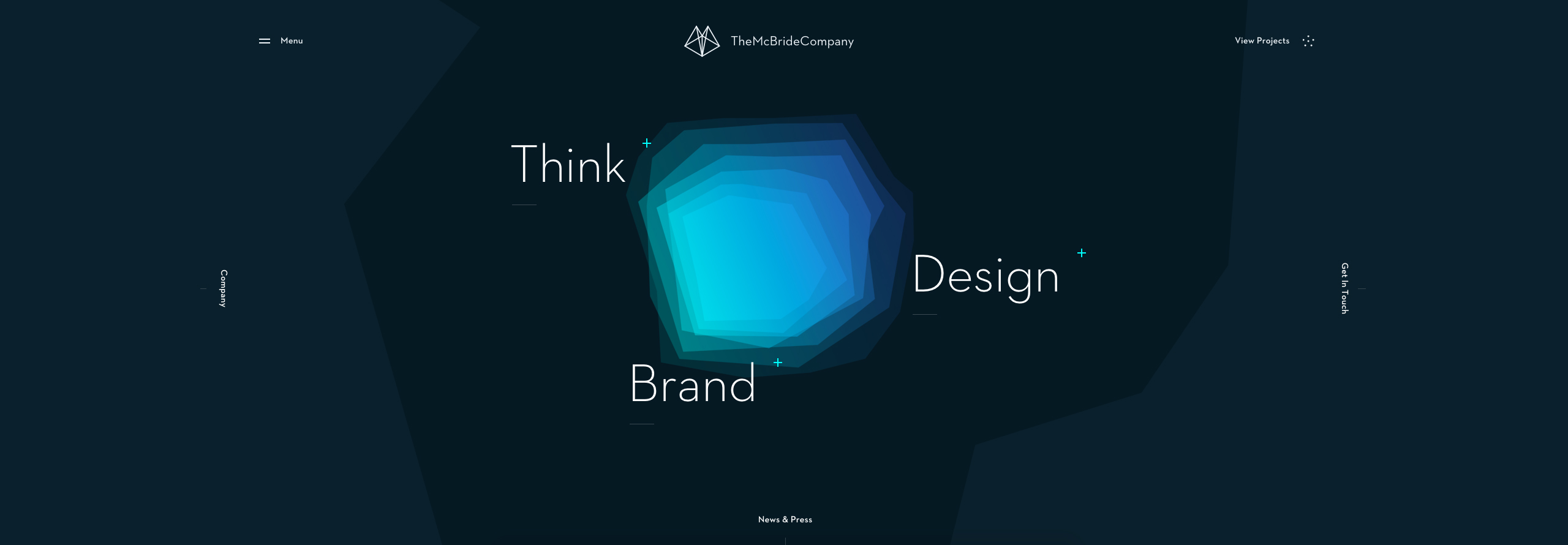
There's something enthralling about this work. The combination of deep colors, background animation and smooth transitions on every user action puts you in a bit of a trance. You have done a very good job of achieving that feeling. Most impressed by the overlays on the home page.
However, for me as a developer, there're some details that make you return to reality. Of the functional flaws, I found only one on the News and Press page. When you go to the second page of news of any category, except for All, the category changes to All.
The rest are just minor improvements:
- On the Who we are page, the carousel sometimes scrolls too much when dragging with the mouse. And both rows should move at the same time.
- On the News and Press page there's no image preloader, like on Projects page. And the images are too large for their containers, so the page load time is longer than it could be.
- Sometimes, when the user navigates using the Back and Forward buttons, some animations aren't performed. And there's an unexpected movement as well, like on a single project page, when images are enlarged when you click Back.
- When the user tries to navigate via menu to the current page there's no need to reload it.
Still, this is definitely a candidate for the FavF status. Recommend.
Comments 1


Maxim Aginsky
accidental ꩜ initiates ꩜ serendipitous
Maxim Aginsky
Very well crafted! Cheers >)


Comments 2
I-Creativ Studio
I-creativ studio is a small creative team of designers and web developers that can bring in the spotlight the best of every business. The strength of I-creativ web studio is the elaboration of complete projects from the concept, visual identity, photo shooting to web design, web development and promotion. The studio...
Yohannes Artinyan
Congrats!
Maxim Aginsky
accidental ꩜ initiates ꩜ serendipitous
arrowww.space
Maxim Aginsky
Congrats! Great work.