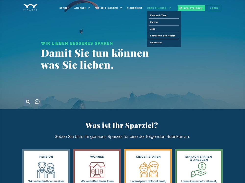
A website for the new Austrian Fintech-Startup Finabro.

Love love love your font choice and colour palette. Couple of stuff can be improved. I think the layout can be polished even more. And the site is not presented well on mobile. Lack of consistency ...
