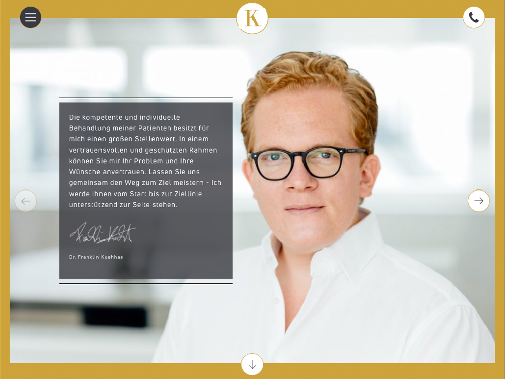
It's a nice website and its clean look and feel, its sobriety very well serve this doctor's professionalism, while having this hint of style that definitely change from the other "medical" content we're used to see on the web.
A few point can be improved:
- I thought the left / right arrow didn't work as there is no pointer mouse cursor (hovering over them) and I thought they would trigger a slider. The idea of going through the page like this is good, just wondering if a different UI could be more efficient
- Certain elements look clickable, but nothing happens (just brought to the top of the page)
- I find there is sometimes a misuse of the white space, as some elements are not vertically centered
- The "Kontact" button looks weird on lower resolution (phablet portrait for instance). Maybe just an icon, or smaller font size would do the trick, and it would benefit for a clear horizontal alignment (left, center or right)
- Some discreet micro-interaction could help (overall feels very static)
- Maybe I have a twisted mind, but I find the brownish yellow color (and the red in Kontact) err... well... it reminds me of what one's gets when having a urology infection lol Ok, ok, let's forget about it :P
Overall good job :)


