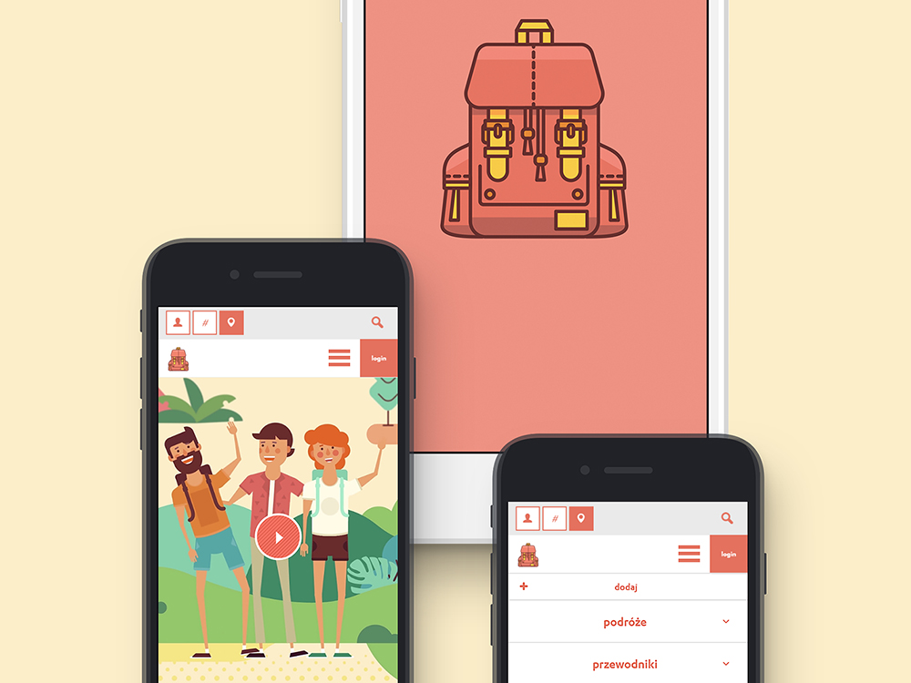
"Trampaway" second review


Gregor Ojstersek
Crafting beautiful things from design phase and all the way to finished and developed phase.
Gregor Ojstersek
That's a really cool idea for an app. I can see a lot of potential in it. Also the work you (your team) have done to make the experience as it is, is admirable - illustrations, video, the whole site's branding, animations, micro interactions etc.
I'm just curious how many people was involved in this, because I can see some nice server - client efficiencies like the carousel images of a trip loading one by one and cache the recieved image, instead of loading the whole thing in one request. Also you are providing different browser urls for different images. But the browser back button seems to refresh the whole page.
For the UI part, the header experience on mobile is a bit buggy (search + nav + the fixed parallax hero image), other than that, I think you have done a great job regarding the UI/UX.
My suggestion is for the front-end part. I can see you have used dropzone for the image uploading. I have recently used cropper.js with a combination with dropzone in a project, to make the user decide where he/she wants to crop the images. You could do that for trip's cover photo.
Overall a really great job. I will stay tuned to see the progress of the app and also to get some inspirations for some nice travel destinations :)
"Trampaway" first review


Vincent
I'm a French UX Designer and Art Director, originating from Poland and currently living in Canada. I see every project I am involved in as an opportunity to go further, providing my clients and employers with quality materials and a great working relationship.
Vincent Przybyla
That's a pretty cool site, and this idea of suggesting trips and creating a community around this service is excellent for people like me who never know where to go for the next vacations :P
Visually speaking, it's clean, I love the simplicity, the illustrations, and the fresh / friendly color scheme, so good job. The site could be even more clean by standardizing the font sizes (eg in the trip cards).
It's a good idea to propose a filtering system for the search (by username, hashtag, and place), that way I know what I can type. Be careful though, because tapping a filter is a bit buggy on Safari iOS.
Concerning mobile resolution, I find that the search + the header take way too much room combined. That doesn't leave the content a lot of room.

The hamburger icon could be smaller, and the search bar only visible when the user clicks on the search icon (just like in the desktop version).
Enough on that, let's go planning my next vacations ;)


Comments 1
Maxim Aginsky
accidental ꩜ initiates ꩜ serendipitous
arrowww.space
Maxim Aginsky
Very smooth and creative! I am missing the About page. My transcription: international community of people that united around idea of - trump (Donald Trump) away com (top-level domain). This is was my first association when I saw trampaway.com in the address bar :)
Love the illustrations. Who is a creator of such a great illustrations?
Also I have strong feeling that the top part (with illustrations) not really matching the bottom (content) style, especially on the homepage. For example on the /guides page both parts follow the same style rule.