"Nama Home" first review


Drew
I'm a Tech Lead with over 8 years of experience. Music addict. Fond of different crazy stuff, like iframes on iOS (sarcasm). Author of the slash conspiracy theory. You never know when one slash will ruin your whole routing.
Still reading this? Great, so, uhm, don't take a word above seriously. Except the first senten...
Andrii Zhukovskyi
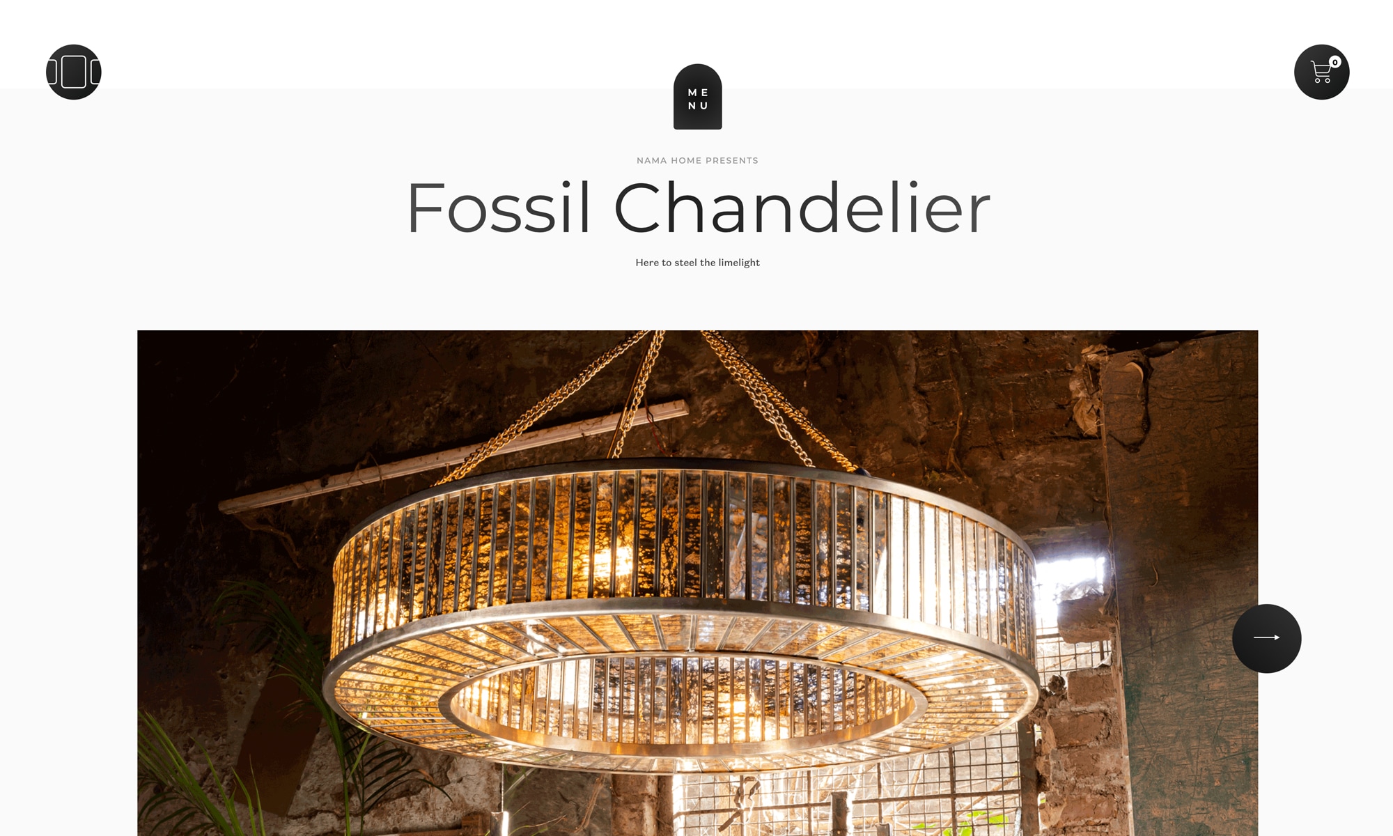
The first time you visit the home page, it becomes obvious that you have a well-balanced composition in front of you. Let the purpose of this craft is to present the works of other creators, it is not a calm canvas - it holds on by itself, complementing and emphasizing the graphic content. I would also like to note the animation component. Sometimes subtle, sometimes mesmerizing animations, had a calming effect on me and encouraged to visit more product pages.
The latter is very useful for an e-commerce website =).
Although there was good work on the animations, some of them seemed to me to be a bit under-tuned, and some I found lacking. To the first, I would include, for example:
- a change of the page title - sometimes it starts a bit early or late, and it is performed instantly, which contrasts with the rest of the smooth interactions;
- the constant work of animation in the footer of the page, even without the hover on it. In my opinion, it would be better to have an automatic animation there, which is active only when the footer is in the viewport, and when hovering it would work as it does now, but the position of the images would fully follow the position of the cursor;
- etc.
The second would be the lack of outro animations, mainly when navigating through the pages. It usually takes a few seconds before the browser completely unloads the current page and starts rendering a new one. At this time, the current page remains active. It would be very helpful to immediately inform the user that his click on the link was accepted by the site and gracefully carry him to the next page. Even considering that navigation between pages is default browser-based (not by dynamically updating the content), this is still more than possible.
There are also little things, like the position of the actual cursor relative to the custom one - it is located in the upper left corner, and not in the center of the circle, which at first makes it difficult to click on small links and affects the hover animations of the latter. The abrupt transition to the beginning of the looped video in the header of the home page is striking as well.
But it should be emphasized that, in fact, all of the above does not affect the foundation and the general concept of the work - these are just questions of some fine-tuning. This is high quality craft and I recommend it.
Comments 2


Maxim Aginsky
accidental ꩜ initiates ꩜ serendipitous
Maxim Aginsky
Good and very detailed review, Andrii. I enjoyed it very much!


KP-Design
Karan is a Creative Director/ Visual Designer with 6+ years of experience in Digital Art Direction, Branding and Print Design. His design style tends to be visually rich and memorable.
Karan Patel
Thanks for the insightful & detailed review Andrii. You made some really useful points. Much appreciated.

Comments 2
KP-Design
Karan is a Creative Director/ Visual Designer with 6+ years of experience in Digital Art Direction, Branding and Print Design. His design style tends to be visually rich and memorable.
Karan Patel
Thank you for the kind words Maxim. I appreciate it.
Maxim Aginsky
accidental ꩜ initiates ꩜ serendipitous
arrowww.space
Maxim Aginsky
Very good. Creative. Awesome Karan, congrats!!