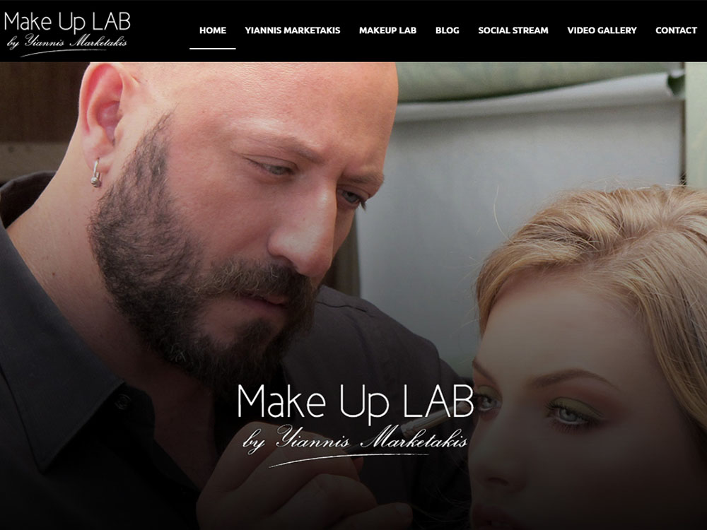
"MAKE UP LAB" fourth review


Janet Wong
Full time job at iflix. Currently exploring UI/UX. http://www.janetwong.net
Janet Wong
Hey there, would be great if you can insert language toggle button on your menu to support multilingual website.
Overall the design is great but lack of creativity. My suggestion is to spice it up by adding some slick transitions.
"MAKE UP LAB" third review


Vincent
I'm a French UX Designer and Art Director, originating from Poland and currently living in Canada. I see every project I am involved in as an opportunity to go further, providing my clients and employers with quality materials and a great working relationship.
Vincent Przybyla
This site is efficient and the design is pretty slick. But it looks like a regular wordpress site and I find more creativity could be injected.
I noted a few inconsistencies:
- Only one item in the main menu is not clickable (Yiannis Marketakis), and the others are
- Some buttons have a hover effect, others don't
- Some text are in Greek, others in English
- The use of the white space is not even throughout the pages
- The lightboxes' ui is not consistent with the rest of the site
Other than that I feel like the mobile version would need more attention (for instance, certain buttons are cut off), and more micro-interaction would help to make it less static.
Overall I understand that is Yiannis is a talented and artsy guy, so the site succeeded in conveying that ;) You're on the right way!
"MAKE UP LAB" second review


Gregor Ojstersek
Crafting beautiful things from design phase and all the way to finished and developed phase.
Gregor Ojstersek
The site has a clean and modern feel with high quality images that nicely present the protagonist of the site, Yiannis as a great make up artist. Yet some aspects of the site could be more consistent UI and UX wise.
The first thing that caught my eyes was the mixing of English and Greek. That is not good regarding UX. I would recommend that you make the site multilingual.
The second thing is UI wise. You seem to be using some different plugins for different features of the site. Most of them are pretty consistent with the overall branding, however the video gallery is set to default css of the huge-it video gallery plugin if I am not mistaken. You should play with that description on hover, that red on black background is not really nice :)
I am just in the making of a video gallery wp plugin that would play the preview of the video on hover. Can see it work nicely on your site.
"MAKE UP LAB" first review


Stoyan Daskaloff
Senior UI/UX and Motion designer with 15+ years of experience.
Founder of SliceCrowd.com , SliceCrowd LABS, CreativeFrontEnd.io and Pixel Innovations.
Stoyan Daskaloff
The scrolling bahaviour is wired on mac, it doesn't feel natural. The colors are nice, the design is minimalistic which is good but I in general it looks too stretched on my 27'' display.
Also I don't understand why the some of the menu items are in greek :)
In general the direction is good, but it looks like attention was not paid on the details. Some more white space could be added, it should be tested in more resolutions and devices, the typography can be improved and some nice animations can be added. It will surely take it to the next level.
Cheers
