"Inkilas" first review

Janet Wong
Full time job at iflix. Currently exploring UI/UX. http://www.janetwong.net
Janet Wong
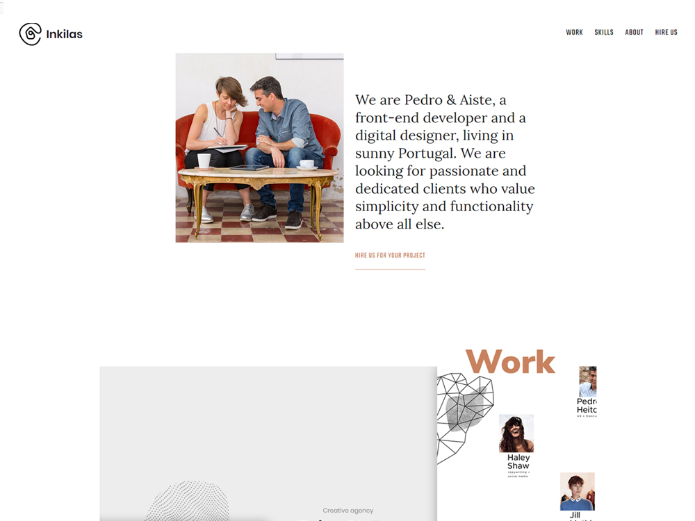
You guys not only have scored minimalism, but killed it perfectly! Personally think there's something special about this site that keep things excited and I'm not bored! Timeless and fresh. Can't wait to see what's next coming from ya!
Keep it up!
Comments 3


Janet Wong
Full time job at iflix. Currently exploring UI/UX. http://www.janetwong.net
Janet Wong
Hey no worries! Really happy for you! Wishing you great journey ahead :)
Thanks Janet and Maxim, fantastic to see that comment Janet, specially because our goal here was to make something less trendy, techy or complex with obvious and distracting animations and transitions. We wanted something that was more timeless, something that was more about content, so it seems we made it, happen without being to boring, perfect for me


Maxim Aginsky
accidental ꩜ initiates ꩜ serendipitous
Maxim Aginsky
Agree :)

Comments 5
Maxim Aginsky
accidental ꩜ initiates ꩜ serendipitous
arrowww.space
Maxim Aginsky
You also can do: .entry-header img {width: 100%;}, this will work better on the large screens.
Maxim Aginsky
accidental ꩜ initiates ꩜ serendipitous
arrowww.space
Maxim Aginsky
Hahaha... Nice. Yes, laptops are not the best tool for testing the design for the large screens :) Cheers
Inkilas
Inkilas
Hi Maxim thanks for getting in touch, love to get some feedback and ideas.
1. Some elements do have a max-width of 1920px and that's mostly because we would need very large assets to allow the website to "grow" more and we felt it was plenty good at larger screen sizes. But your comment did result in some bug fixes on larger screens so many thanks, one of the downsides of working on laptops.
2. We did try many different interactions for the works sections and in the end we went with this one, but it's still open to debate, maybe we will try it again, we decided on keeping the animation on scroll because it was more "compatible" mouse/touch devices, but we could try separate approaches. Once again thanks for the time
Maxim Aginsky
accidental ꩜ initiates ꩜ serendipitous
arrowww.space
Maxim Aginsky
Great work! Just a few comments.
1. Why some elements of the site have max width 1920px?
2. I had a strong feeling that the works sections on the home should be animated on the mouse hover.
Love the logo animation when navigating from other pages to the home page.
Great!
Inkilas
Inkilas
We are very happy to be nominated here, thanks and we hope everyone enjoys our new home. If you have any feedback why not get in touch with us, we are happy to hear it :)