"In-HouseTeam" first review


KP-Design
Karan is a Creative Director/ Visual Designer with 6+ years of experience in Digital Art Direction, Branding and Print Design. His design style tends to be visually rich and memorable.
Karan Patel
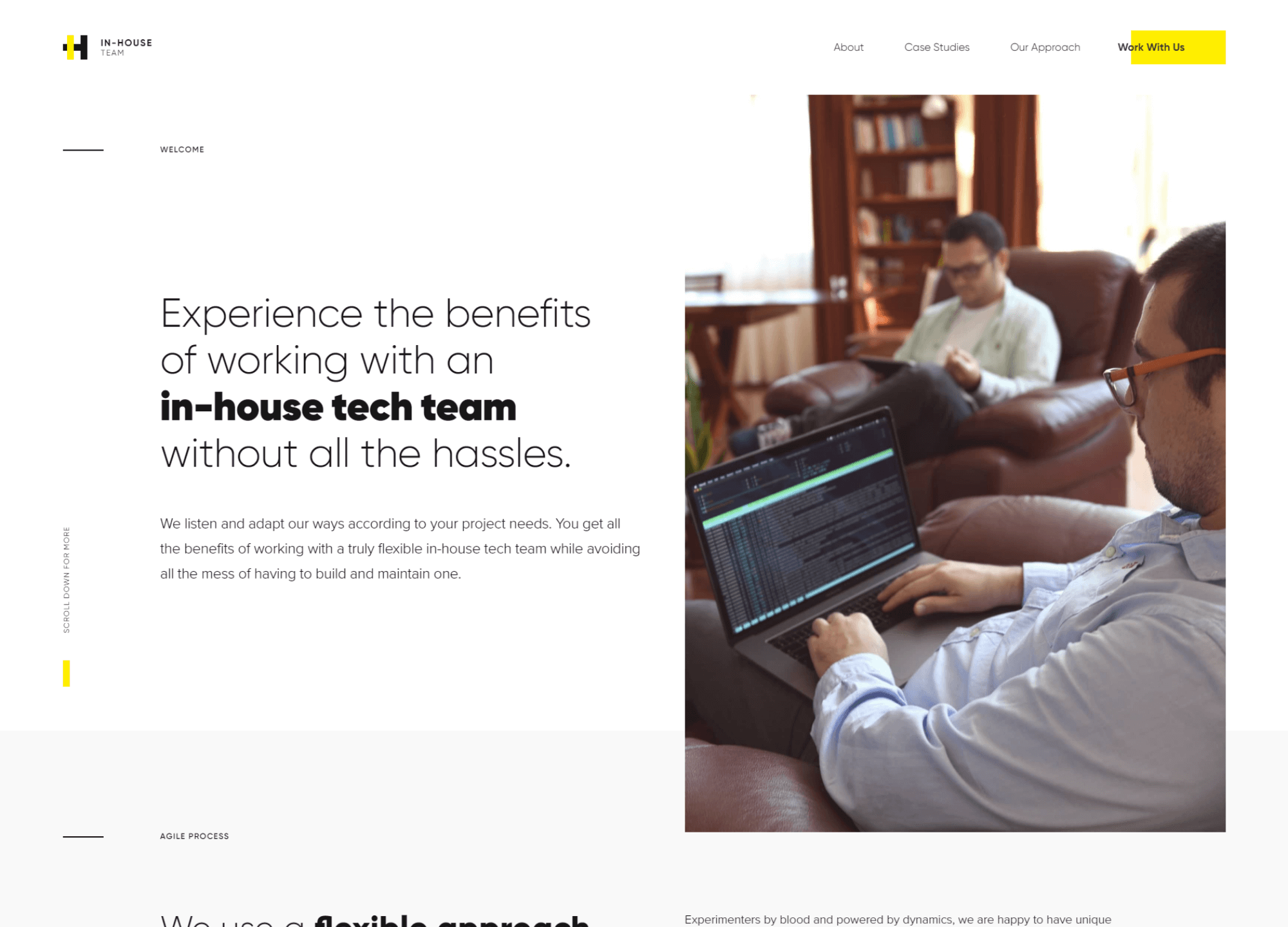
While this website is not groundbreaking in terms of animation or UI, it is nonetheless sufficiently appropriate for the work that they do. As a matter of fact, I found the straightforward honest approach to the design and content quite refreshing. Everything from the UI and typeface selection to the actual written content echoes this perfectly.
If I had to nitpick, I would look at using slightly better quality screenshots on some of the case study pages. The low quality does become apparent on large retina devices. Also, navigating back to a case study page using the browsers back button seems to have a bug.
However, these are really just minor niggles. All in all, this is a well finished website that accurately communicates the personality of the team.
Comments 1


Maxim Aginsky
accidental ꩜ initiates ꩜ serendipitous
Maxim Aginsky
Good work Karan. All is very true. Best.

