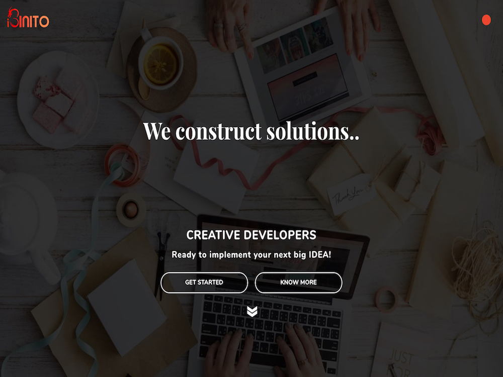
"ibinito" second review


Vincent
I'm a French UX Designer and Art Director, originating from Poland and currently living in Canada. I see every project I am involved in as an opportunity to go further, providing my clients and employers with quality materials and a great working relationship.
Vincent Przybyla
The home page feels crowded because of the fonts, the icons, the colors, the misuse of negative spaces, and too many micro-animation.
The portfolio page could benefit with a scrolling navigation. When I landed on the first project, I didn't see the arrow on the right, tried to scroll but nothing happened (FF and Chrome). I thought you actually only one project. I had to search to find this down arrow. Your user should not have to think ;)
Each project has an "Explore soon" button. Just don't display it if there is nothing to explore. Each project could actually benefit for more than one screenshot.
In pure visual considerations, nothing is harmonious.
I can appreciate the effort you put to have a creative site, I know it's a lot of works, but there are too many design issues as far as I am concerned.
"ibinito" first review

Janet Wong
Full time job at iflix. Currently exploring UI/UX. http://www.janetwong.net
Janet Wong
Hey ibinito, couple of stuff you can enhance/improve the site..
ICONS: All the icons used here are really different and they don't really synced together. Seems like they are compiled to this site.
FONT: Need to have more consistency on the font use. Note the font use on your landing page: MOBILE APPS, WEB APPS, ENTERPRISE APPS, INTERNET OF THINGS.
And because of these inconsistencies, they already hide some of the cool effects you're trying to apply here(hover effects).
Probably need to have an overall in-to-depth look on your website in order to determine what's good to keep and what to left behind. And by the way, effects are a bit too much for a single website. Users might get distracted and not reading your site.
Comments 2

Ibinito
Ibinito is proud to present their refreshing new performance-centric website with a lot of custom animations throughout to showcase our work and services.
Ibinito
Thank you Janet and Maxim for your valuable feedback. I'll be coming up with the second version of our website and would definitely incorporate the above suggested changes. Also, I would tone down the animations and effects to a more subtle level to make them less distracting.
Thanks a lot. Really appreciated.


Maxim Aginsky
accidental ꩜ initiates ꩜ serendipitous
Maxim Aginsky
Yep Janet, personally I always spend majority of the time looking into the part before the fold. Absolutely agree with your note about "...consistency on the font use...". Most of the chances that, serif and sans-serif going to be a bad couple :)
Also about the company statement - "We construct solutions. We design softwares. We augment your business."
Such an important information needs to be available for the visitor of the site immediately or at least faster than it is now, based on this info visitor will be able to understand what you can give, what kinda things the site is offering.
Cheers
