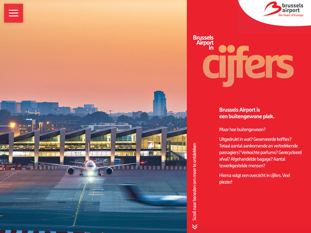
"Brussels Airport in Numbers" fourth review


Gregor Ojstersek
Crafting beautiful things from design phase and all the way to finished and developed phase.
Gregor Ojstersek
The animations are great and the attention to detail is on a high level. The interactions between the elements are really on point with good timings. Like the fonts, the grid and the composition of elements. You have been really consistent throughout the whole site.
The UX is fresh and surprising at the beginning, but when you go through a lot of different pages, you get that feeling that you have already been there, because there are main scroll down transitions and then the carousel on detail pages, but the carousel trasitions are really diverse and that overcome that routine feeling.
The goal of the page could be a little more clearer, because it is not really known until you go through some pages.
You have presented a lot of different facts, that may get boring, if you are not really interested. But you have done the opposite. you have presented them in a really fun and unique way. Some of the elements of the site are really nice to watch. Great job.
"Brussels Airport in Numbers" third review


Stoyan Daskaloff
Senior UI/UX and Motion designer with 15+ years of experience.
Founder of SliceCrowd.com , SliceCrowd LABS, CreativeFrontEnd.io and Pixel Innovations.
Stoyan Daskaloff
The scrolling behaviour is very bad on mac. This is a common issue because of the scrolling inertia on MacOs so whatever plugin you want to use you need to carefully test.
And in general I find it very difficult to understand what the site is about. Interesting facts about the airport, I figured it out after a while but it's a bad UX in general.
I really believe that a small guide / map / timeline will help a lot - something that's always on the screen showing you where you are, next/prev - imagine the preview pane in Photoshop or something.
"Brussels Airport in Numbers" second review


Janet Wong
Full time job at iflix. Currently exploring UI/UX. http://www.janetwong.net
Janet Wong
Agreed with oninross about the slide in animations. To be honest, I've no idea that those infos are clickable till I hovered them. Especially text like '21.8 million', '20,000'.
Suggestion: Probably you can apply Black and White treatment to your background images. And use different colours on copy for each slides/sections. So user can differentiate the sections by contrast colours.
"Brussels Airport in Numbers" first review


oninross
I'm Niño Ross Rodriguez (oninross), a Senior User Experience (UX) Developer with nine years of industry experience, specializing in developing pixel perfect websites quickly without sacrificing code quality and ensuring that users have the best UX they can get in a site.
As a Senior UX Developer, I love being challe...
Nino Ross Rodriguez
Its an interesting way of displaying numbers and statistics. I like the grid and the transitions. It was entertaining at first but it got a little boring and repetitive as you progress through the sections. It would be nice to actually animate the numbers as well. Not just using the simple slide in animation, but include the counting up also.
The icons could've used some animation as well. I feel the atmospheric images would've been better if it was a video.
Good job on transferring this on mobile as well.
Overall, good job guys!

