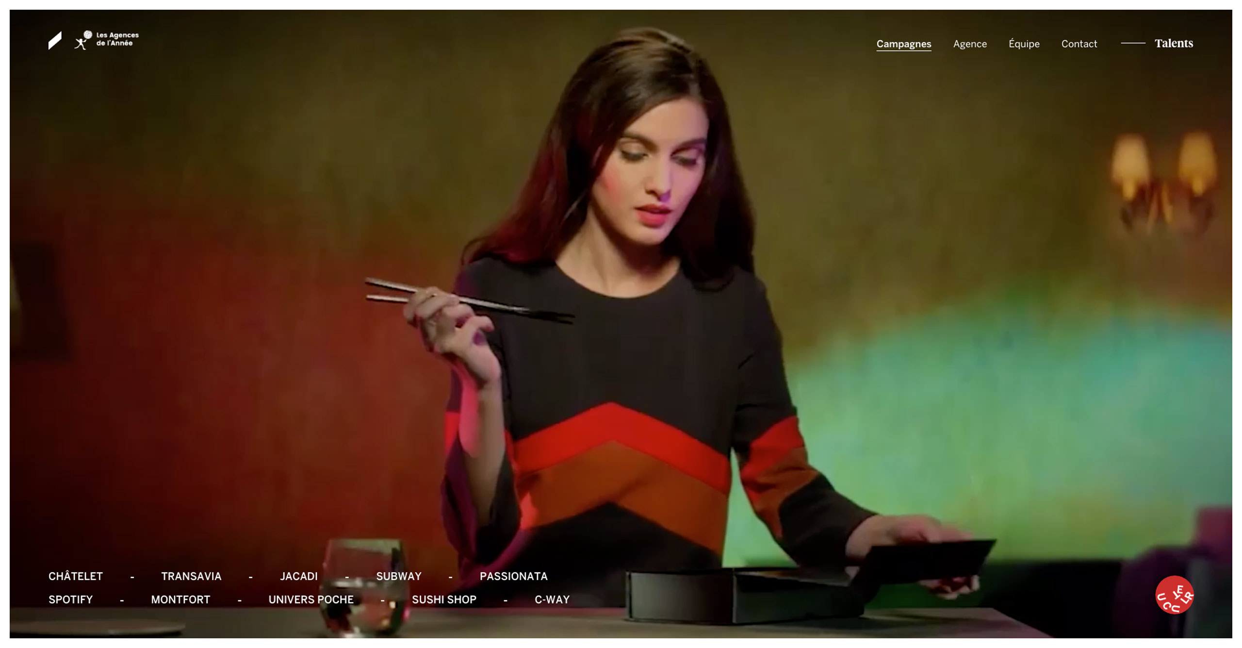
"Braaxe | Maison de Publicité" first review


Drew
I'm a Tech Lead with over 8 years of experience. Music addict. Fond of different crazy stuff, like iframes on iOS (sarcasm). Author of the slash conspiracy theory. You never know when one slash will ruin your whole routing.
Still reading this? Great, so, uhm, don't take a word above seriously. Except the first senten...
Andrii Zhukovskyi
An interesting work without a doubt. Short videos on the desktop version of the home page give you a clear idea of what selected project is about. Every case study page has its own feel, but small animated details make them even more special.
Every page has great visual effect mainly due to high quality images. And the page loads quickly enough. High speed of processing the request on the server and content optimization do their job. However, for a site that is heavily dependent on visual experience, some animations need to be improved:
- When navigating through history two pages forward or backward, preloader isn't always animated appropriately. And it's missing when visiting the site for the first time.
- The transition from project to project when scrolling at the bottom of the page works a bit randomly.
- I've encountered some broken elements on the Transavia page. In the section that scrolls to the sides, sometimes several slides are missing. The flapper tags are duplicated when visiting the page in a new tab.
- When scrolling on the Team page the photos are changed too fast (if the cursor is over the names of team members). Perhaps the best approach would be to remove hover prevention while scrolling and add a timeout before displaying a photo of a team member. The timeout can be cleared at the scroll event, thus cancelling the photo change.
- Slider animation feels fragile. If you don't scroll through the images one by one, you can get result like this:
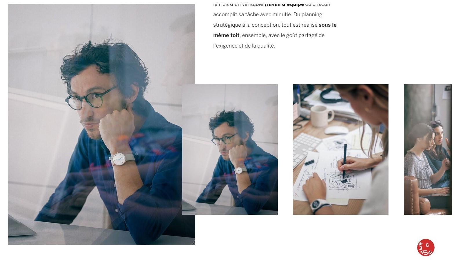
Duplicate photo
And a small observation. Looks like you animate the preloader concerning the direction of history navigation. An interesting feature, but your determination method doesn't always work correctly in appropriate situation (when you forward and backward pages aren't the same).
Although I've described issues mostly, this doesn't mean that I didn't like this work. On the contrary, I think it's a decent project to be recommended to favorite status. Good luck!
Comments 1


Maxim Aginsky
accidental ꩜ initiates ꩜ serendipitous
Maxim Aginsky
Drew, this is great post!!
I would like to add just one small thing.
When you scroll the page for example on single project, the navigation is gone for ever! and you do not have a way to jump to different section.
I probably can understand why user forced to go over entire page without the option to escape :), but when some one decide what I should do, I personally do not feel comfortable.
By the way, navigation as well as other repeatedly appearing site components help to define the space better for user.
This small details creates an emotional chain and not just separated points of information.
Brand elements are the glue, which can connect different imageInfos.
I must say, I really like this form of communication between you and me. Cheers!

