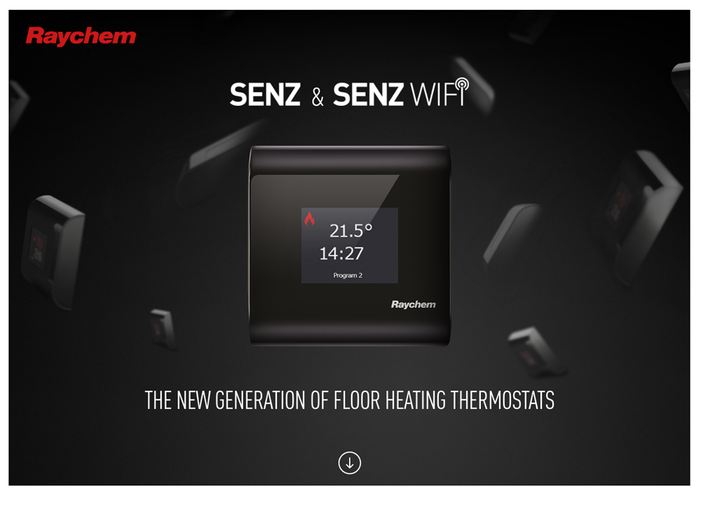
"Senz & Senz Wifi" first review


Vincent
I'm a French UX Designer and Art Director, originating from Poland and currently living in Canada. I see every project I am involved in as an opportunity to go further, providing my clients and employers with quality materials and a great working relationship.
Vincent Przybyla
This single page does the job of promoting the product. Simple scrolling navigation, no "wow" effect, but it's effective. The contents and the contrast of colors are pretty nice.
Maybe persistent links would have been nice to directly jump through the sections (instead of scrolling navigation only), ot to download the app ?
The choice of fonts are not bad, but could be improved. So could be many other UI elements (buttons, icons).
The phone-resolution version is a bit below though ("Switch gear" transition triggers too fast, and the "eye for design" tabs are hard to tap / should be on top of their content).

