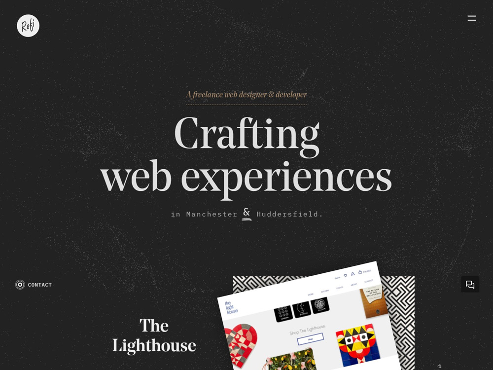
The Website design overall looks good.
Below some points which i feel like need to resolve.
1. In Firefox taking too much time too load and feel like heavy loading on homepage when scrolling. or open menu icon. effect of blur background not match with your design.
2. In Inner page of project/portfolio work should have back link or next link to view next per previous project.
3. On Contact validation error/msg should be in white or with visible color. right now i see in black font in black background.
4. I have seen in homepage there have some titles like "In short" "The who". only for those 2 sections used different font style which is not required as per my point of view, think about it.
5.Noticed on each page have different size of body fonts and different line heights. Which is now showing proper UI things.


Comments 1
Maxim Aginsky
accidental ꩜ initiates ꩜ serendipitous
arrowww.space
Maxim Aginsky
Very well done Rofikul! Have you developed the WP theme yourself?
Best.