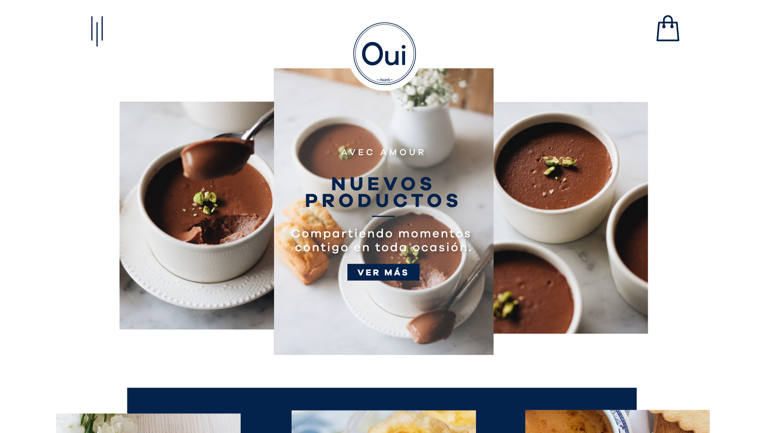
When it comes to product based e-commerce websites like this one, the proof really is in the pudding (pardon the pun). But from what Ive seen of the initial design and user experience, I wouldnt be surprised if the site performed well.
I loved the food photography and the simple clean blue-white colour palette. Moreover, the user experience is straightforward and direct, which is what you want on a site like this. I particularly liked the text based hover animation for the different product categories on the homepage.
There were however, two things that stood out and which I might have done differently. First, I might have added some white space between the different sections to give the users eye some rest. And secondly, I mightve worked on the typography to add some contrast between the titles and paragraphs.
Of course, these are really just minor niggles. For what it is, the website does its job well. Good luck and I look forward to seeing more of your work.