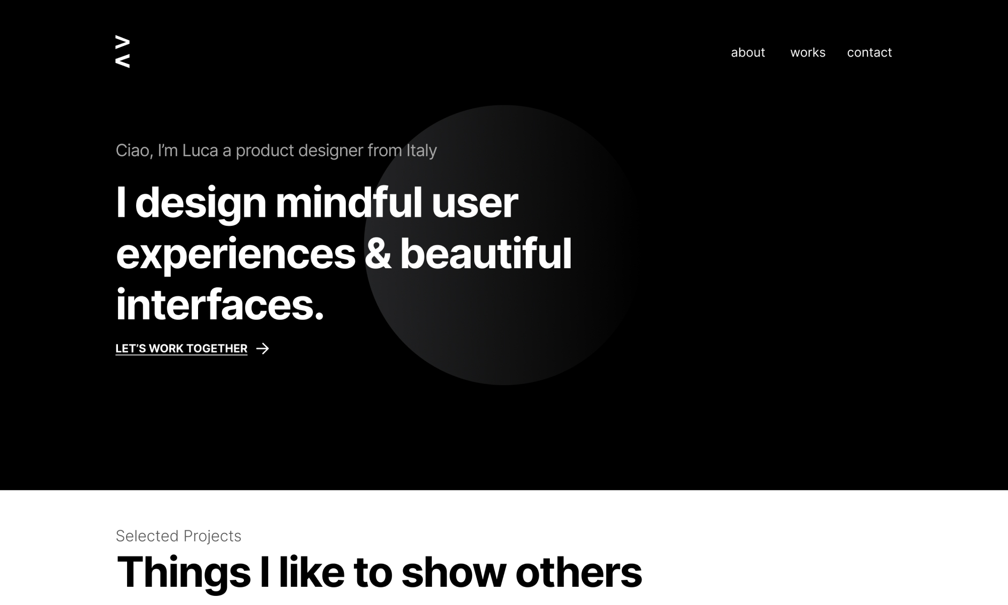
"Luca Volino - Portfolio 2021" first review


KP-Design
Karan is a Creative Director/ Visual Designer with 6+ years of experience in Digital Art Direction, Branding and Print Design. His design style tends to be visually rich and memorable.
Karan Patel
Its always tricky to review a fellow designers work. Since this is all subjective, I am always aware that each creator would take a different approach in designing his or her website.
In this case, the approach was simple and direct. The entire site from the sitemap structure to the layout and colour scheme was straightforward and gets straight to the point. I particularly liked how the logo and the page transitions were animated in line with this style.
With that being said, the site definitely needs a bit more creative animation to tie it all together. Something to add a bit more depth to the experience and pique your visitors interest, encouraging them to explore further. Other than that, there were a few sections which were a bit off, like the homepage and project page titles on mobile.
I would say this is a good base to build on and refine until you have something truly special. Something with that ever elusive wow factor we all chase on every project we undertake.
Comments 4


Maxim Aginsky
accidental ꩜ initiates ꩜ serendipitous
Maxim Aginsky
Hmm.. I could not stay a side :)
Just a small observation, something that keeps bothering me every time I navigate through the site: Pages like Root, Works and Contact have very similar styles at the top, which is OK. But I have noticed that for me it is hard to identify the pages and first impression when I open for example Works after Contact is like - is this is a new page?.


KP-Design
Karan is a Creative Director/ Visual Designer with 6+ years of experience in Digital Art Direction, Branding and Print Design. His design style tends to be visually rich and memorable.
Karan Patel
Sure Luca,
using iOS 14.6 Safari browser at 1080x1920


Luca Volino
I am a UX/UI and Product Designer crafting minimal digital products and elegant web experiences from Italy.
Luca Volino
Hi Karan,
thank you so much for your feedback. You got the point, my goal was to be effective and clear as much as possible with the communication. Being a portfolio I wanted to focus on the essence and the contents in order to express what is my style.
It is absolutely true that it is important to work on the wow factor and for this reason, I will certainly not stop here but I will continue to work in order to improve.
As for the mobile defects, could you please tell me the resolution of your device? So that I can fix them.
Thank you


Maxim Aginsky
accidental ꩜ initiates ꩜ serendipitous
Maxim Aginsky
100% with you Karan !
