infinite imaginations | UX Front-end Developer tale
infinite imaginations
Hello world!
I am Nino Ross Rodriguez from the Philippines based in Australia as a senior UX developer. It is an honor and privilege that the team at Cssfox has selected my site as a Favorite Fox.
Concept
A portfolio is the reflection of one's work. It shows the people how you think, how you conceptualize and how you execute. infinite imaginations' concept came to be while I was working on a personal progressive web app project and noticed how beautiful Helvetica looked on the periodic table of elements.
Helvetica on the periodic table of elements
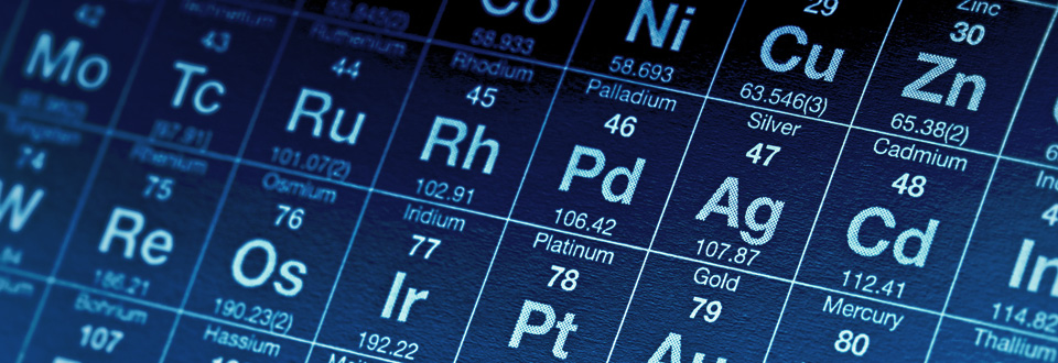
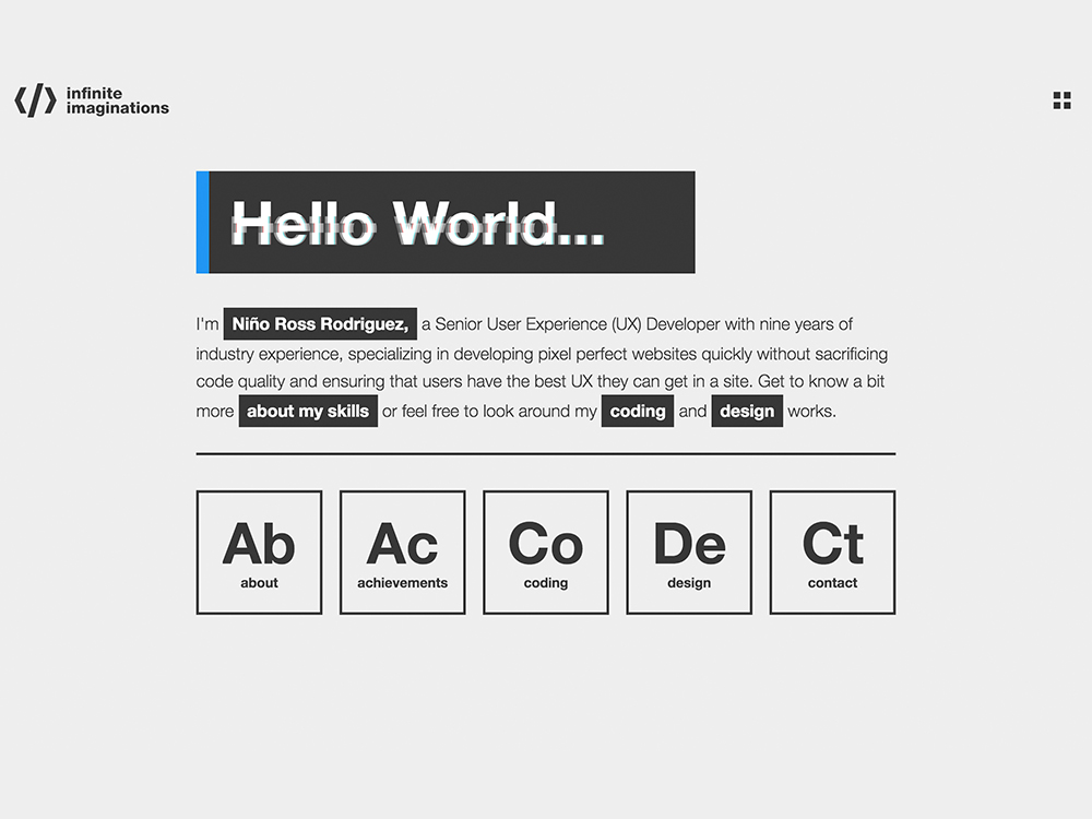
I was then obsessed with the font family. Taking elements from the periodic table of elements, the design of the website was inspired.
The Golden Ratio
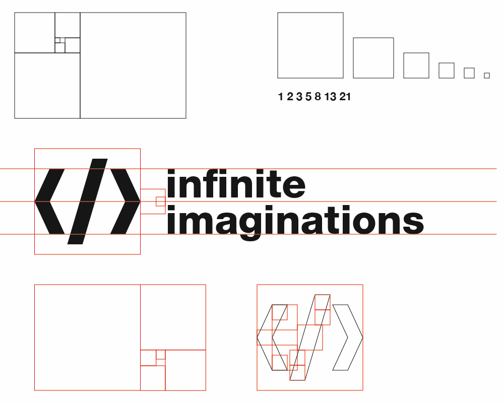
The theory behind the golden ratio was that if it was applied to any design, it would look perfect. It exists in nature, in life, everywhere. I researched how the golden ratio was being applied to design, specifically logos and found out how the Apple and Nat Geo logos were made using the ratio.
The Golden Ratio at the Apple and Nat Geo logos
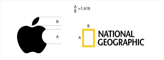
I already had an existing logo and I didn't want to deviate from it to much. So I created my own set of golden ratio elements. I deconstructed the golden ratio boxes and played jig-saw and connect-the-dots with it keeping in mind the look I wanted to achieve.
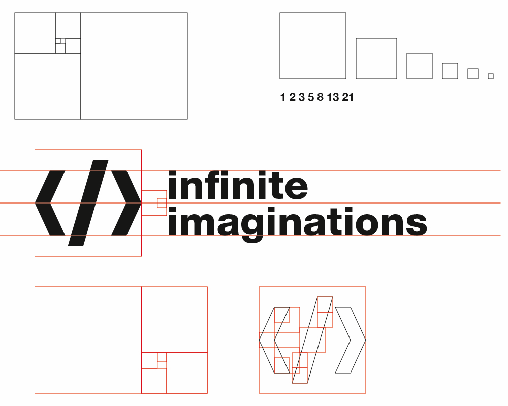
The end result was more than satisfactory.

Typography
When in doubt, use Helvetica. Helvetica has been in my blood since I started web design and development. No matter how hard I try to find a new font for my website, I always come back to Helvetica. In my opinion, it's the most beautiful and perfect font in the industry. You can never go wrong with it. I like my work to be clean at all times and Helvetica was just the perfect fit.
Animations
Since golden era of Flash, I was always amazed with the seamless transitions between pages. The user experience was always smooth with no abrupt page changes. The user's focus and attention will never be disrupted. Flash then slowly was being phased out of the face of the internet and Single Page Applications was soon in the rise. With a little research in the internet and tweaks to the code, I managed to make the transition as smooth as possible. Inspiration also came from Google's Material Design, which basically sums up all the animation that I wanted in my site.
Comments 1


Maxim Aginsky
accidental ꩜ initiates ꩜ serendipitous
Maxim Aginsky
Great Tale Nino!
I am not a fun of the Golden Ratio theory. I would like to believe that there is nothing more powerful than personally developed rules, but in case of your logo the Golden Ratio theory obviously works :)

Comments 1
Maxim Aginsky
accidental ꩜ initiates ꩜ serendipitous
arrowww.space
Maxim Aginsky
This is awesome oninross1