"August Studio" third review

Stéphane Billon
I'm a French Web and Graphic Designer currently working in Montreal. I'm passionate about art, design, sneakers and street culture. I have some affinities with minimalism, UI design and photography. As art director and designer, I have been creating digital products to connect design, technology & digital storyt...
Stéphane Billon
The minimalist treatment of the site is a good idea but not worked enough in details.
The general feeling of the site is a little bit too simple, the use of fonts could be much more creative. There are too many images and not enough spaces.
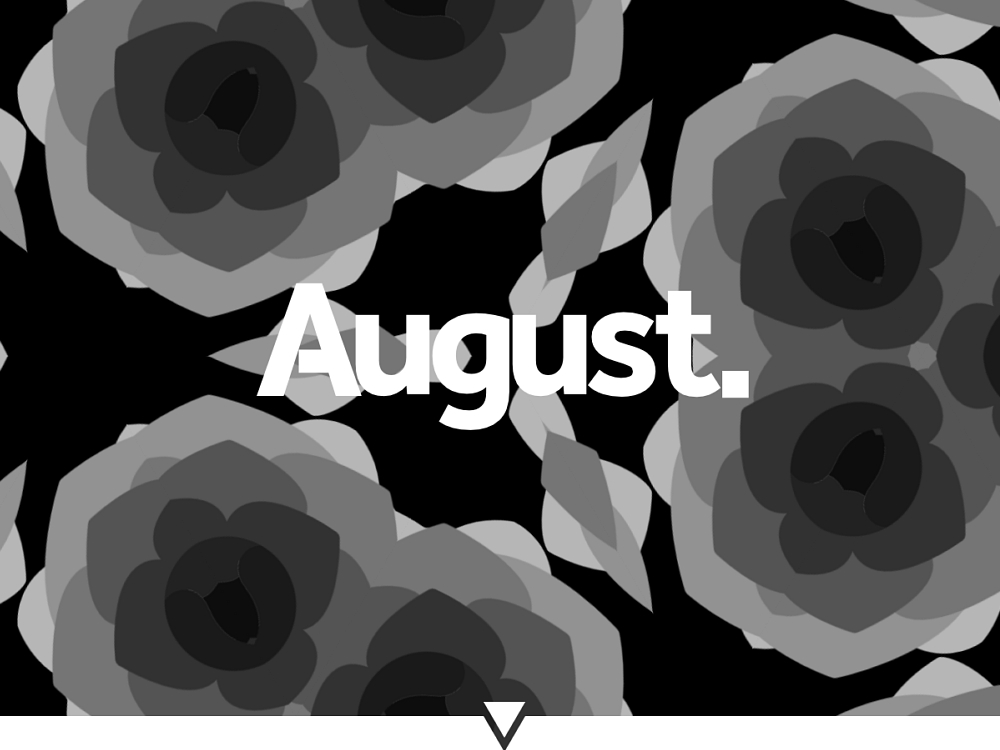
The use of rose animation is really a good idea but could have been better integrated with the rest of the site. There are also different navigation problems with some UI details.
The content is really good and this website with some details could be really nice.
Comments 1
Today Design
Today Design
Stephane Thank you for your feed back and lovely comments. We shall definitely take them on board.
"August Studio" second review

Stoyan Daskaloff
Senior UI/UX and Motion designer with 15+ years of experience.
Founder of SliceCrowd.com , SliceCrowd LABS, CreativeFrontEnd.io and Pixel Innovations.
Stoyan Daskaloff
There's too much imagery for me with no white space in between. This is the first thought that crosses my mind when I open the website.
1 - I don't understand the meaning of the roses (maybe?) on the homepage
2 - The typography is weak and too simple
4 - There's too less text in the case studies and the images are presented in a boring way
In general it looks more like a template, I don't see creativity, sorry.
Comments 1
Today Design
Today Design
Stoyan, Thank you for your feed back. It is greatly welcomed.
"August Studio" first review

Vincent
I'm a French UX Designer and Art Director, originating from Poland and currently living in Canada. I see every project I am involved in as an opportunity to go further, providing my clients and employers with quality materials and a great working relationship.
Vincent Przybyla
Overall, the simpleness and the prominent use of nice imagery (over text) contribute to make this portfolio a bold, straightforward and relatively pleasing experience. The site appears well, and loads quickly on mobile, which is appreciated :)
Many details in the UI should be improved though:
- The covers in the home page, in the work page, and in the project page are not the same, and I find it a bit disturbing. And the way to navigate to the project through the covers in the home page and the work page is different (in one, you click on the title, in the other, you have to find the tiny "more" in the bottom.
- In the home page, even if the whole project interacts on rollover (zoom), only the title is clickable. If an element interacts, I feel like the whole element should be clickable, this is my point of view.
- In the work page, it took me some (way too long) time to find the "more" link to the project. And as I said, I feel like the navigation should work the same in the work and in the home page.
Concerning purely visual (and thus) personal consideration, I believe there could be more work in the contrast of the fonts (headings vs paragraph) and the negative space surrounding them. Allow more rhythm in the layout, and maybe a hint of craziness :P
Also beware of Firefox, the overlay when rolling over the covers in the home page is slightly displaced (vertical center), which causes the page to bounce.
The semantic of the HTML structure, and the overuse of spans for the text elements could be improved.
Concerning the content, felt a bit dizzy with the home page cover, but that's fun.
The content is really good, beautiful materials, very good work ;)
Comments 1
Today Design
Today Design
Thank you so much for your invaluable feed back Vincent. Much appreciated!
Comments 2
Today Design
Today Design
Hi;
Design really. The idea behind this to make the site as pictorial as possible where the images speak for themselves. Often in an agency site the last time a potential client wants to see a "blog-like" sea of information where as an image can do this. We may change this, who knows? :@)
Maxim Aginsky
accidental ꩜ initiates ꩜ serendipitous
arrowww.space
Maxim Aginsky
On the "OUR WORK" page, where your designs are presented with a such nice images, was a bit hard to find how should you open the individual project page. Relative to the chosen pattern of big elements - logo, menu icon, top icon and others; it is at least strange.
Any reason behind it?