Hello, Cssfox and subscribers!
I am Igor Yakovlev, CEO of Affinage company. My colleagues and I would like to share the story of creating affinage-agency.ru website with you and also talk about our personal ideas about it.
We are not the first to say that every respectable digital-agency needs to have their own website.
Prehistory
Before talking about the site, let's remember our history.
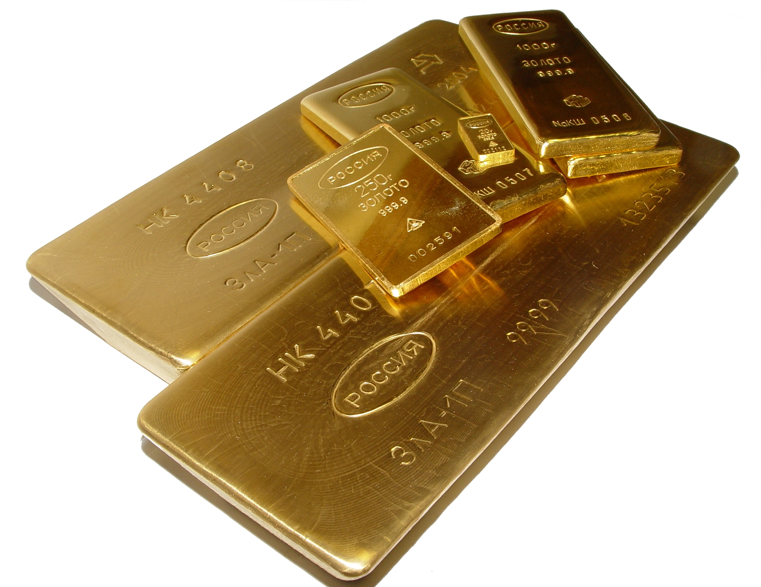
Everything began by choosing the name (August 11, 2014). We had to choose between Affinage (the act or process of refining a gold)
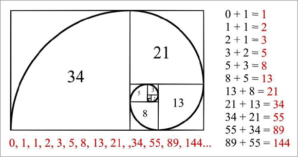
and Fibonacci (after the famous mathematician who introduced digital notation to Europe).
We decided to toss a coin and Affinage won with 50% probability! It was an awesome and important moment of a lifetime!
I remember the coin turning around in the air and landing on my palm very slowly. Nobody dared to break the tension in the air, when the coin was on my open palm facing heads up. Everybody accepted that fact as a given and went back to their work without a word. Now it is funny to remember it, but we were very serious at that moment. We thought the future of the Universe depended on that.
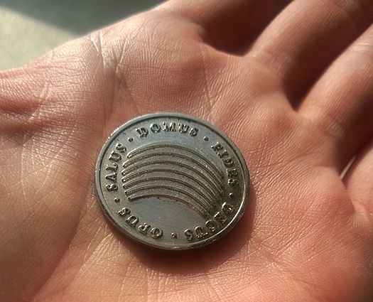
Affinage side
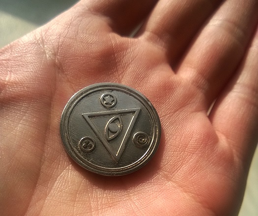
Fibonacci side
Fate knew that we should choose the Affinage name from the very beginning. Supreme Beings ensured us this was the right name.
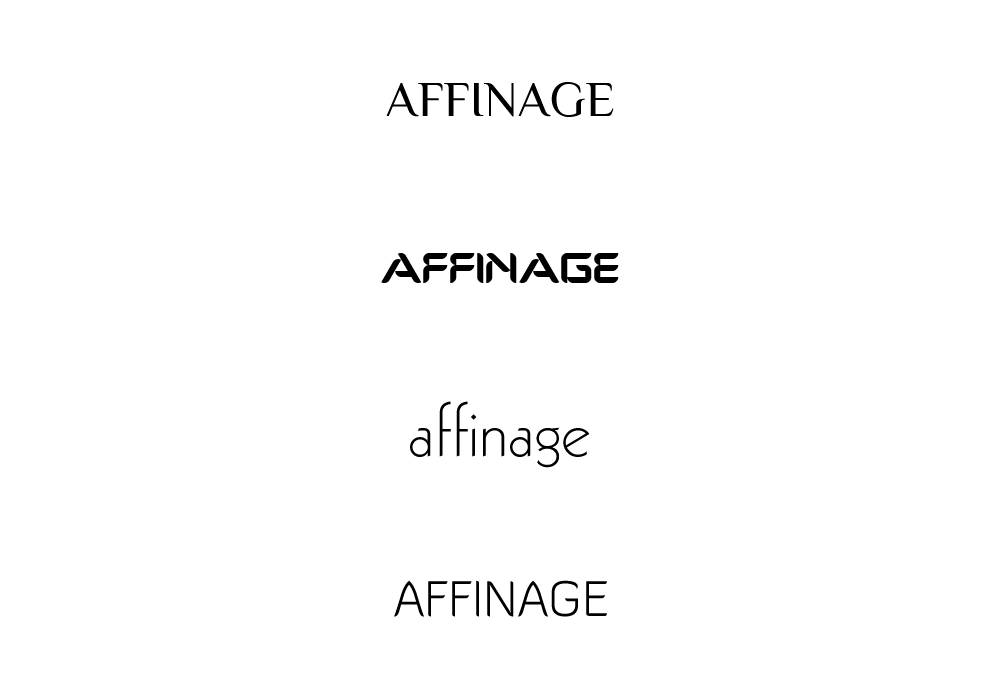
Then we were choosing the font and just trying different choices, using our sense of beauty. We tried uppercase and lowercase. Finally we decided on a serif typeface in an aggressive style, because Affinage sounds a little bit rude in the Russian language.
We added a small wreath to draw attention to the jagged edges of letters.
Respectability, aggressiveness, classic black and white colors and vector graphics - all those main ideas were joined together.
We talk about it, because it laid the foundations of site's design and conception.
Prepare
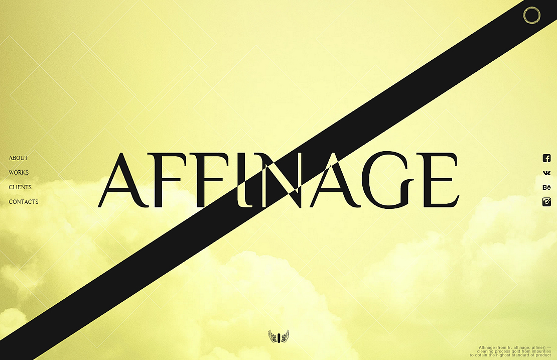
However, we didn't get stuck on creativity. Looking through other works, we chose two different ideas (full screen parallax saw on one of the sites + metro-design by Microsoft) and used them as the base to create something new and unique.
In this way masking effect was created. We hadn't ever encountered parallax and absolute masking effect that were joined together and able to be displayed in browsers.
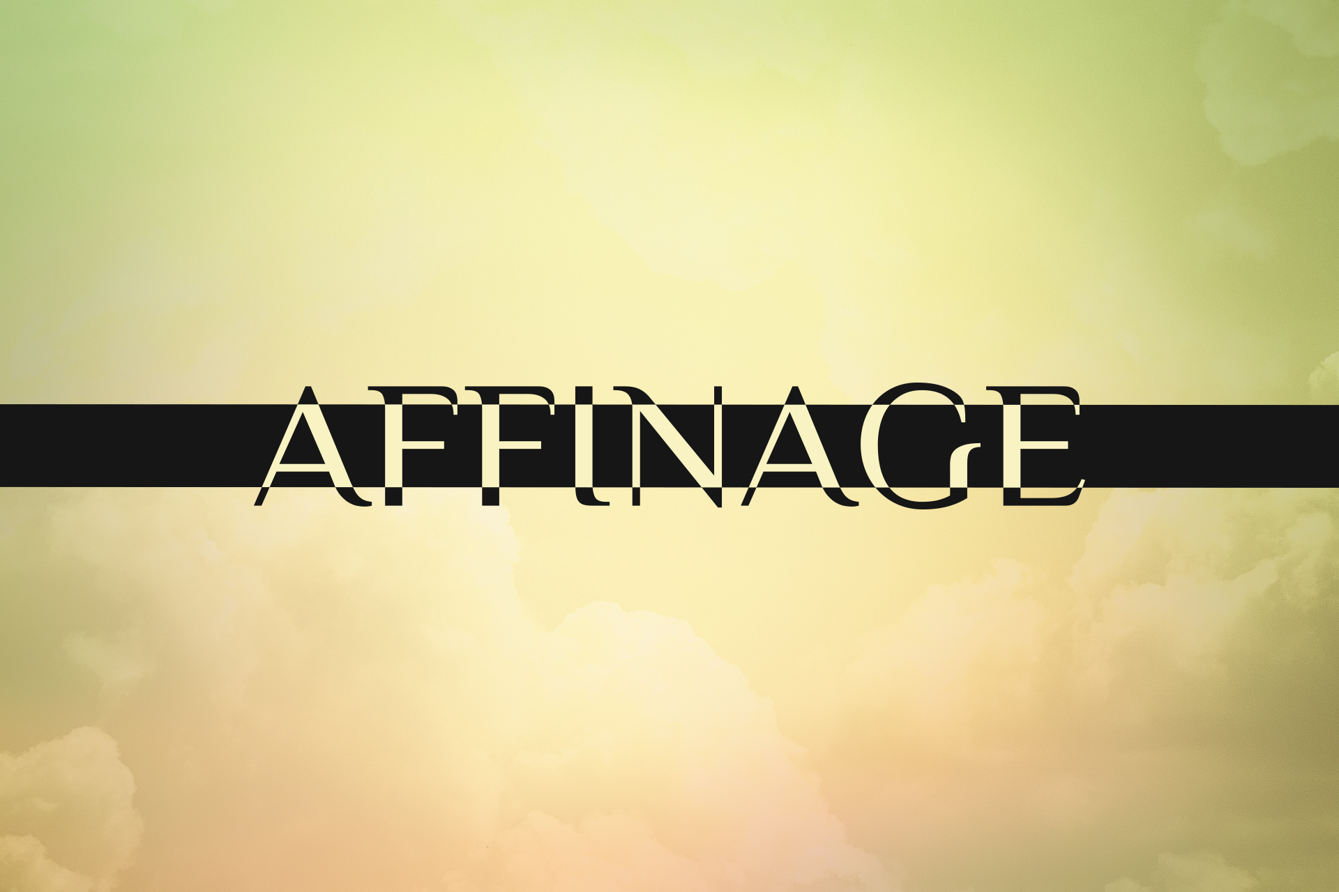
We couldn't settle on the element being an accompaniment/addition to the logo and decided that the diagonal line going to the top-right handle corner would be the perfect choice.
Why SVG? After examining features of this format and cross-browser compatibility, image scaling possibilities and w3c standards we made the choice it definitely should be SVG format.
The first release worked only in Chrome. It was terrific! I remember what the web technician said after finishing the project: "Yeah, baby, it is working!"
About animation. Our whole team was thinking in what order the slides should move. At that time we decided the line will turn around in the range of 90 degrees.
We will talk about that next.
Development
During the process of working we found some bugs. We didn't find unified rules of working with SVG. There were two errors:
- Animation worked in Internet Explorer incorrectly
- Masking wasn't represented in Firefox.
To all appearances Firefox's authors ignored w3c standards and made in their own. As a result, we had to write hard operated and long code were forced to use hacks being able to go by ourselves.
There was one feature the main image SVG with the line and logo was of 50×50 pixel real size. Scaling fixed all the rest.
The yellow colored background was better, because it matched general ideas of website: sharpness, hardiness, and aggressiveness.
Designing website pages we composed some sketch's themes, black diagonal line and some occasional things. As you see, nothing creative.
Main idea was realized we liked the effect we got joining together parallax and mask and animation of slides.
Future
About further site developing. We need to correct current bugs and optimize website functionality to let it work on less powerful devices. We also should fill the site with information to show people we have a lot of experience.

Some pages we are going to put:
- Facts and details about a company, its positioning, to let people know what we are doing and which spheres we are experts.
- Information about our team and vacancies
- Cases described in details
- A page of our achievements
- A page with pictures from Instagram :)
We will focus on making unusual animation presenting cases sure, we learnt SVG technology well.
Technical components
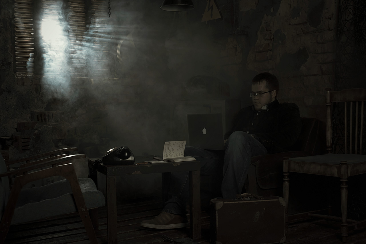
Server-side is made with the latest release of ASP.net MVC. JS-framework MooTools. I wouldn't like to argue why we don't use jQuery, I just speak my opinion. Working in Mootools we can use object-oriented programming. In addition to that wide variety of opportunities makes a framework multifunctional and indispensable tool to use for creating any kind of websites. Why did we decide to use Mootools to work on animation? CSS3 animation sometimes processes SVG incorrectly and has a limited variety of functions.
Mootools made operating animations easier and solved many other problems. Take easing functions for example (http://easings.net/). I think, movements of diagonal line, when you go from slide to slide, is amazing. JS had a key role in it. It's all thanks to the team of Mootools.
By the way, we are the first in Russia who really use SVG animation at the highest level.
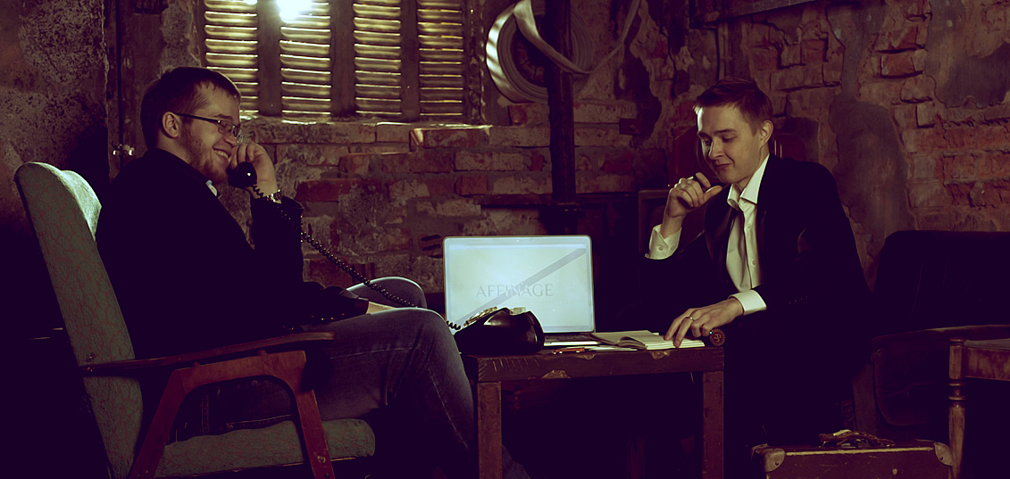
Our team would like to say "thank you" to Cssfox. Thanks to you we realize that managed to create unique market product.
Thank you!
Comments 3
Kiril
It was very exciting going through your creation of your website. I know how important each tiny detail feels in the beginning. I think, You succeeded to create something, which can be considered not only as a good website but also as art.


Maxim Aginsky
accidental ꩜ initiates ꩜ serendipitous
Maxim Aginsky
Thanks for such a comprehensive tale. Impressive work, inspires. Explorer and Firefox -uff... Good job!
Sharon
Awesome! Love the studio pictures. Looks/feels really creative.
