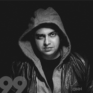
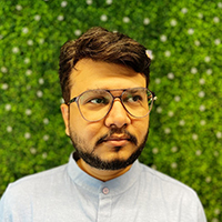
The journey goes back to my childhood. I was fond of drawing in those days. Pencil and colors were my best buddies. Over the years, I realized that I could turn my hobby into profession. This realization inspired me complete Advanced Dual Diploma in Multimedia at the age of 15 only. To increase my knowledge and experience with colors, for a while I also worked in a matching center where colors were the prime focus of female clients! My being of a designer was a pure result of passion turning into profession.
Designing is his Hobby, Passion and last but not the least the only Profession and Thinking + Creativity + Imaginations + Color combination sense are the most important grounds on which a designer has to be qualified in.
I'm a highly creative, award-winning and talented UI/UX, Web, Brand, Graphic Designer with 18+ years of professional experience.
After 14 years of fruitful relationship with the Europe & US based Web Development Companies, I decided to hope into my own creation my own company, a digital agency TRIONN DESIGN (trionndesign.com) was thus founded in August, 2012. India's Max. award-winning digital agencies where art enthusiasts and tech freaks connect over innovative ideas. Now have 18+ Years of professional experience in age of 35 and gained knowledge by devoting precious time in experimental learning. According to Me, size of the working place is not the concerned matter but Size of the exposure was his key concern.
Lately, when I commenced this company there was only a staff of 2. Today I feeling proud in saying that they have grown to staff of 16 and have successfully completed 150+ projects of countries like Europe, UK, USA, UAE, Australia, Sweden, France, Greece, Germany, Canada, Ukraine, Netherlands, Romania, Russia, Thailand, Spain, Norway, Italy, Brazil, and Singapore.


