Swiss Eve
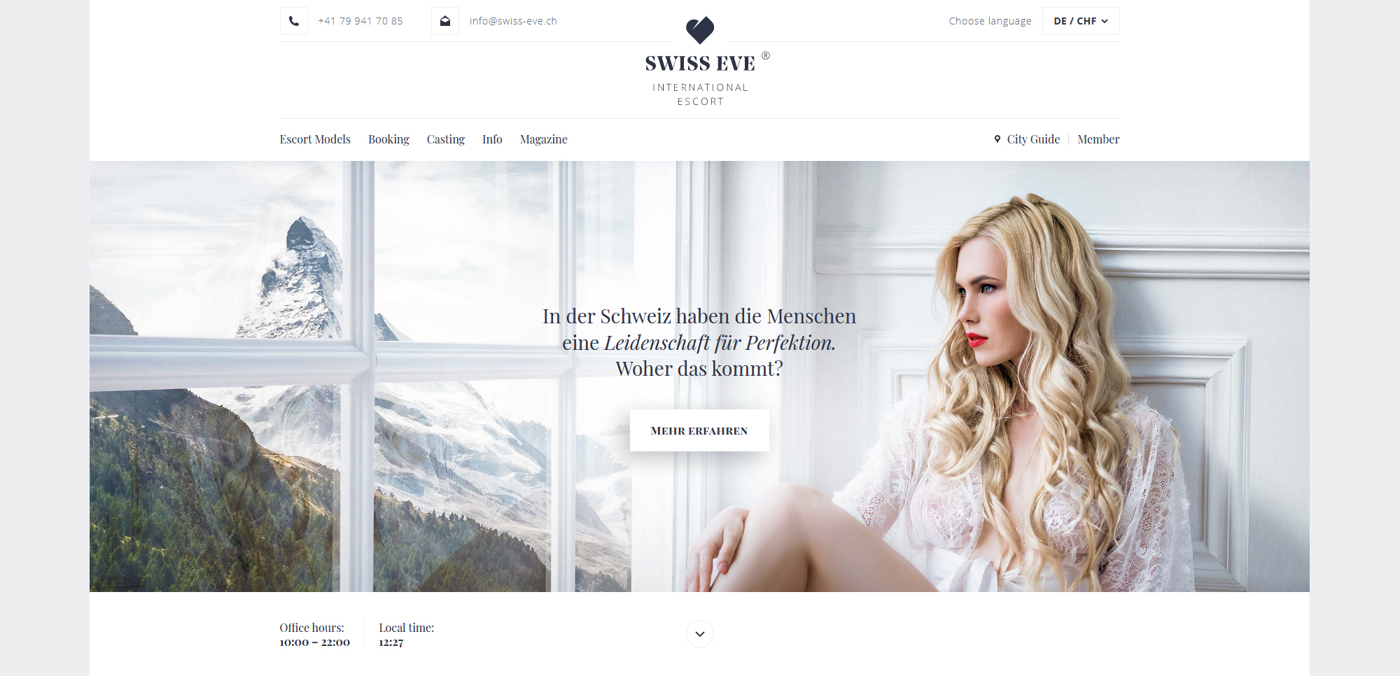
The Swiss Eve Design was created in purpose of transporting the (high class) brand image on one hand and to offer a clear overview and efficient userflow on the other hand. In other words, we wanted to provide the user with a user-friendly, yet aesthetically pleasing tool that supports the brand's identity. So we created a very bright overall picture by using large white and grey ares in contrast to the highlighting brand color, separated by fine lines and a strict grid, paired with classic typography and an onpoint presenatiton of the selected photos and artworks. Light movements and content animations, overlays and other content-structuring elements, provide a pleasant and easy feeling during interactions.
