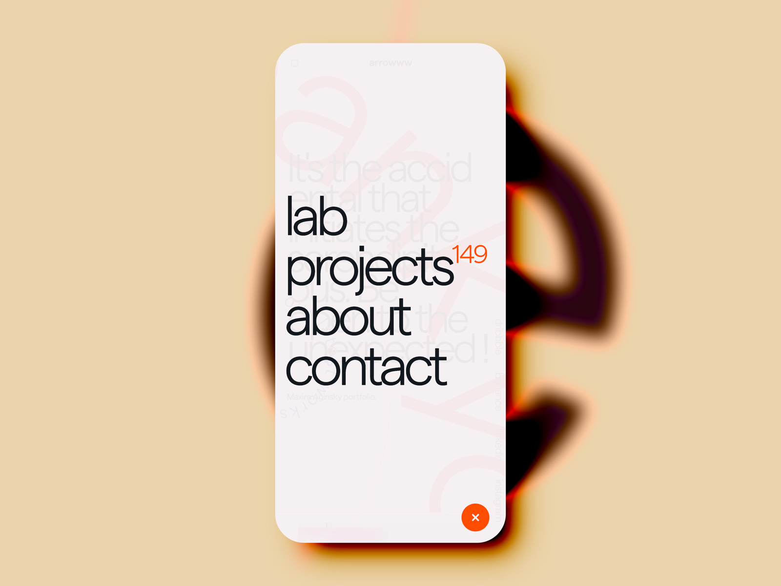
Mobile menu
Maxim Aginsky for arrowww v16November 28, 2020
All the UI texts are following the same patterns - first letter lowercase.
A slightly transparent background intended to give a clue about where the user is coming from - give a context.
