"The ArcShapeR" second review

I'm a French UX Designer and Art Director, originating from Poland and currently living in Canada. I see every project I am involved in as an opportunity to go further, providing my clients and employers with quality materials and a great working relationship.
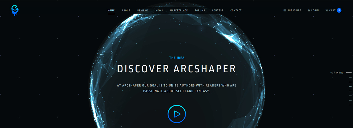
I think you guys obviously did a pretty good job in attracting the user's interest right from the home page. I like the graphics and animations and obviously they give a wow effect.
My comments will be mainly UI related, and I think that some aspects of the visual design are to be polished:
- I think the font is great, but you should have one for the headings, and another one for the paragraphs. Another possibility would be to give a lighter font-weight for the <p>. Now, the overall lacks in contrast. I feel like the text alignment could be also improved in some sections. I would also slightly decrease the line-height for the paragraph texts.
- Maybe the linear gradient in some UI elements are intentional, perhaps to give a retro sci-fi look and feel...? Looks very late 90's/early 00's to me :P
- You should definitely take advantage of the full-width, especially in the About and News pages. You would be able to let more space out things and let the graphic elements be bigger
- I quickly revamped the navigation, by adjusting the spaces between the elements and center the main part. Those are small details but they make it cleaner ;)
- Still concerning the navigation, I think that the "marketplace" label is weird (what about "store"), and it should be detached from the other navigation element (maybe closer to the cart?)- The mobile version would need more work in the scalling of the elements (mainly the fonts). The down arrow in your context seems useless to me if.
Playing with your CSS / HTML, I found that the structure could be much more light (for instance, there are classes that are injected in the element but don't do much).
To conclude, you have a good site who will be even better with numerous light adjustments. Good job and keep up the good work ;)
Comments 1
Thank you very much for review :).
Yes, gradients are intentional, the idea was to get old arcade feeling, after all it's made for sci-fi and fantasy lovers :). Marketplace is because other users will sell their books there, so it's a multi-user store... Regarding all other comments we appreciate it. Will take a look at what you mentioned for sure!