Tint image in HTML using Image Opacity & Solid Background Color. Formula

Some time ago I decided to update one of my old (2013) posts - Three ways to tint image with CSS, which is quite well appearing on Google search.
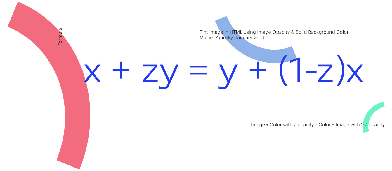
While working on the update I have found an interesting rule, which I have translated into formula.
To tint image with CSS, usually we will apply a semitransparent layer on top of it using box-shadow, multiple backgrounds or pseudo elements CSS techniques.
Now! If we will do opposite - first solid background color and then, on top of it semitransparent image, the result going to be the same.
The rule
Image + Color with 0.4 opacity = Color + Image with 0.6 opacity
The formula
x + zy = y + (1 - z)x
CSS, HTML code example
Tint image using Image Opacity
HTML
<div class="wrap">
<img src="image.png">
</div>
CSS
.wrap {
 position: relative;
 display: inline-block;
 background: rgb(204, 0, 255);
}
.wrap img {
 display: block;
 width: 100%;
 opacity: 0.6;
}

Thank you for your interest.