Three ways to tint image with CSS3: box-shadow, multiple backgrounds and pseudo elements.


Maxim Aginsky
accidental ꩜ initiates ꩜ serendipitous
Maxim Aginsky
Updated on December 2018. Surprise included.
There are two use cases Background-image in CSS or inline style and Img tag directly in HTML. Please note, for the second case (Img tag directly in HTML) the image have to be inside container.
Background-image in CSS
Tint image using Box-shadow property
The trick here is to make sure the shadow height is equal or bigger than the image height.
In the example below the height of the image is 528px, but I have used 3000px for the v-offset box-shadow value. Just in case :)
HTML
<div class="canvas"></div>
CSS
.canvas {
 width: 100%;
 height: -webkit-fill-available;
 min-height: 100%;
 background-image: url(image.png);
 background-size: cover;
 background-position-x: center;
 box-shadow: 0 3000px rgba(204, 0, 255, 0.4) inset;
}
Example with purple shadow, opacity 0.4

Tint image using Multiple Backgrounds
The trick here is to use same color value for the linear-gradient, value of the Background property.
This is of course if we want to use same color for the image cover. Gradient can be used instead.
HTML
<div class="canvas"></div>
CSS
.canvas {
 width: 100%;
 height: -webkit-fill-available;
 min-height: 100%;
 background: linear-gradient(rgba(204, 0, 255, 0.5), rgba(204, 0, 255, 0.5)), url(image.png);
 background-size: cover;
 background-position-x: center;
}
Example with linear-gradient, same purple value, opacity 0.5

Example with linear-gradient, opacity 0.6

Tint image using :after Pseudo Element
The trick here is to use Pseudo Element's :after. That is it :)
HTML
<div class="canvas"></div>
CSS
.canvas {
 position: relative;
 width: 100%;
 height: -webkit-fill-available;
 min-height: 100%;
 background: url(image.png);
 background-size: cover;
 background-position-x: center;
}
.canvas:after {
 content: '';
 position: absolute;
 width: 100%;
 height: 100%;
 background: rgba(204, 0, 255, 0.7);
}
Example with purple :after, opacity 0.7

Img tag directly in HTML
What can be done if image in an HTML page? - We will need a container for this image.
Tint image using Box-shadow property
HTML
<div class="canvas">
 <img src="image.png">
</div>
CSS
.canvas {
 position: relative;
 display: inline-block;
}
.canvas img {
 width: 100%;
}
.canvas:before {
 content: '';
 position: absolute;
 width: 100%;
 height: 100%;
 box-shadow: 0 3000px rgba(204, 0, 255, 0.4) inset;
}
Example with purple shadow, opacity 0.4

Tint image using Background property
This example uses solid background color, but we could also use the linear-gradient (background value).
HTML
<div class="canvas">
 <img src="image.png">
</div>
CSS
.canvas {
 position: relative;
 display: inline-block;
}
.canvas img {
 width: 100%;
}
.canvas:before {
 content: '';
 position: absolute;
 width: 100%;
 height: 100%;
 background: rgba(204, 0, 255, 0.5);
}
Example with purple background, opacity 0.5

Surprise
Now, after we have covered all the options, it is a time for small surprise. Here is the thing.
Usually we have an image and on top of it we will apply the transparent color to tint it.
But if we will do opposite, the result going to be same solid background and transparent image on top of it.
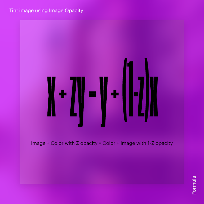
Image + Color with 0.4 opacity = Color + Image with 0.6 opacity
The formula:
x + zy = y + (1 - z)x

Tint image using Image Opacity
HTML
<div class="canvas">
 <img src="image.png">
</div>
CSS
.canvas {
 position: relative;
 display: inline-block;
 background: rgb(204, 0, 255);
}
.canvas img {
 display: block;
 width: 100%;
 opacity: 0.6;
}
Comparing solid background and image with 0.6 opacity
and
one of our previous results Img tag/Tint image using Box-shadow property with shadow opacity 0.4
As you can see the result is same.


Thank you for your interest.