"brandon". Etude

This concept was originally formulated February 2018.
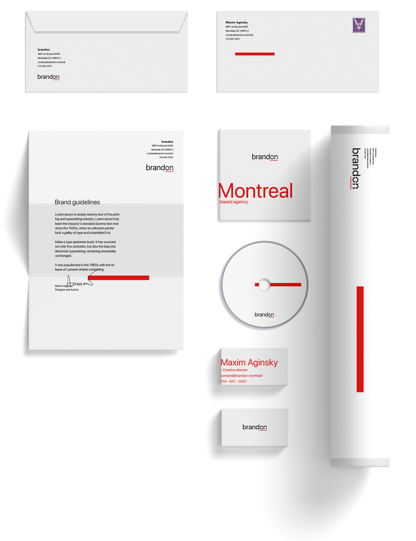
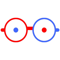
Applications
Application rule for the main graphic decoration object - the line. The line should be applied on the right side of the parent object, visual reference to the heart.
Website home page test
Logo inspiration - new Sid Lee branding, published recently. Usually this type of agencies dictates How To. That is safe! Hohoho...
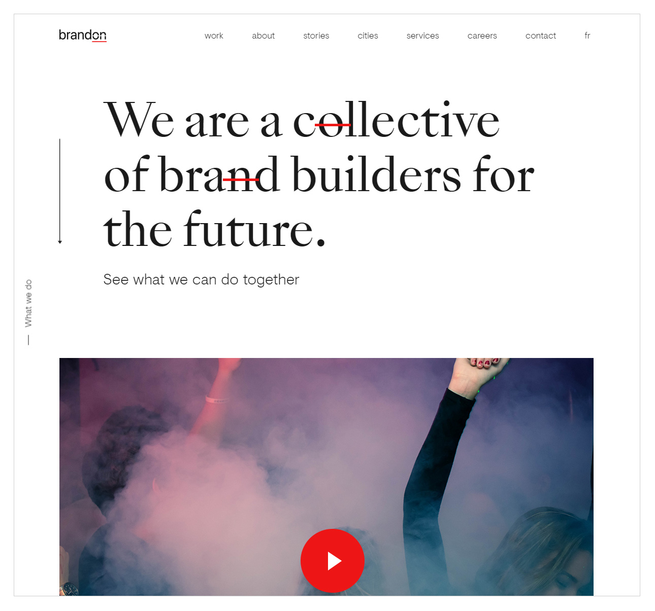
Sid Lee 2018, modified website homepage. October 20
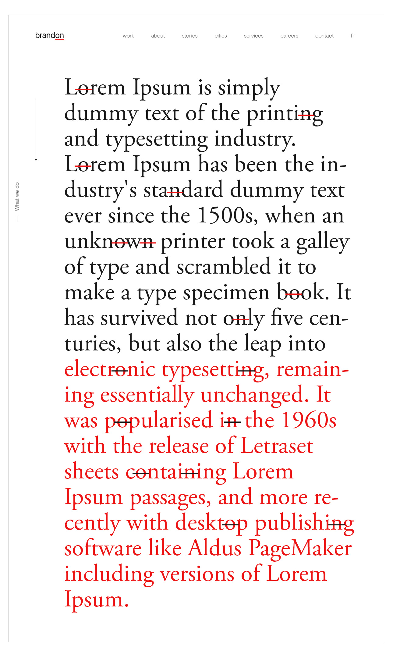
Display text decoration
A few rules:
1. Do not highlight two, stand beside each other letters.
2. Keep distance between the sets vertically.
Brand,
How does it feel on?
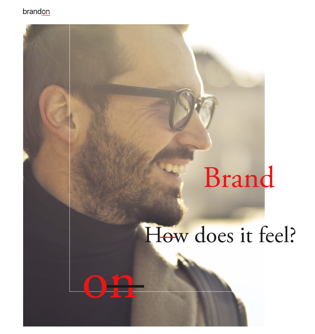
But positive
Text and shape. Word and symbol. Black and red.
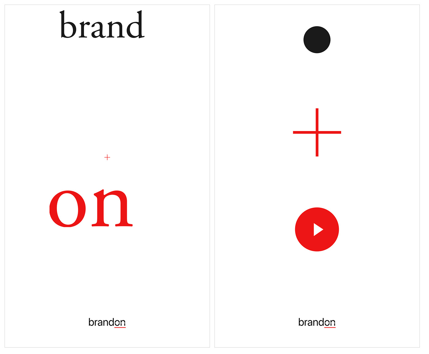
Left & Right
Realistic comparison or fact
brand and Trump.
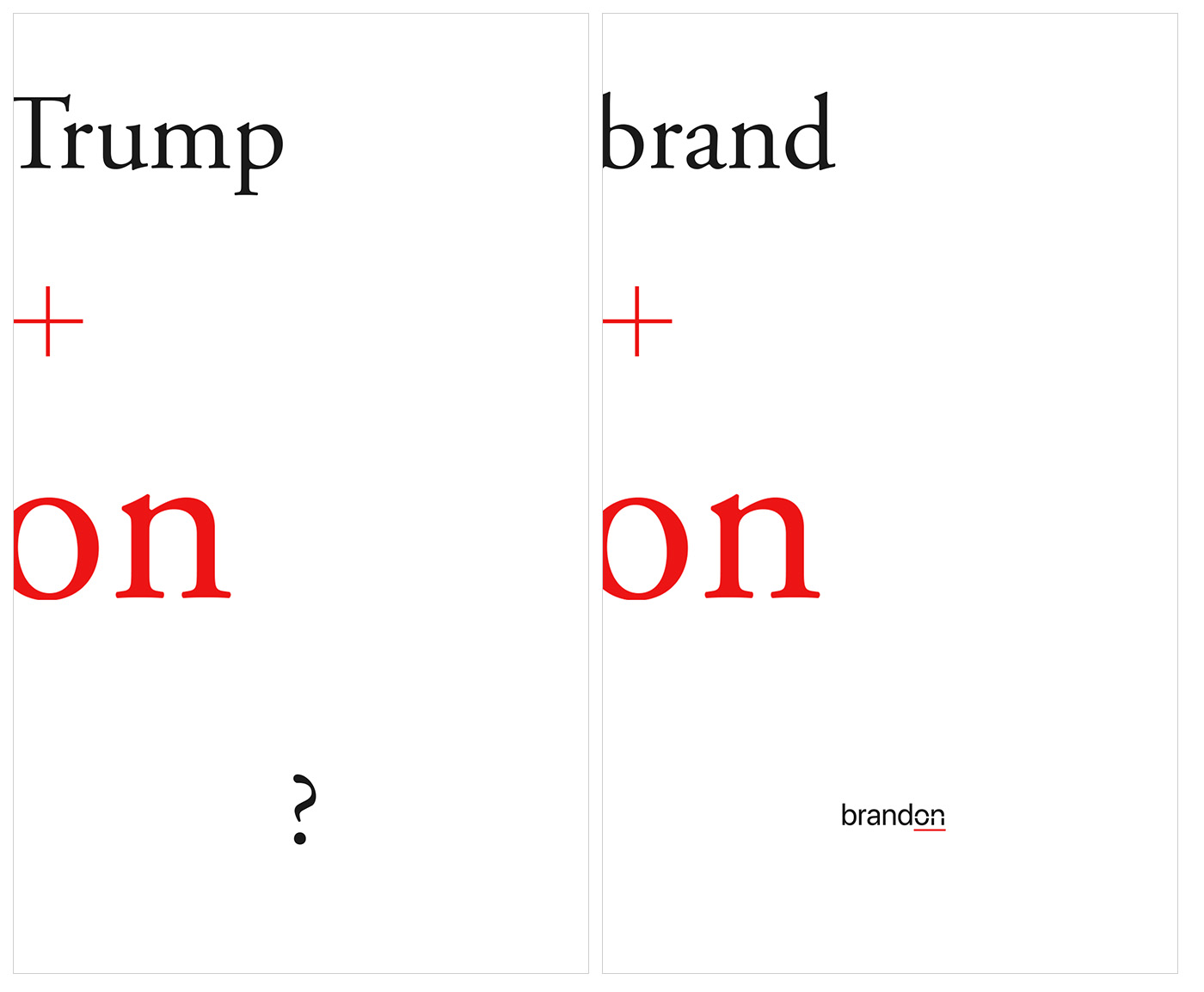
Donald & brandon
English lesson
Realistic (preposition) and abstract usage of the "on".
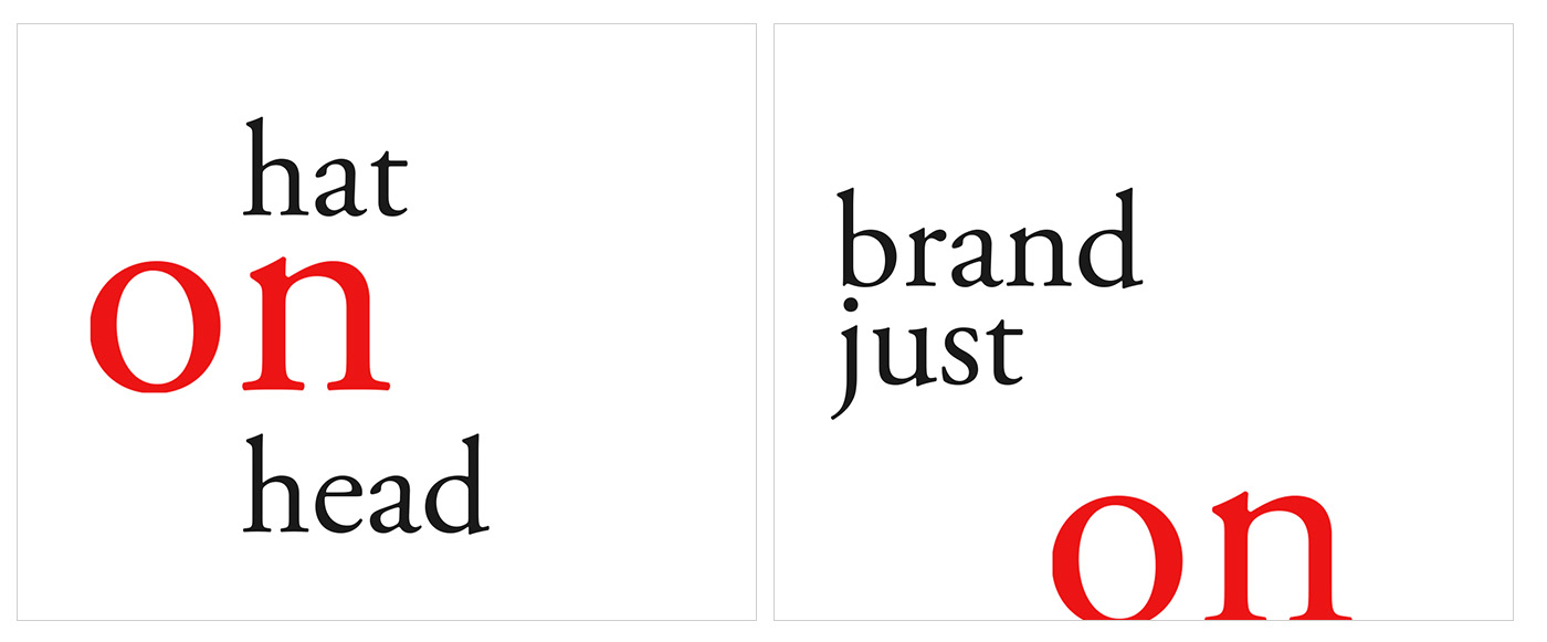
on 3:46 AM. on Time to sleep. on On
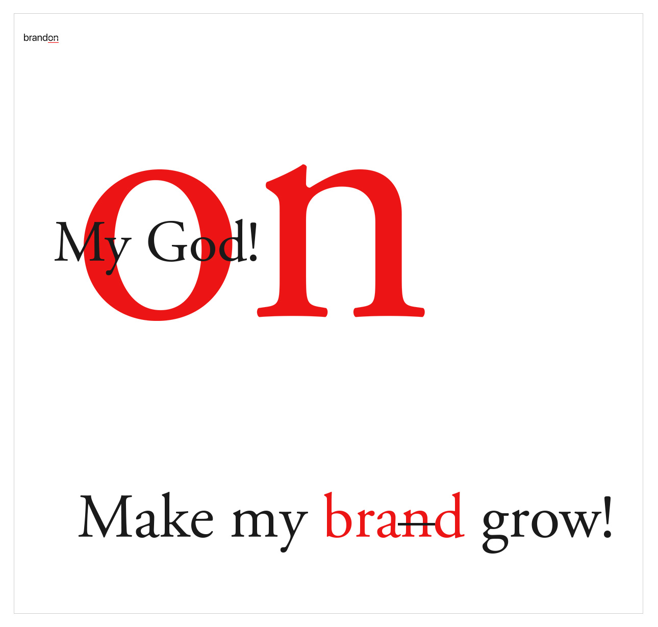
Morning mantra
on My God!
Make my brand grow!
Make my brand grow!
Ok, yesterday and today (11AM) are linked now (my yesterday's comment and this mantra). It is safe now to jump ON something different. on On
Comments 4
or like this:
on My God!
Make my brand growing!
on My God!
It's growing!
Yep, probably "most" laconic distance between the concept and reality.
One of the application rules is that the main graphic decoration object - the line (when alone), appears on the right side of the parent object, visual reference to the button in the ON state, heart...
Thanks!
I'm a Tech Lead with over 8 years of experience. Music addict. Fond of different crazy stuff, like iframes on iOS (sarcasm). Author of the slash conspiracy theory. You never know when one slash will ruin your whole routing.
Still reading this? Great, so, uhm, don't take a word above seriously. Except the first senten...
Laconic and witty company name, just as it's visual presentation. BTW, red line on the CD disk looks like ON button =)