Almost there
We're foxing your request.
Stay cool!
Something went wrong.
Please try again or contact us for support.
The first look of the new version was quite different from what you will see as a final version nine.
When I made the decision to upgrade, I already had in mind some of the elements to include or modify in the new design. When I am ready to create a new design for my portfolio I have a very strong feeling of creativity that lets me know I am ready for the changes. So I started to experiment with animations, layout, new logo concepts, typeface and more.
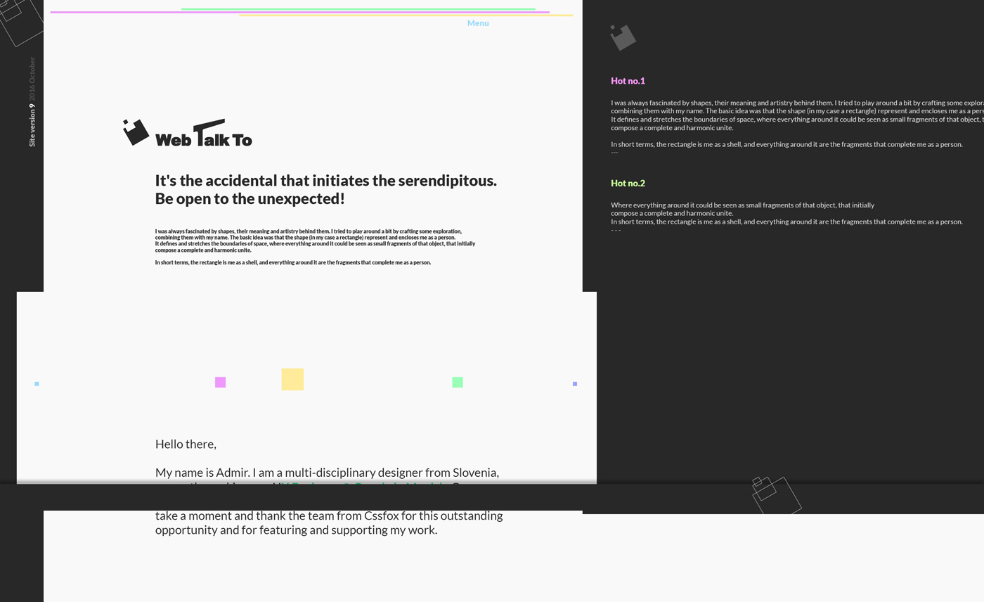
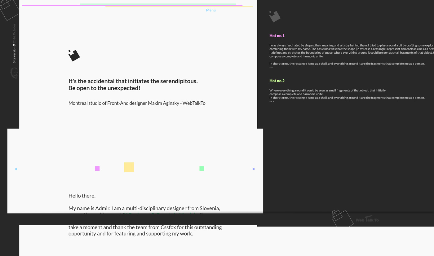
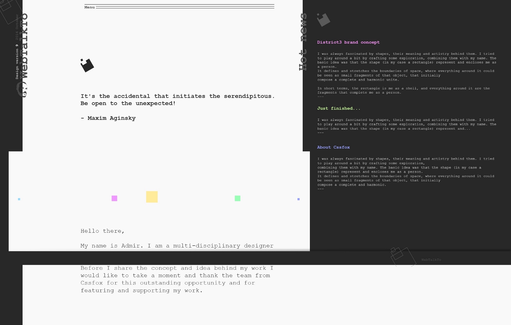
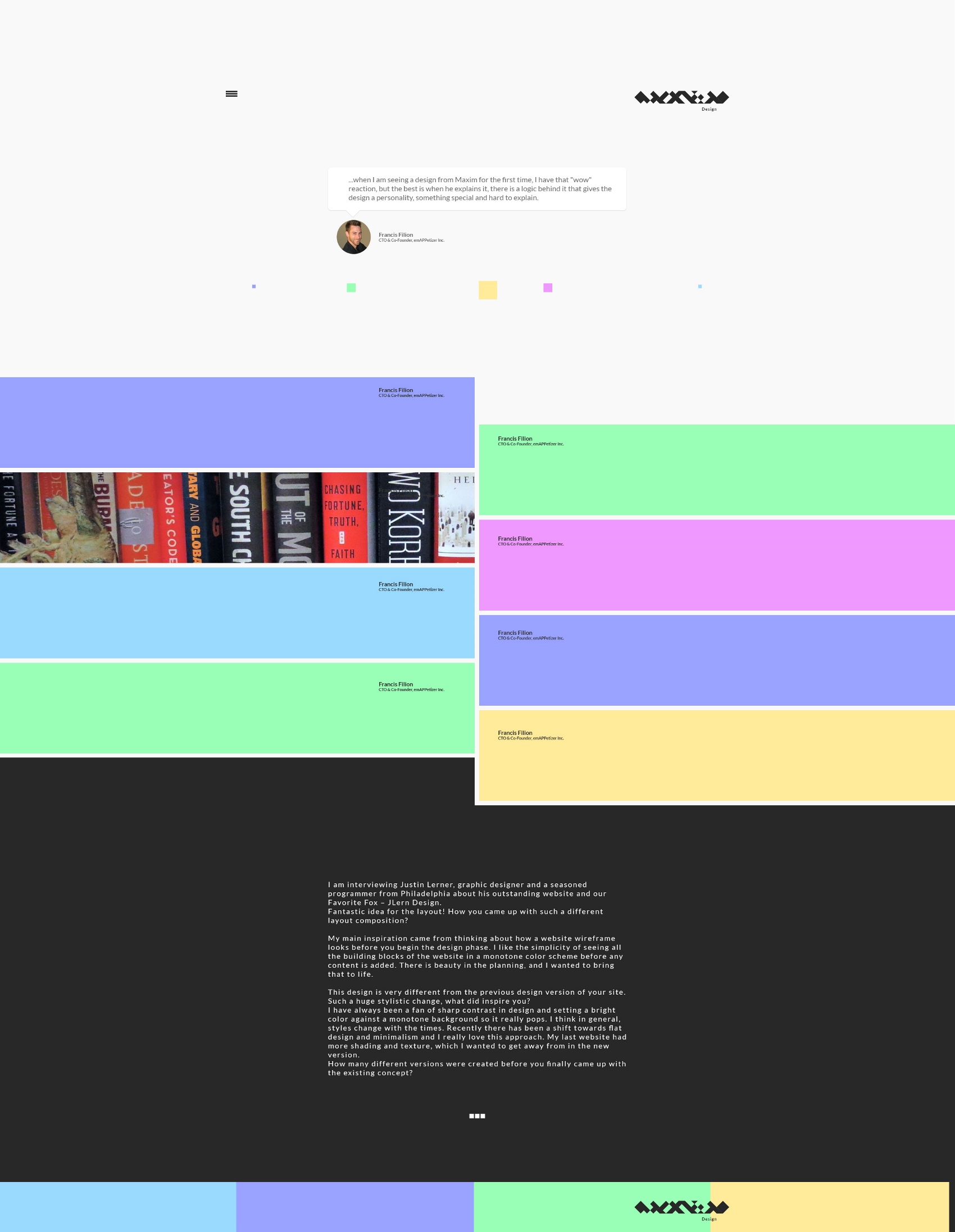
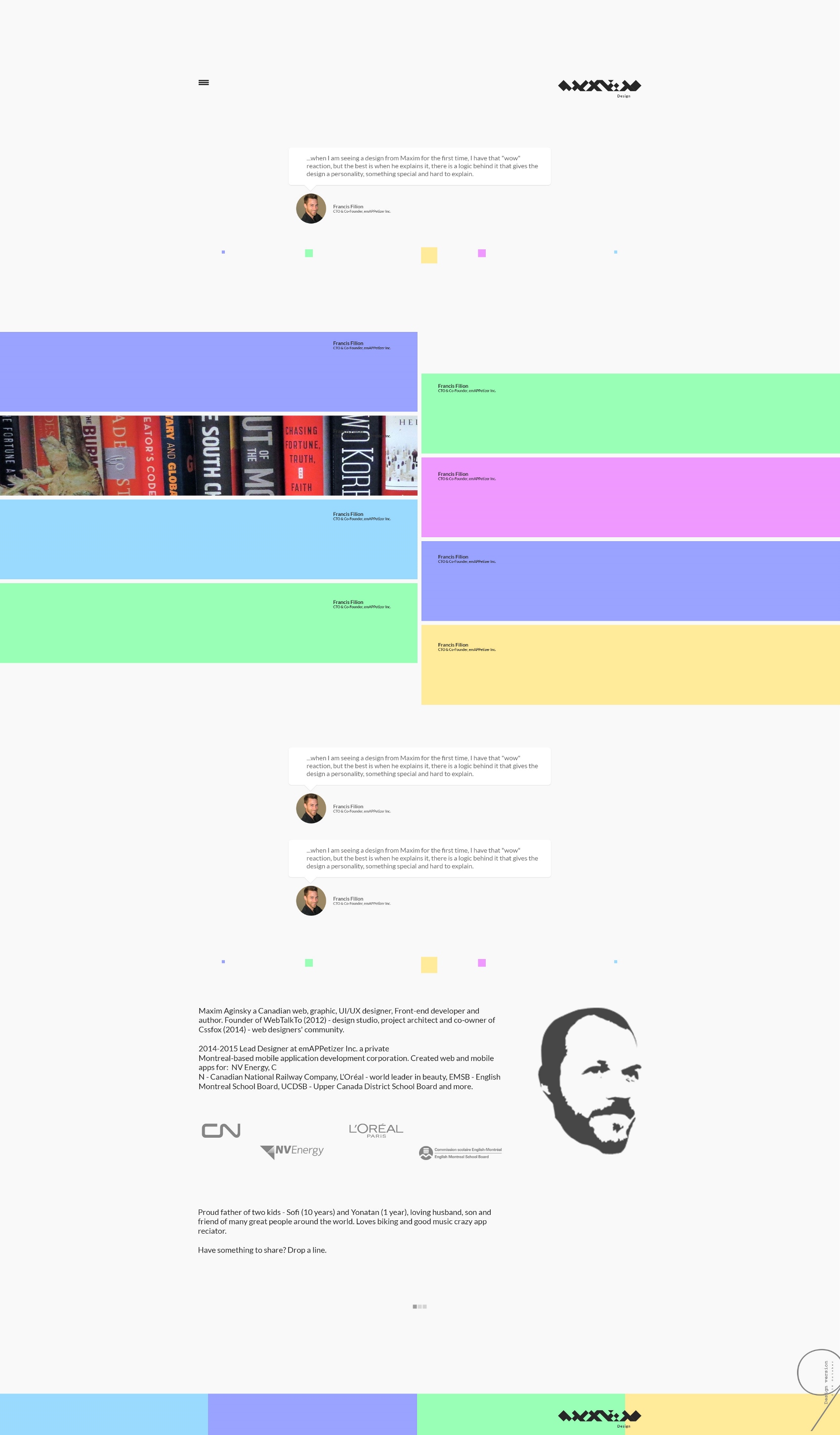
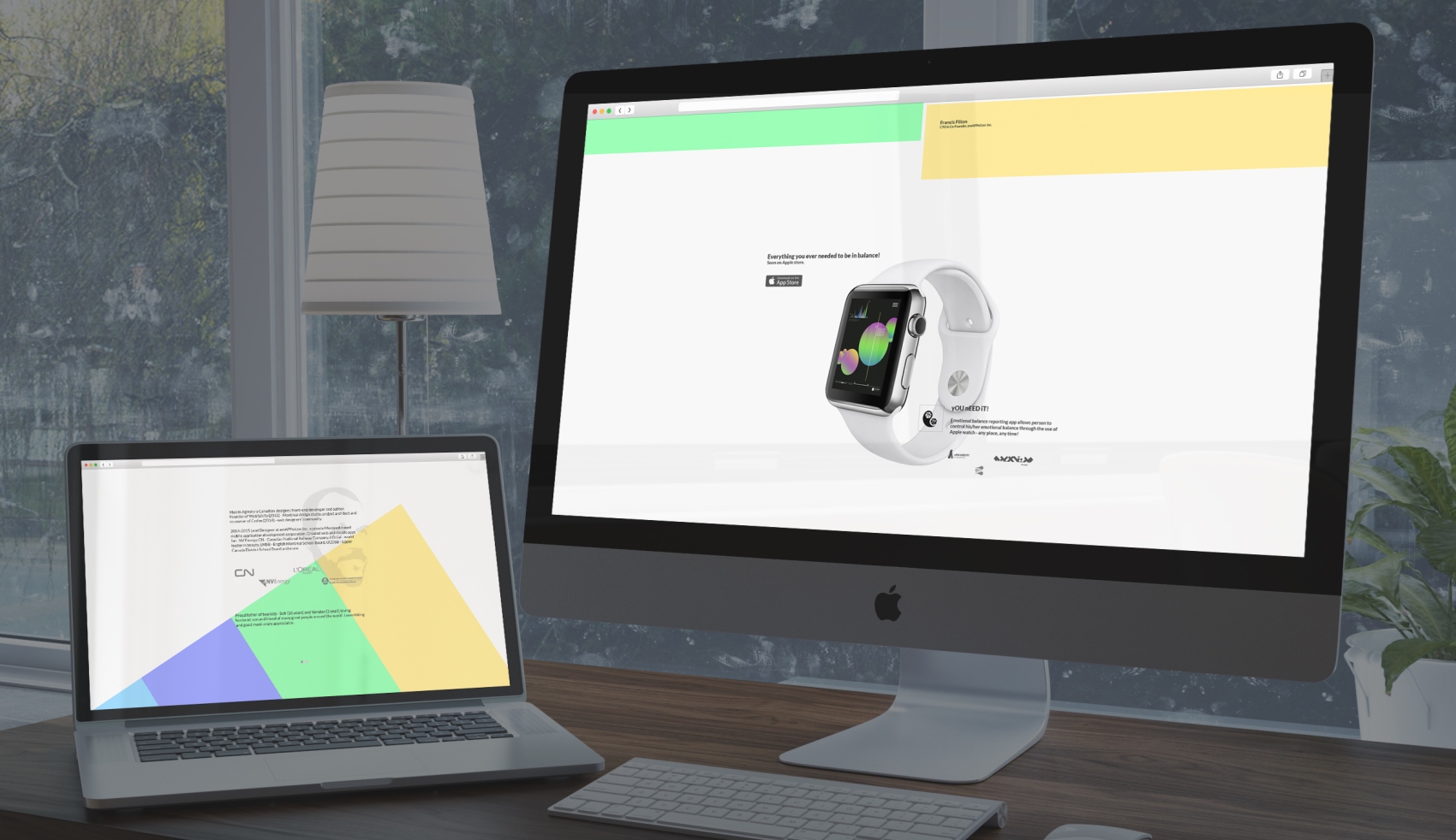
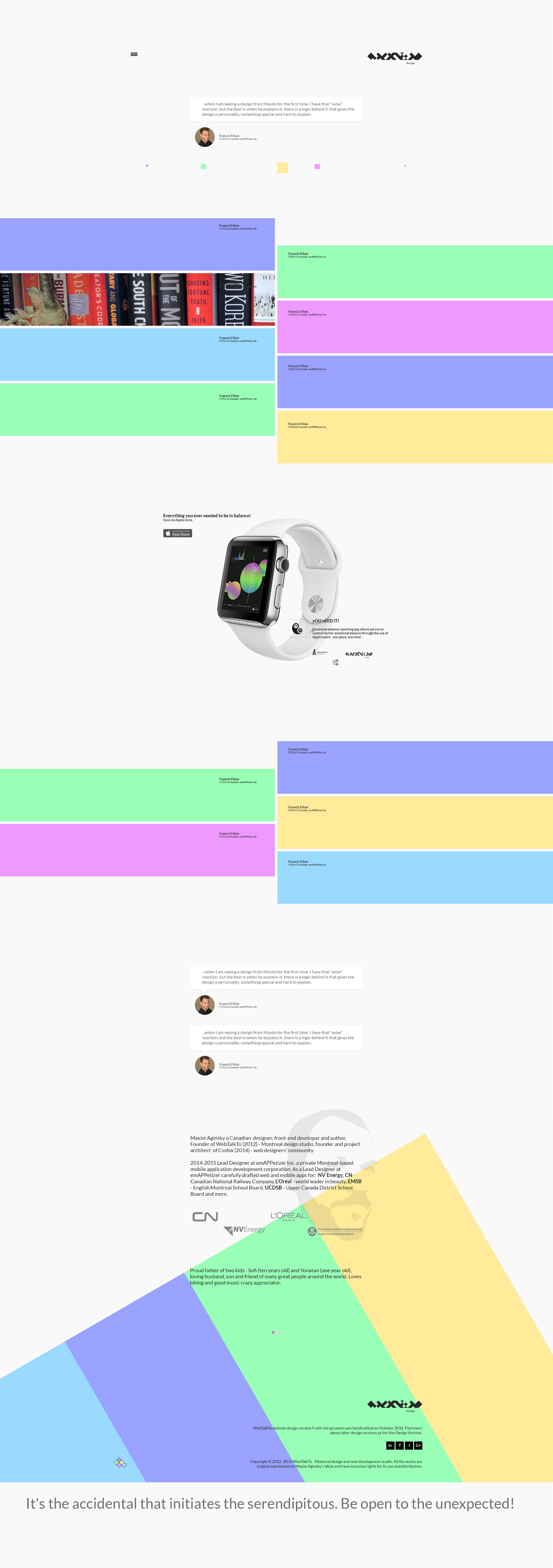
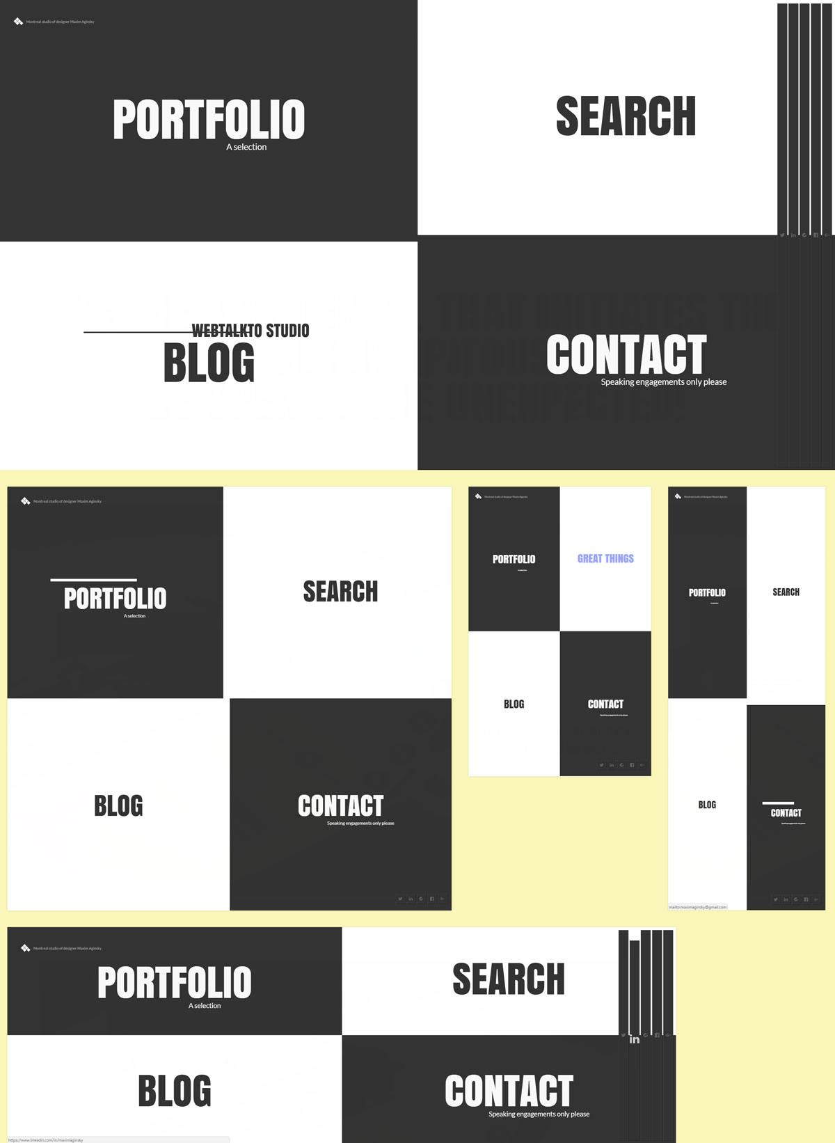
The first part of this post is all about tests and experiments preparation for the new version. The final output of these tests and experiments, the contents logo, typeface, colors, how to present the works on the portfolio page looked like this:
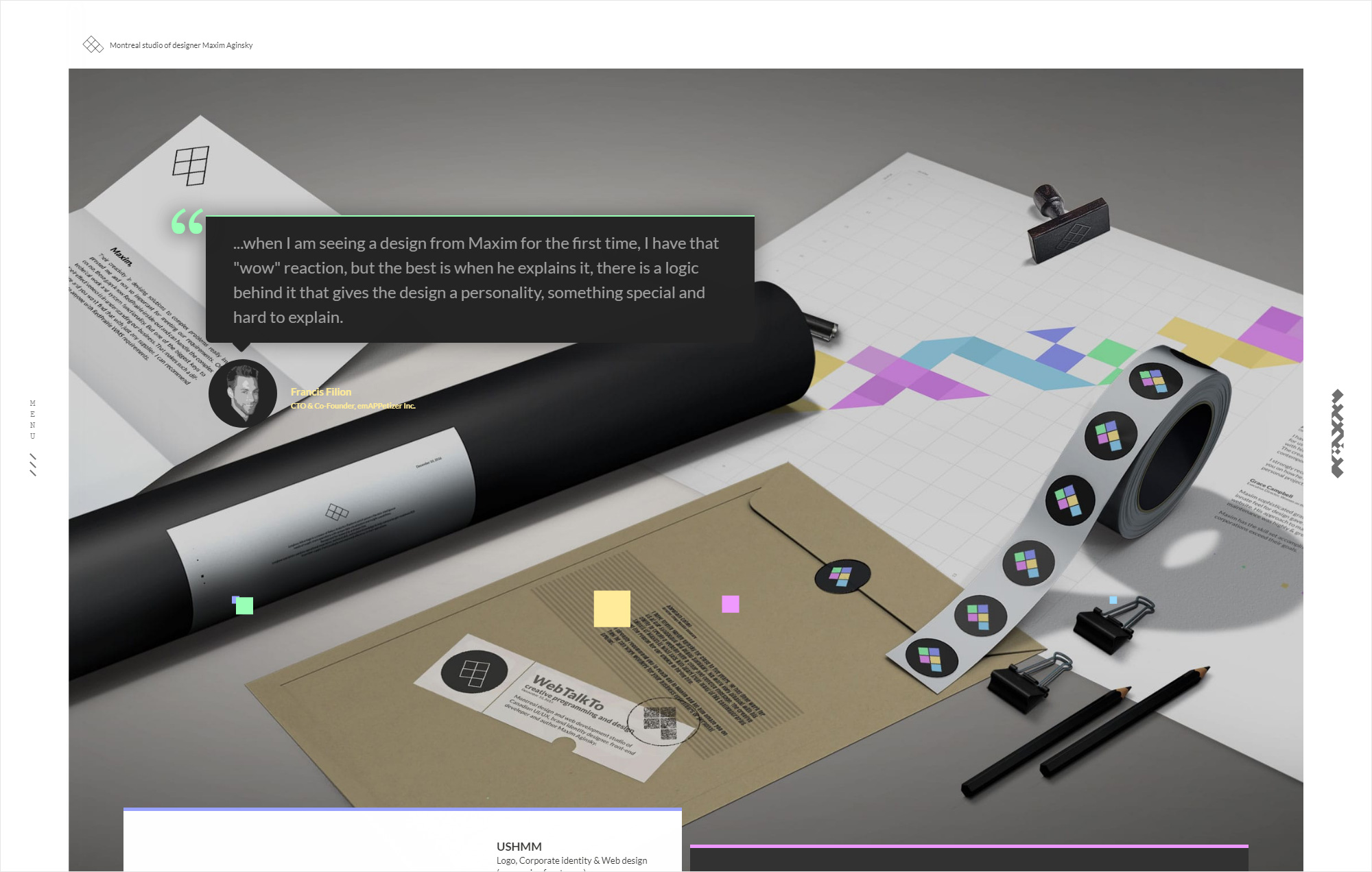
At the same time, I have created an html version (see it here) of this design in progress to test animations and parallax effects I planned to use on the portfolio page, as well as other design aspects.
It is hard to say why I changed my mind and decided not to continue with this concept, but I am guessing that I felt like trying something more elegant and classic that will sell better :) I was in the middle of searching for a new employer.
Ah I remember now: the main problem was actually the way I planned to show my works sticking to the left block of solid color creates the effect of continuity from the top to the bottom of the page.
Yep! So I put aside these design ideas and started from scratch or it would probably be more correct to say I am continuing from where I stopped.
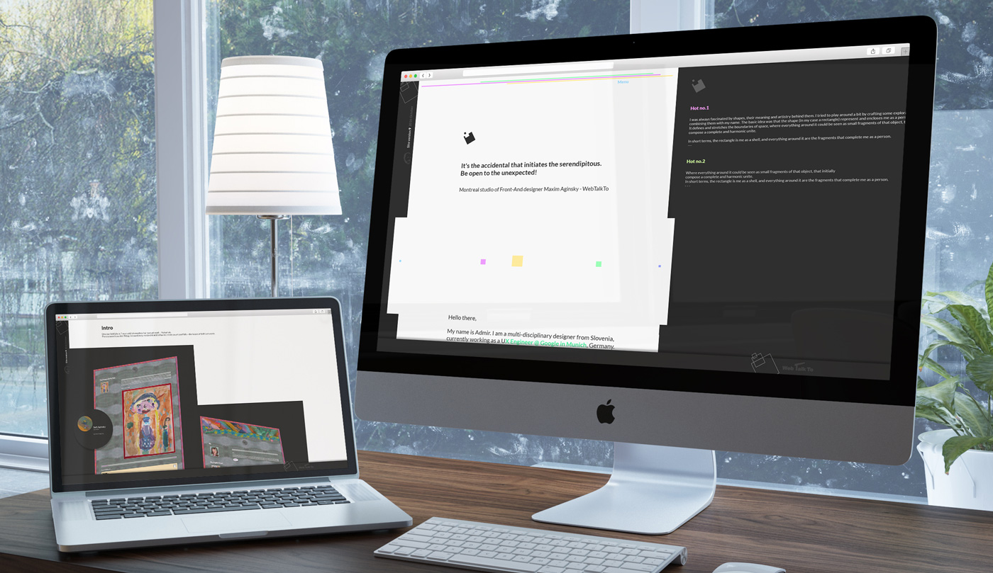
Here are some images that I have saved for myself ( and you) that should show/map the steps my mind went through.
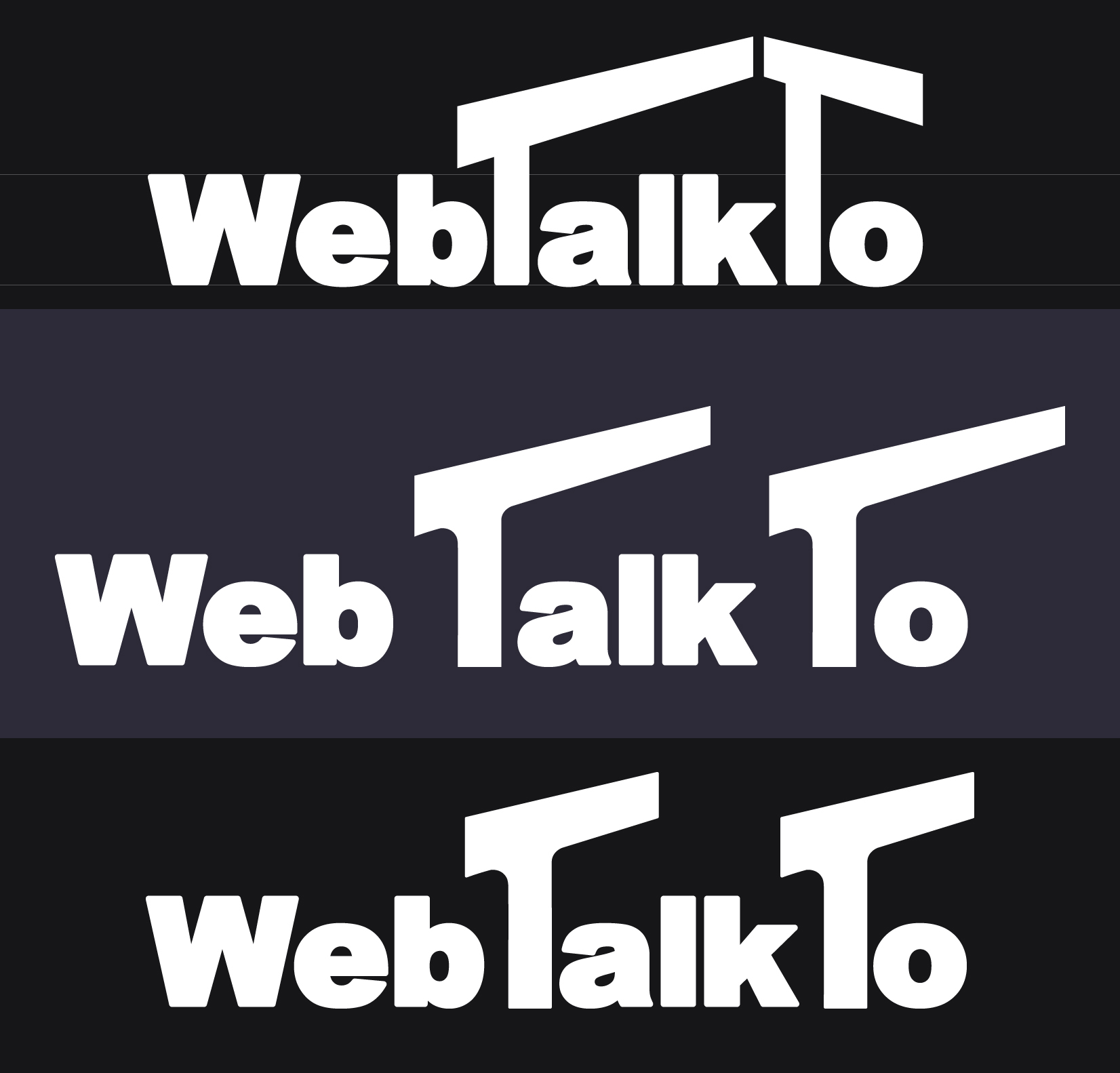
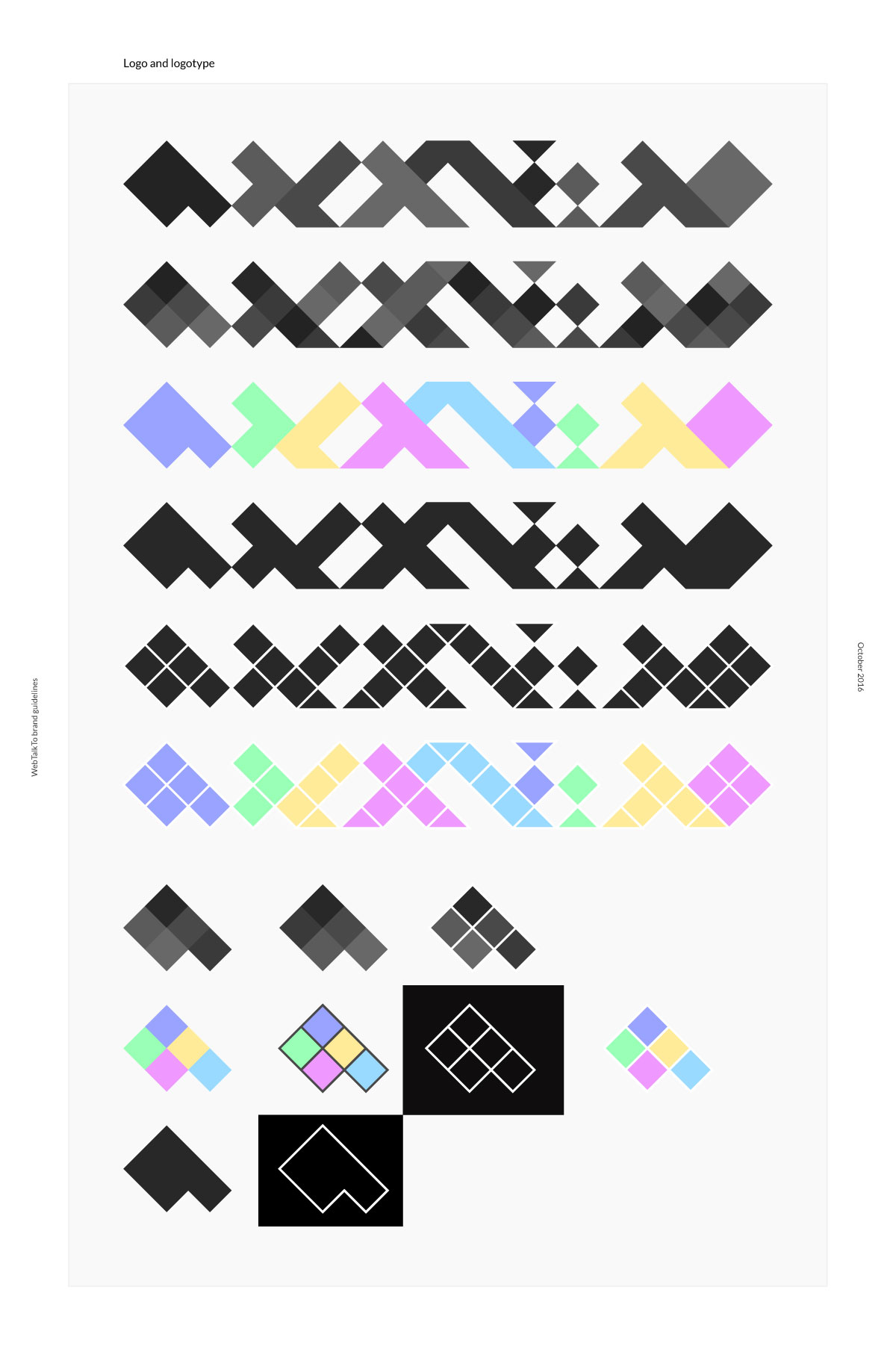
Logo tests
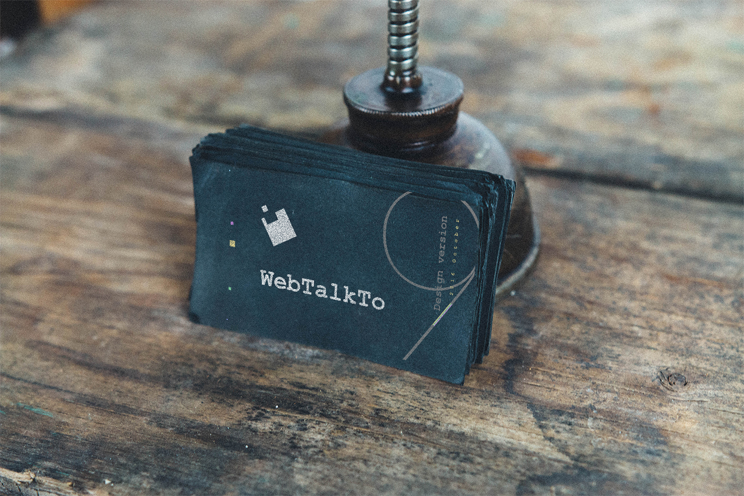
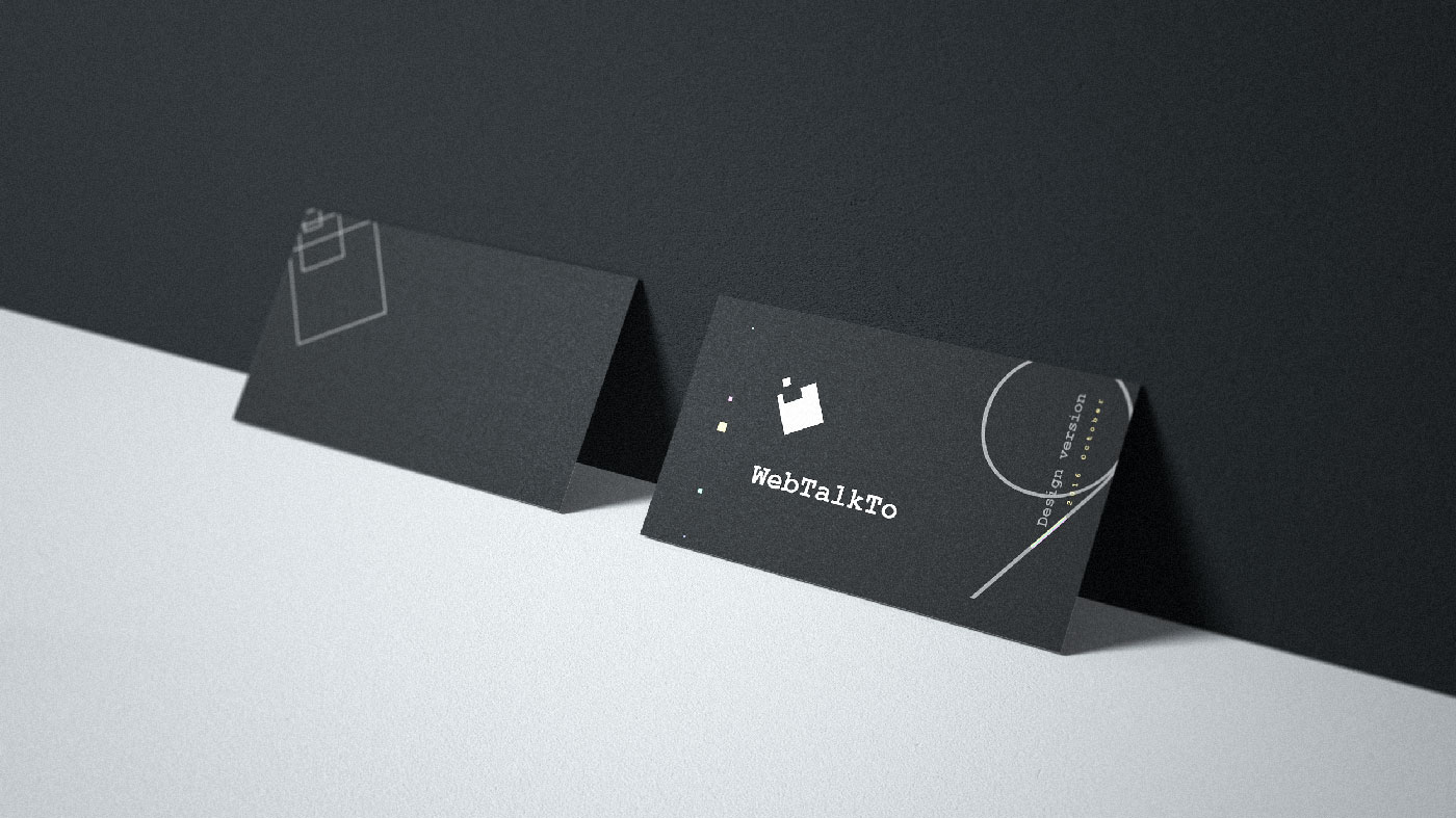
Business card
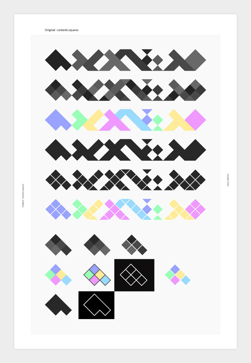
The golden center of the overall composition is going to be the new logos. Nothing really to say :) simply watch what happens.
Logo test
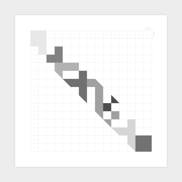
Logo guidelines
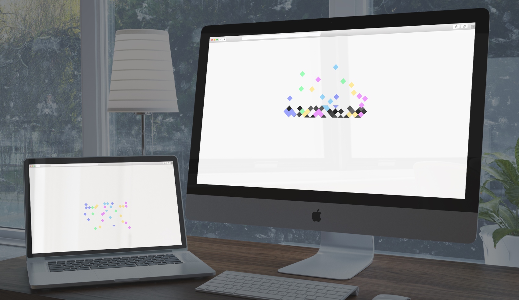
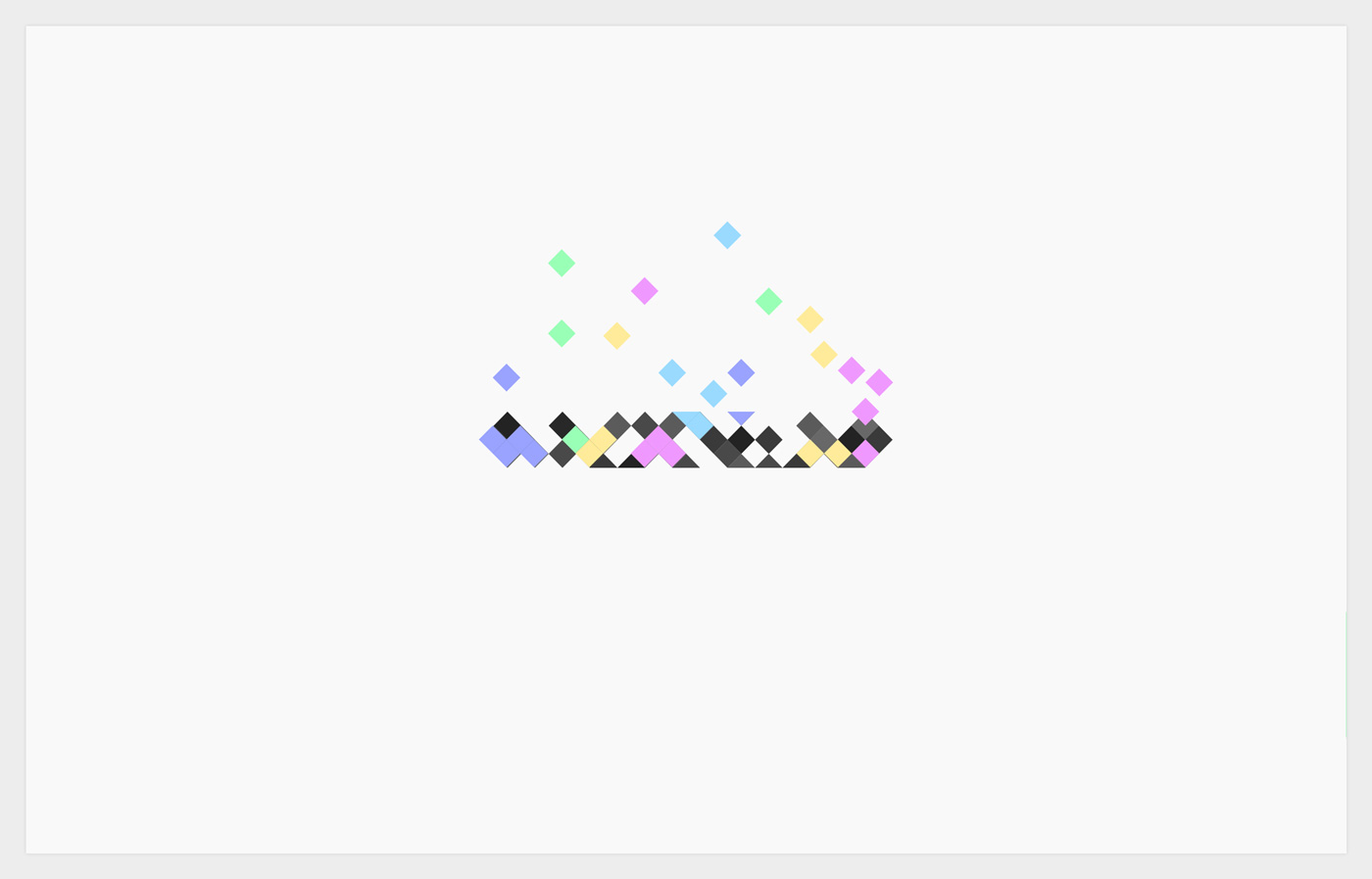
Intro animation
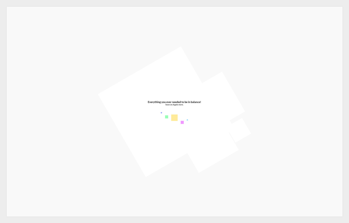
Loading screen
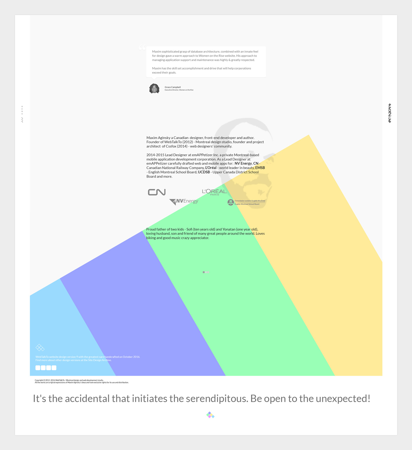
Footer
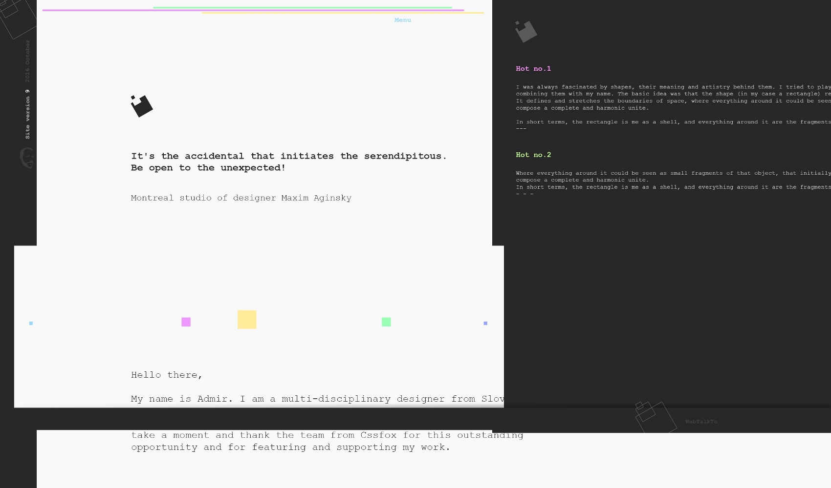
Font type for the Blog template titles test. I love the "Druk Condensed"!
Of the families in the Druk collection, Druk Condensed is the most explicit homage to Willi Fleckhaus. Drawn for the 2011 Year in Review issue of Bloomberg Businessweek, Druk Condensed features three widths in the same Super weight. The Condensed and X Condensed are very graphic, and the XX Condensed can appear almost abstract. Designer Berton Hasebe introduced a purposeful and subtle change to the texture of the typeface by preventing terminals and crossbars from lining up too often on the horizontal axis. This keeps an emphasis on the verticality of the letterforms and prevents words and headlines from becoming monotonous.
Footer
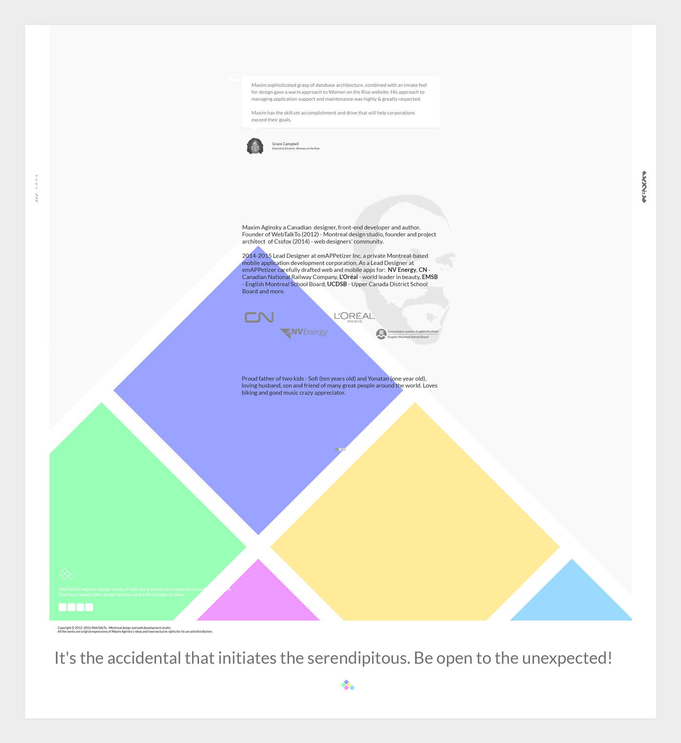
Perfect map of the creative process! Isn't it?
Originally was published on WebTalkTo on December 2016. All design versions of the site are here. Also "WebTalkTo v9 tests with Druk Condensed".
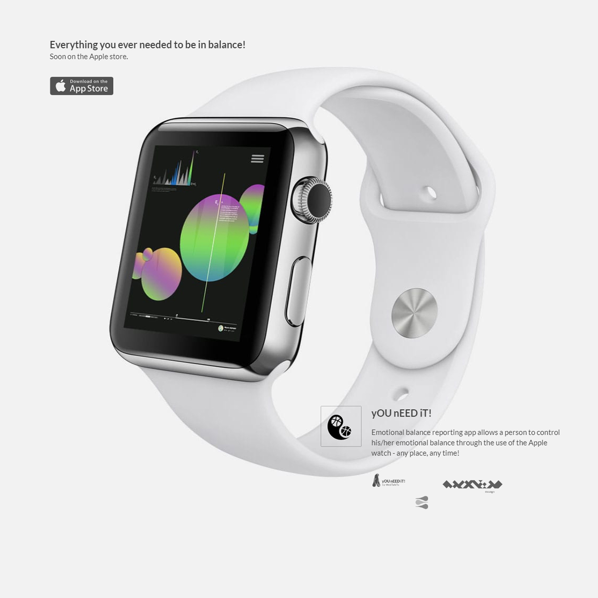
Logo, Corporate identity & Web design for United States Holocaust Memorial Museum - A living memorial to the Holocaust
Examples of the menu responsiveness to the different screen sizes.
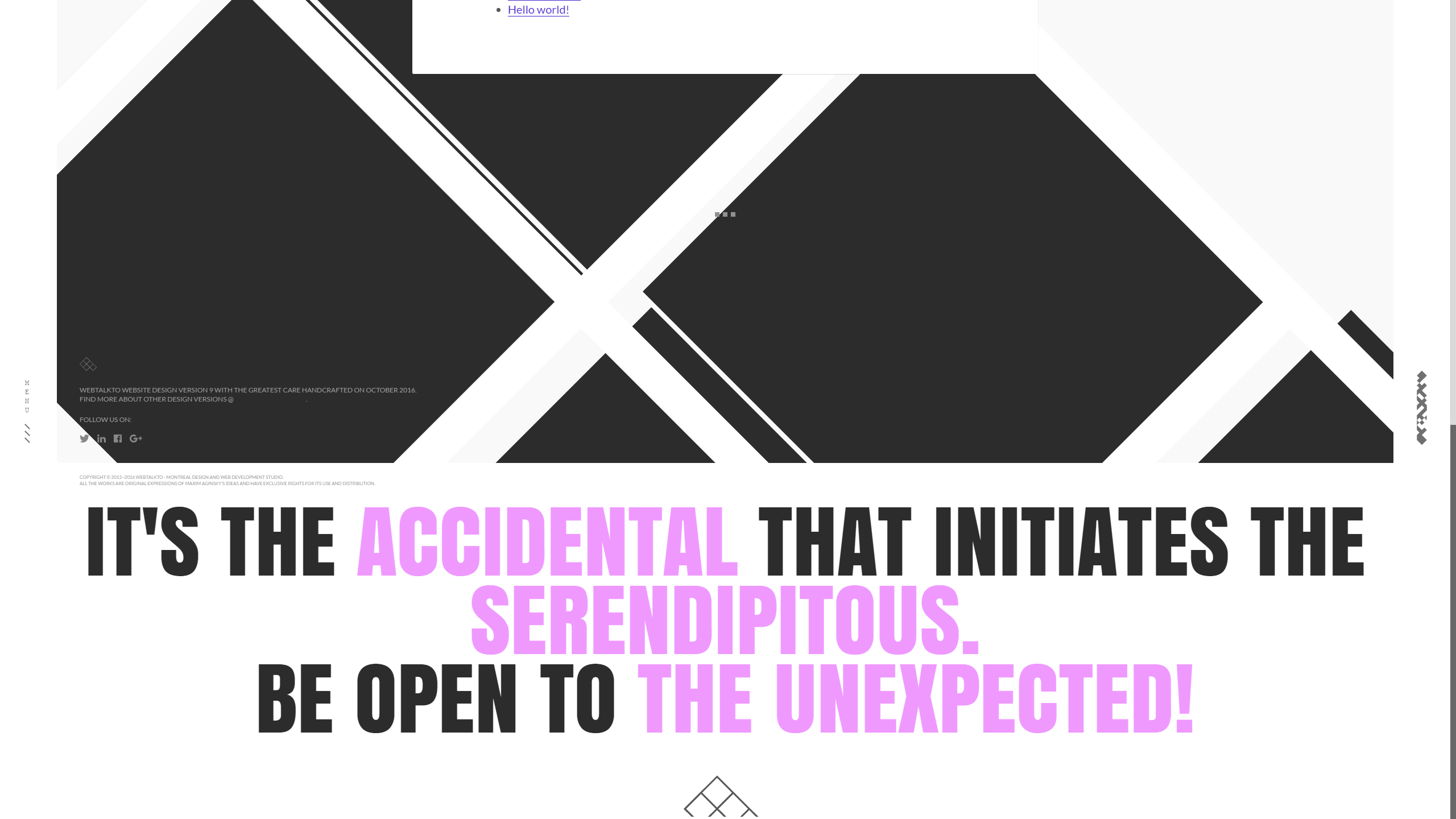
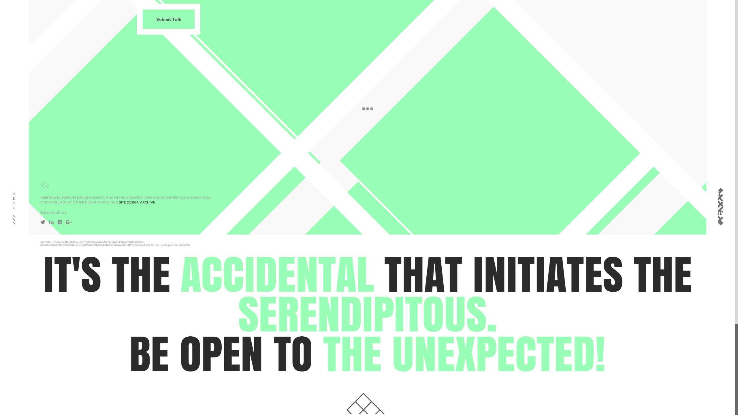
The motto: "It's the accidental that initiates the serendipitous. Be open to the unexpected!"
The footer screenshot of the Blog's standard template.
The footer screenshot of the Blog's green template
Full time job at iflix. Currently exploring UI/UX. http://www.janetwong.net
I can see there's lot of effort on your site! This site is totally unique and one of a kind. Your logo kills. Love love love your footer.
Just some comments:
- There's lack of consistency across all your project pages. Too much stuff to digest.
- Not a fan of the multiple colour use with inner shadow effect on your form. I find the use of grey cool. But probably lighten the shadow.
- Agreed with Stoyan on preloader speed. The speed is just great for intro animation. Probably not for preloader.
- Would be great if you can also slightly speed up the hover effect on cards from your Blog page.
accidental ꩜ initiates ꩜ serendipitous
Thank you Janet!!
"Not a fan of the multiple color use with inner shadow effect on your form."
The first idea was to have just one form with all different colors, Then I came up with idea to have about 6 monochrome page themes. There are about 6 monochrome page themes for the Blog. For the final polish I have planned to remove the multiple color form and use - if I remember right - just white mono color, but after 3-4 month of work I could not find more energy to finalize it :) In the coming version!
"The speed is just great for intro animation. Probably not for preloader."
I'm a French Web and Graphic Designer currently working in Montreal. I'm passionate about art, design, sneakers and street culture. I have some affinities with minimalism, UI design and photography. As art director and designer, I have been creating digital products to connect design, technology & digital storyt...
Nice work.
The site is really nice to navigate. The animations, transitions are successful. I would just add a close button in the menu section and bigger project titles.
The content is also very pleasant to discover. This work is well set to win!
accidental ꩜ initiates ꩜ serendipitous
Thanks a lot Stéphane. I really appreciate it.
That is quite interesting, many people who saw the site mentioned "close button in the menu section" and "bigger project titles".
About the menu.
At some point - while working on this version - I probably planned to force user to choose one of the menu options, when the menu has been opened. The idea was - if I remember right - if you have done some action, do not go back, but continue. There is just one way you can check whether the concept working or not - implement it and see what is going on. I have successfully learned something else :)
Thank you again for your warm words :)
Love the color scheme and interface interactions. Great work with fonts. I love the search blog)
accidental ꩜ initiates ꩜ serendipitous
Thanks a lot Tim!
Senior UI/UX and Motion designer with 15+ years of experience.
Founder of SliceCrowd.com , SliceCrowd LABS, CreativeFrontEnd.io and Pixel Innovations.
I loved some some of the portfolio pieces in the website.
But there are some things in the design that definitely can be improved, such as :
- The intro animation. First I thought that it's a preloader but then I realized that it's taking the same amount of time for each page. It's a bit annoying.
- Typography - the titles of the projects could be bigger
- The blocks look took plain without images. I would recommend you putting your portfolio images not only on hover. For example the way you've displayed the iWatch is great.
accidental ꩜ initiates ꩜ serendipitous
Many thanks, Stoyan!!
Now some thoughts.
The idea behind the intro animation was to "impress" the visitor with the CSS/SVG animation of the logo, also visually prepare the canvas for further page view. Since the intro appears just on a little number of pages (2 pages linked from the home page and the home page, the rest pages use preloader) I was OK with it, but completely agree with you that at some point - probably second or third time the visitor will view the same intro, will slightly loose the focus, but at the same time you can say this about any element of the composition. I would even say that in general it is hard to keep things fresh after second or third time you look thru them.
I'm a French UX Designer and Art Director, originating from Poland and currently living in Canada. I see every project I am involved in as an opportunity to go further, providing my clients and employers with quality materials and a great working relationship.
Wow... Ok... Ok... Where should I begin.... Maybe simply by saying you did a brilliant job :)
I would add a way to escape the menu. Not a fan of the music playing (when hovering the menu), but I can understand the humorous tone. On the portfolio / home page, a bigger title on each project links would provide a better visual anchor point. And you don't need to display your clients recommendation...
... As your works speak for themselves.
Creative. Rich. Full of surprises. Beautiful layout. Beautiful works. Nice transitions. Nice fonts. Nice texts. Awesome!
I've spent a long time on your portfolio and enjoyed every minute. I'm impressed. Amazing job Maxim.
No doubt, we have a winner ;)
accidental ꩜ initiates ꩜ serendipitous
Vincent,
It is a great pleasure to have you as a visitor on my portfolio website and the honor to have your opinion as a Cssfox judge. Any person will feel great satisfaction and peace (or fire) hearing from talented men words such as – Brilliant job, and I am not an exception here. Thank You!
1. "I would add a way to escape the menu"
Yep. I left the implementation of this option to the end of the work, but never get back to it. On other hand – not fully sure about this – in some point I probably planned to force user to choose, when the menu has been opened. Well... I agree that better not to force the user.
2. "music playing"
I have launched this version a few weeks before the Christmas, so the use of the song was thereby justified. The music still there just because of the priorities – simply could not get to it yet.
3. "bigger title on each project"
Yep. On the white it is looks better, the difference is better presented than on the dark blocks. I have tried to find the right balance without adding any additional classes. You are absolutely right; this is tiny, but very important detail.
4. "don't need to display your clients recommendation"
The original plan was to use little number of projects. To compensate little presence of the individual projects I have decided to use the client's testimonials. At the end of the work I realised that this parts are not necessary any more, but you should know how hard to remove parts of the composition in a final stages of the work. I have tried, but it simple did not worked for that moment. So I have decided to leave it as is.
Thanks a lot Vincent for the review of my work!
Full time job at iflix. Currently exploring UI/UX. http://www.janetwong.net
I can see there's lot of effort on your site! This site is totally unique and one of a kind. Your logo kills. Love love love your footer.
Just some comments: - There's lack of consistency across all your project pages. Too much stuff to digest. - Not a fan of the multiple colour use with inner shadow effect on your form. I find the use of grey co...
I'm a French Web and Graphic Designer currently working in Montreal. I'm passionate about art, design, sneakers and street culture. I have some affinities with minimalism, UI design and photography. As art director and designer, I have been creating digital products to connect design, technology & digital storyt...
Nice work.
The site is really nice to navigate. The animations, transitions are successful. I would just add a close button in the menu section and bigger project titles.
The content is also very pleasant to discover. This work is well set to win!
Love the color scheme and interface interactions. Great work with fonts. I love the search blog)
Senior UI/UX and Motion designer with 15+ years of experience.
Founder of SliceCrowd.com , SliceCrowd LABS, CreativeFrontEnd.io and Pixel Innovations.
I loved some some of the portfolio pieces in the website.
But there are some things in the design that definitely can be improved, such as :
- The intro animation. First I thought that it's a preloader but then I realized that it's taking the same amount of time for each page. It's a bit annoying. - Typography - the titles of the projects could be...
I'm a French UX Designer and Art Director, originating from Poland and currently living in Canada. I see every project I am involved in as an opportunity to go further, providing my clients and employers with quality materials and a great working relationship.
Wow... Ok... Ok... Where should I begin.... Maybe simply by saying you did a brilliant job :)
I would add a way to escape the menu. Not a fan of the music playing (when hovering the menu), but I can understand the humorous tone. On the portfolio / home page, a bigger title on each project links would provide a better visual anchor point. And you ...
accidental ꩜ initiates ꩜ serendipitous
Montreal design and web development studio of designer and author Maxim Aginsky. December 2016
This design version relocated due to the launch of WebTalkTo v10.
I can see there's lot of effort on your site! This site is totally unique and one of a kind. Your logo kills. Love love love your footer.
Just some comments: - There's lack of consistency across all...
Nice work. The site is really nice to navigate. The animations, transitions are successful. I would just add a close button in the menu section and bigger project titles. The content is also very p...
Love the color scheme and interface interactions. Great work with fonts. I love the search blog)
Comments 9
Maxim Aginsky
accidental ꩜ initiates ꩜ serendipitous
arrowww.space
Maxim Aginsky
I can also confidentially :) tell you, that most votes after "WebTalkTo v9.2" was given to "One Year In Review" - http://cssfox.co/one-year-in-review and "Julien Bucaille Portfolio" - http://cssfox.co/julien-bucaille-portfolio .
We all love your work very much!
Maxim Aginsky
accidental ꩜ initiates ꩜ serendipitous
arrowww.space
Maxim Aginsky
All decisions about community awards make our jury and only jury. I hope you will continue to think more of me :)
The dev team is very busy with the current improvements. As you know the Favorite Fox award decisions is absolut transparent. Same way the main award will work soon. It is just a matter of time, I hope short time :)
I know you was invited, as each Favorite Fox receiver, to participate in community awarding process as a jury member. This can really help. Regards.
Julien Bucaille
Julien Bucaille
Hold on, you awarded the favourite fox to yourself? Cool site, no doubt, but I thought more of you :/
Maxim Aginsky
accidental ꩜ initiates ꩜ serendipitous
arrowww.space
Maxim Aginsky
Thank you Janet!
Janet Wong
Full time job at iflix. Currently exploring UI/UX. http://www.janetwong.net
Janet Wong
Congrats Maxim!
Maxim Aginsky
accidental ꩜ initiates ꩜ serendipitous
arrowww.space
Maxim Aginsky
Thanks!
Drew
I'm a Tech Lead with over 6 years of experience. Music addict. Fond of different crazy stuff, like iframes on iOS (sarcasm). Author of slash conspiracy theory. You never know when one slash will ruin your whole routing.
Still reading this? Great, so, uhm, don't take a word above seriously. Except the first sentence m...
Andrii Zhukovskyi
Congrats! :)
Maxim Aginsky
accidental ꩜ initiates ꩜ serendipitous
arrowww.space
Maxim Aginsky
Thanks a lot =Oleg!
Oleg Tserluk
Developer & co-founder of Cssfox - Web designers' community.
Web developer at Medatech.
Oleg Tserluk
Congratulations.Great work!