"Mays Domat :: Communication Art" first review

Crafting beautiful things from design phase and all the way to finished and developed phase.
I like the initial preloader and scroll animations plus that yellow on black makes a nice contrast. The choice of fonts Dosis + Open Sans feels good. I remember Dosis font for that bulleted zero :)
Some things regarding UI / UX and the overall front-end optimization came to my mind while browsing through the site.
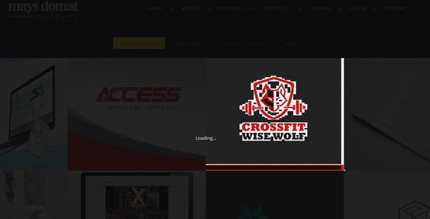
- I like the presentation of you (the about section) and you seem to have a lot of projects :) but I don't think the detail modal of your projects is the best way to present them. It's nice to have so many of them, but I would really like to see some more nice details :) maybe focusing on the most important ones that represent you the best would be the optimal choice. Also there is some thumbnail glitch on chrome, when clicking on the each project:
- That height nav change on 100px scroll, I don't think it is necessary :) the better choice would be to slideOut nav on 100px scroll and slideIn on scroll up. Also the back to top button would be great, mostly for mobile :)
- padding issue with the section: AND MANY MORE CLIENTS AROUND THE WORLD. And the unnecessary yellow section on the whole projects page.
- You have over 30 different css + js requests on your page load. That is really a lot. I think that visual composer is loading a lot of css + js. You should try to combine and compress all of the css and js. A cache plugin would be a great choice for you to optimize the load. Some cache plugins also have the option to compress css and js files.
Overall, I think the site has a nice appeal scroll animated wise.