"Asthenius Capital" second review

Crafting beautiful things from design phase and all the way to finished and developed phase.
That elephant walk in the disclaimer page is fantastic. Really realistic, except maybe a little too fast going from point a to b :)
Ok, let's start at the beginning. That first disclaimer on enter when the cookie is not already created, could be done via pop up or in the left/right bottom corner, that would be better regarding UX, but I'm sure you have a special reason why is it like that.
Now to the colors of the site. The color of the logo is blue, but the main color of the page is not really complementary to the color of the logo. And I don't really like the feel of it. It's too serious. It's not a great fit with your nice animations. You are mixing too much of serious and fun. Try to find that balance.
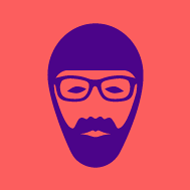
Now to the animations part. Like them. Creativity is in you! Can see the process behind it, a lot of moving in the Illustrator and making sprites :) They were all vectors, but now you have raster png's. More efficient way would be to save them as SVG and animate the svg.
Comments 1
London-based freelance web designer and illustrator
Hi Gregor,
Thanks for your comments. I agree with all your points and yes you're right I had a special reason to have the disclaimer covering the whole page - the brief.
R