WebTalkTo v.9 work in progress

The first look of the new version was quite different from what you will see as a final version nine.
First part
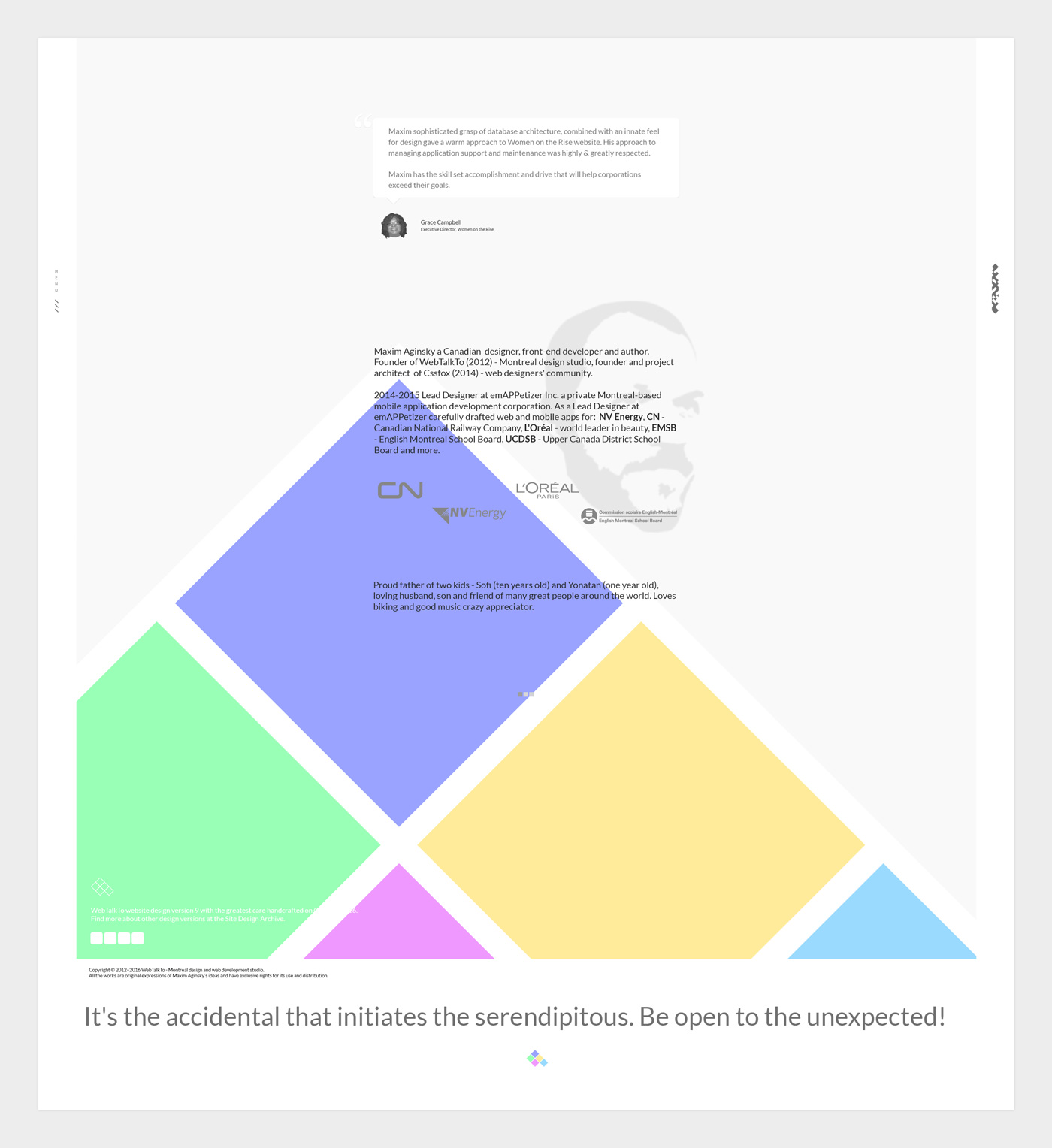
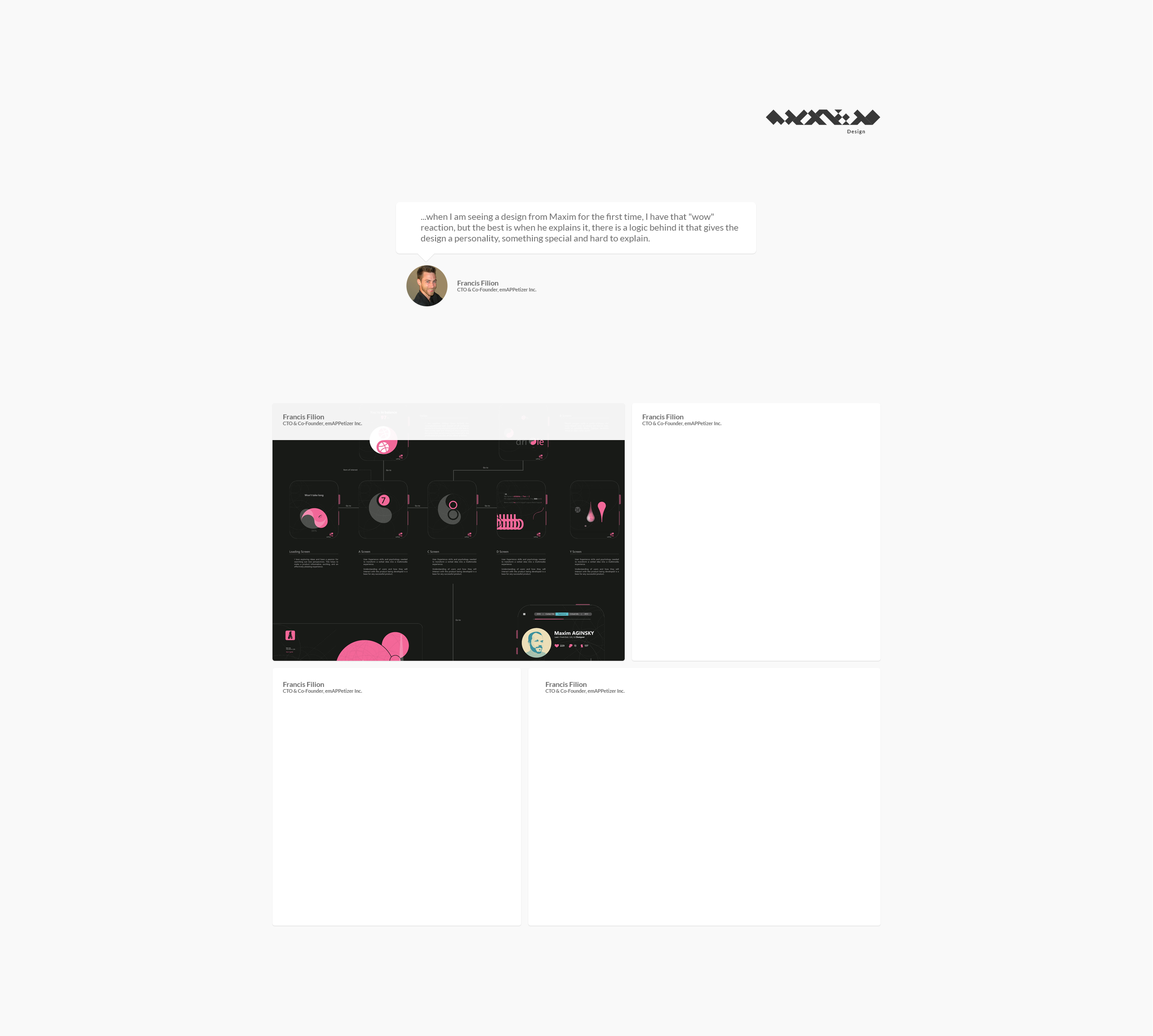
When I made the decision to upgrade, I already had in mind some of the elements to include or modify in the new design. When I am ready to create a new design for my portfolio I have a very strong feeling of creativity that lets me know I am ready for the changes. So I started to experiment with animations, layout, new logo concepts, typeface and more.
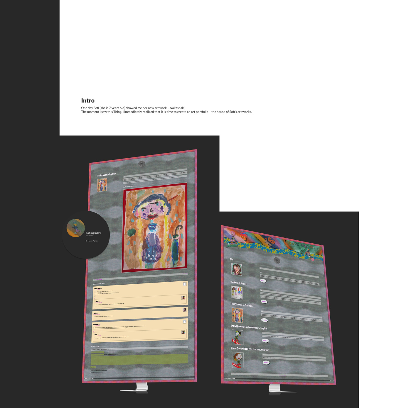
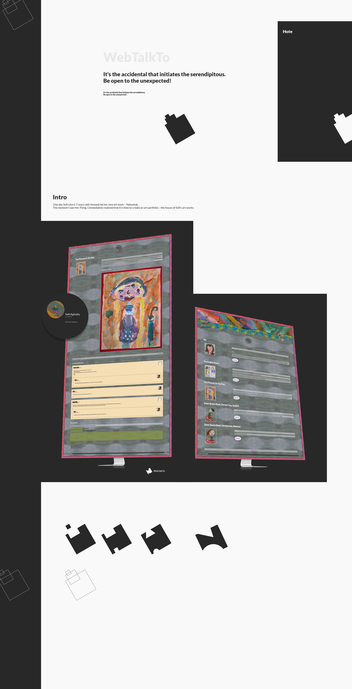
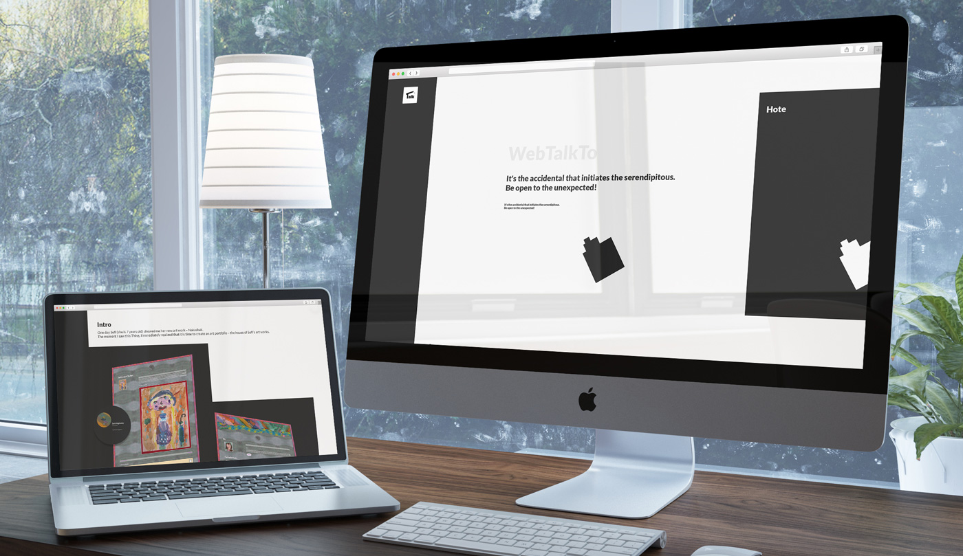
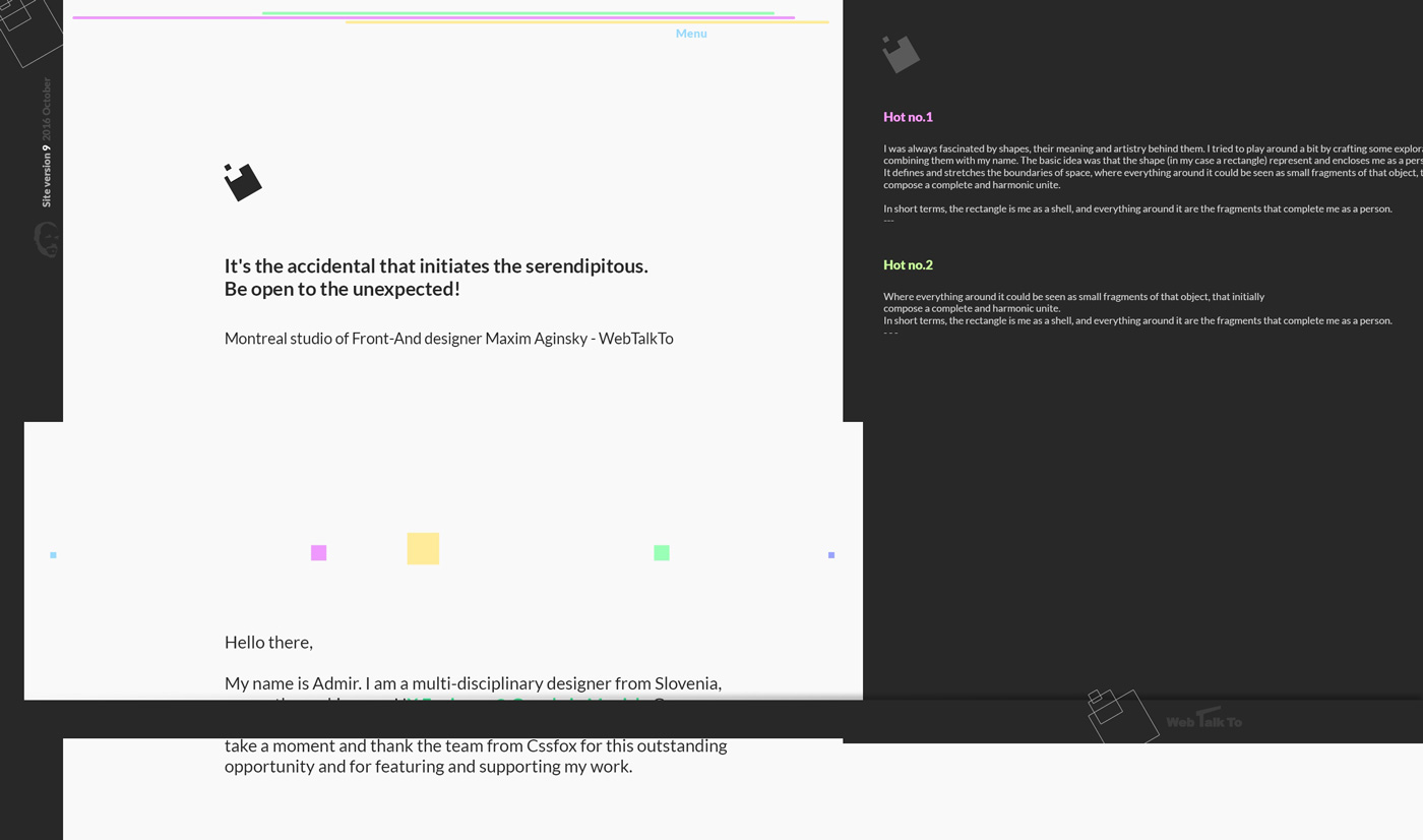
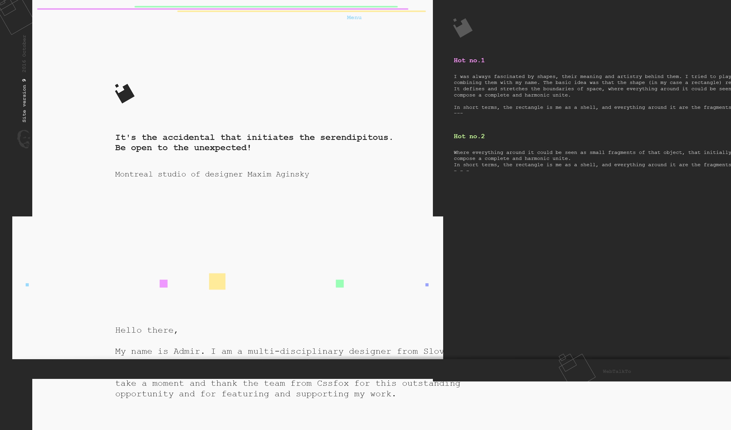
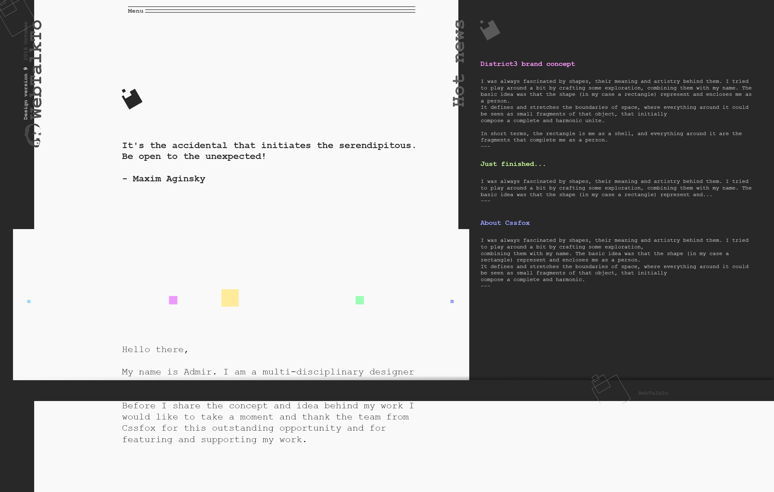
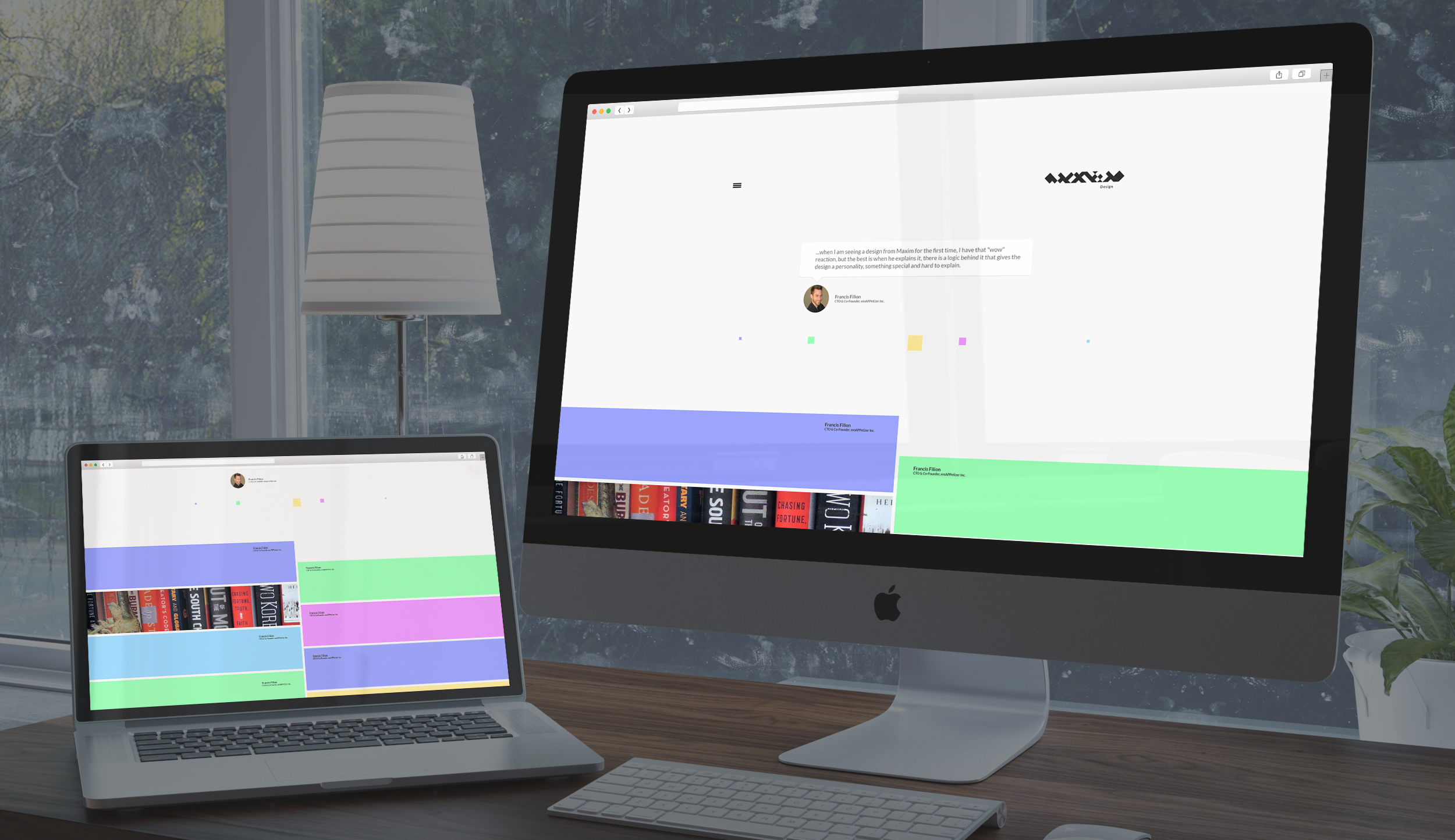
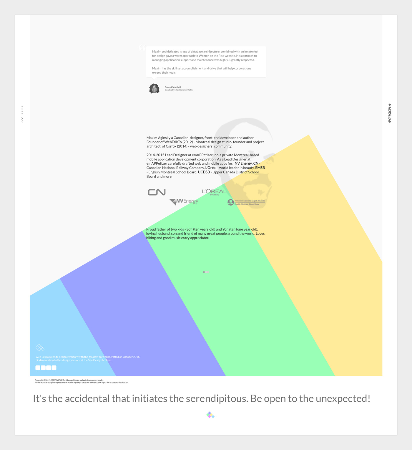
The first part of this post is all about tests and experiments – preparation for the new version. The final output of these tests and experiments, the contents - logo, typeface, colors, how to present the works on the portfolio page - looked like this:

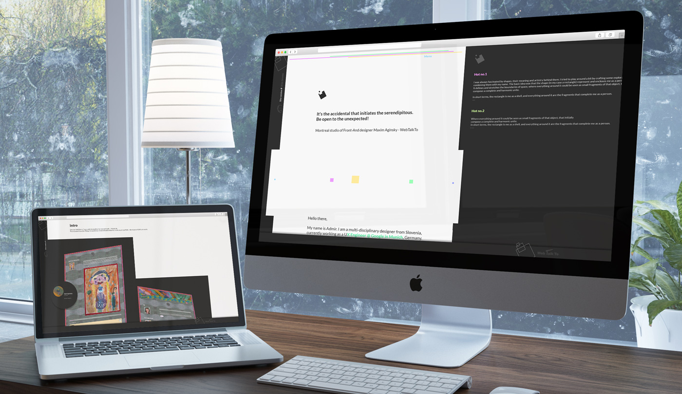
At the same time, I have created an html version (see it here) of this design in progress to test animations and parallax effects I planned to use on the portfolio page, as well as other design aspects.
It is hard to say why I changed my mind and decided not to continue with this concept, but I am guessing that I felt like trying something more elegant and classic that will sell better :) I was in the middle of searching for a new employer.
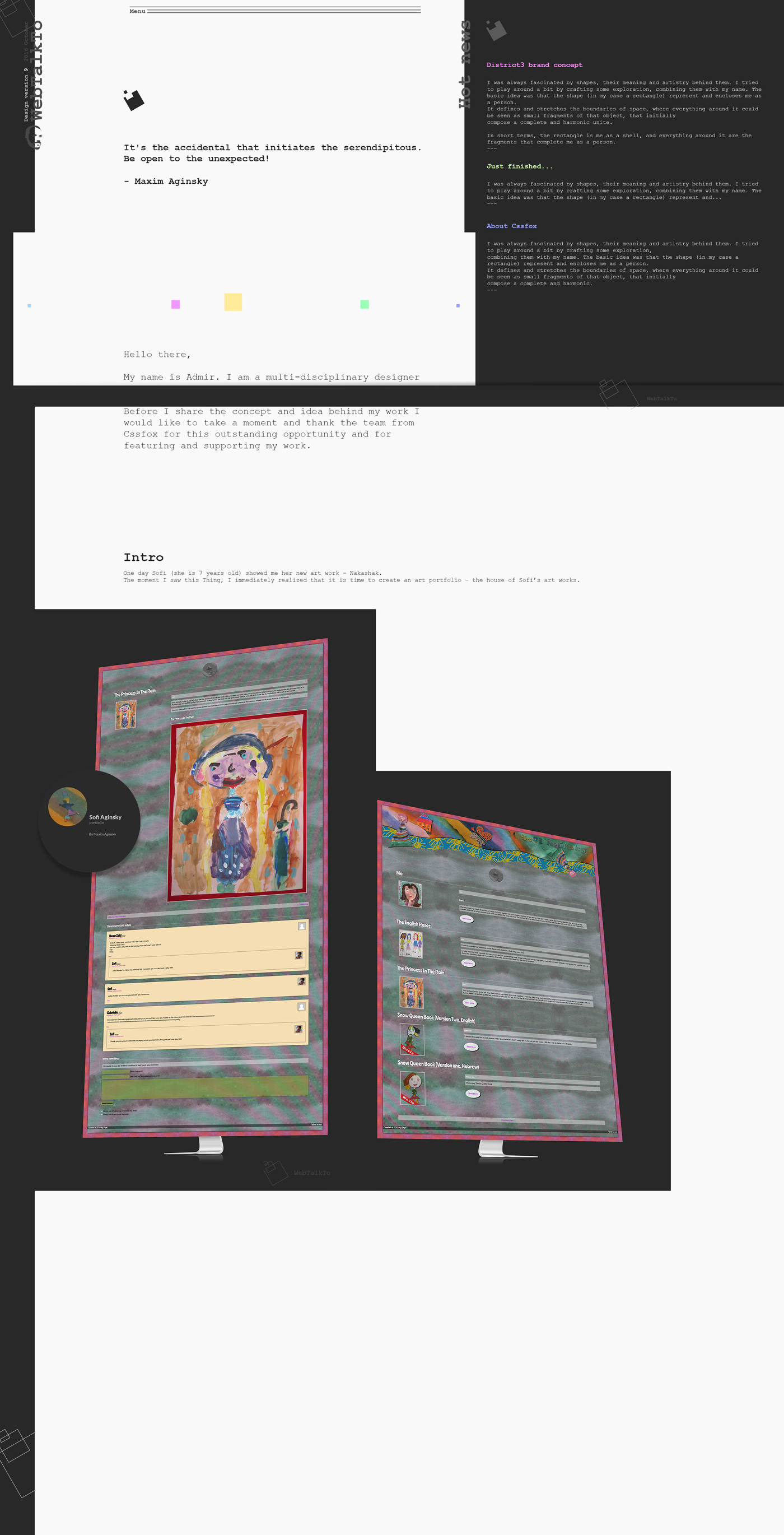
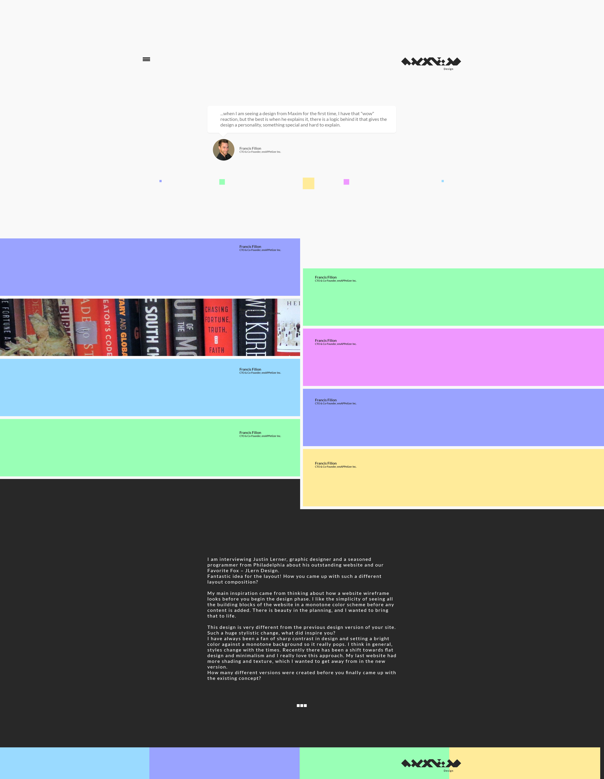
Ah... I remember now: the main problem was actually the way I planned to show my works – sticking to the left block of solid color creates the effect of continuity from the top to the bottom of the page.
Yep! So I put aside these design ideas and started from scratch - or it would probably be more correct to say – I am continuing from where I stopped.
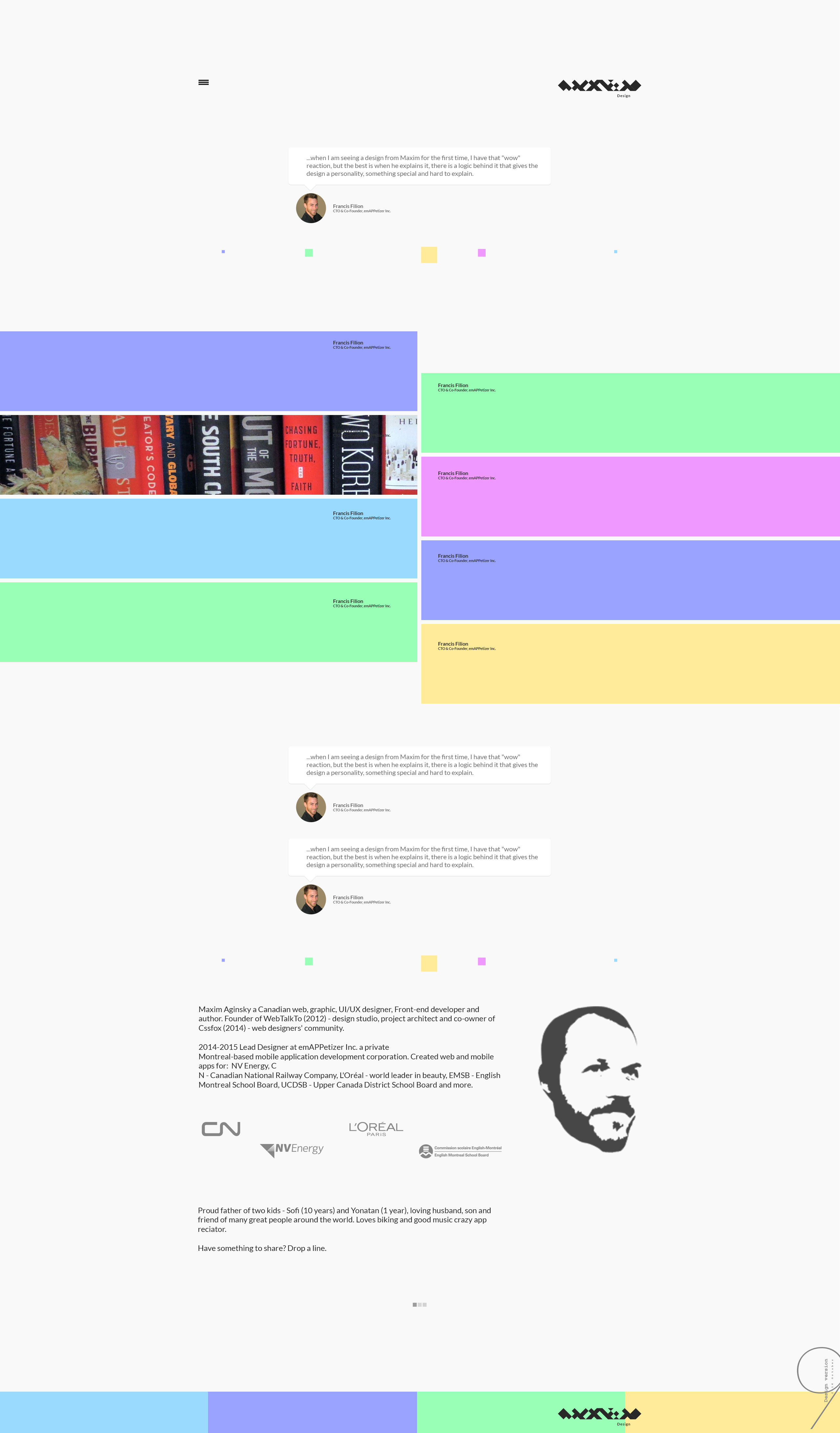
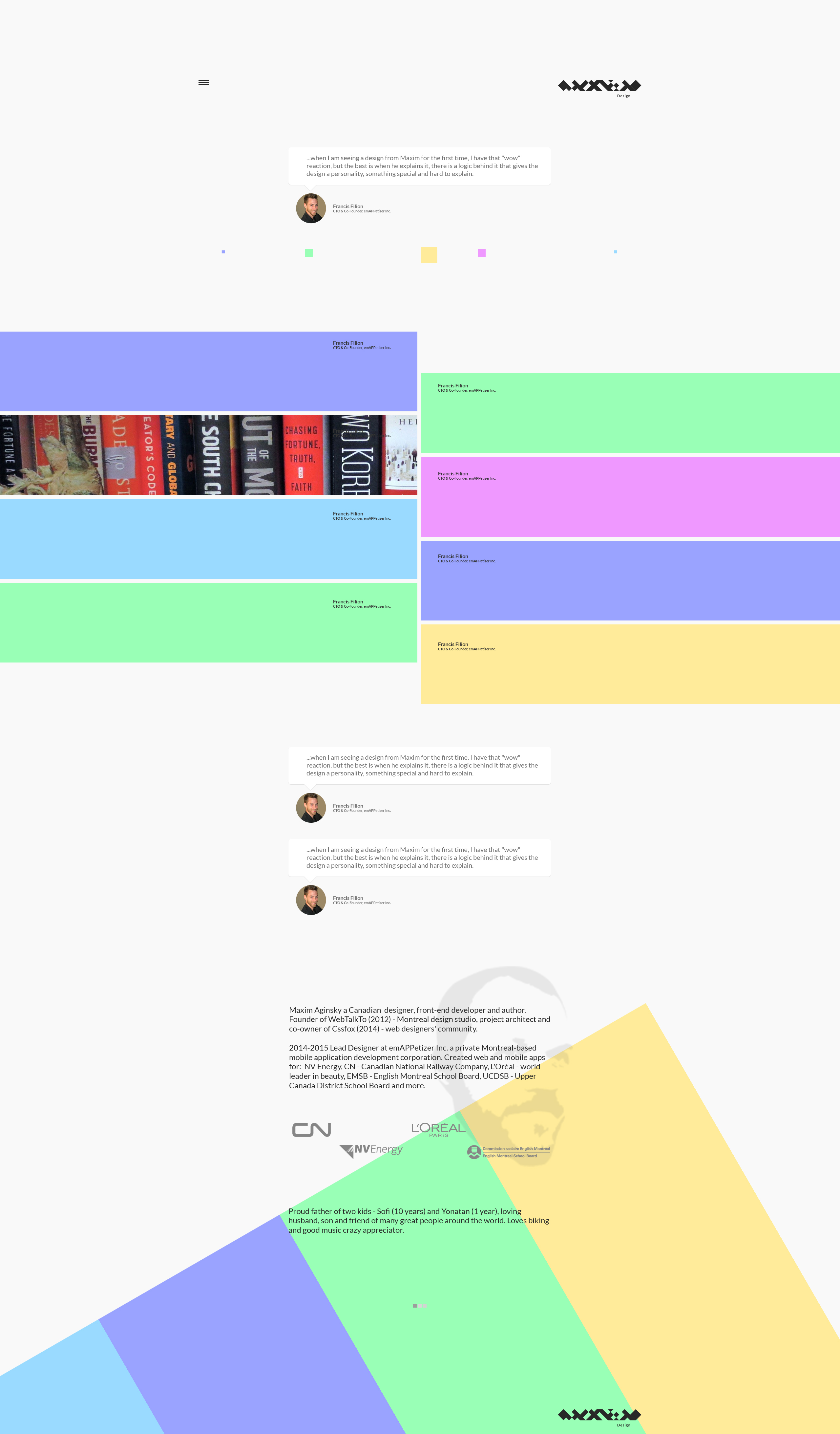
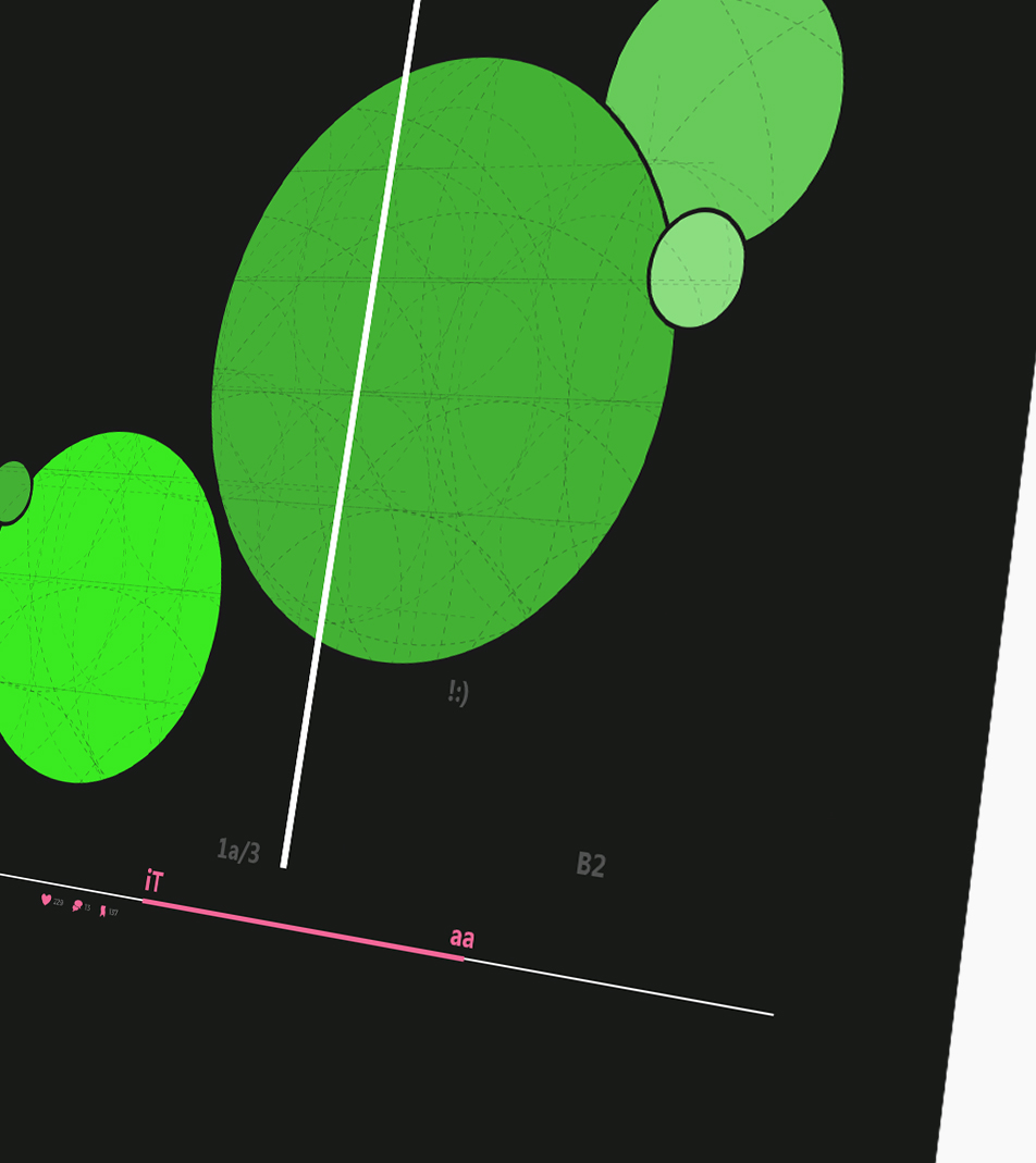
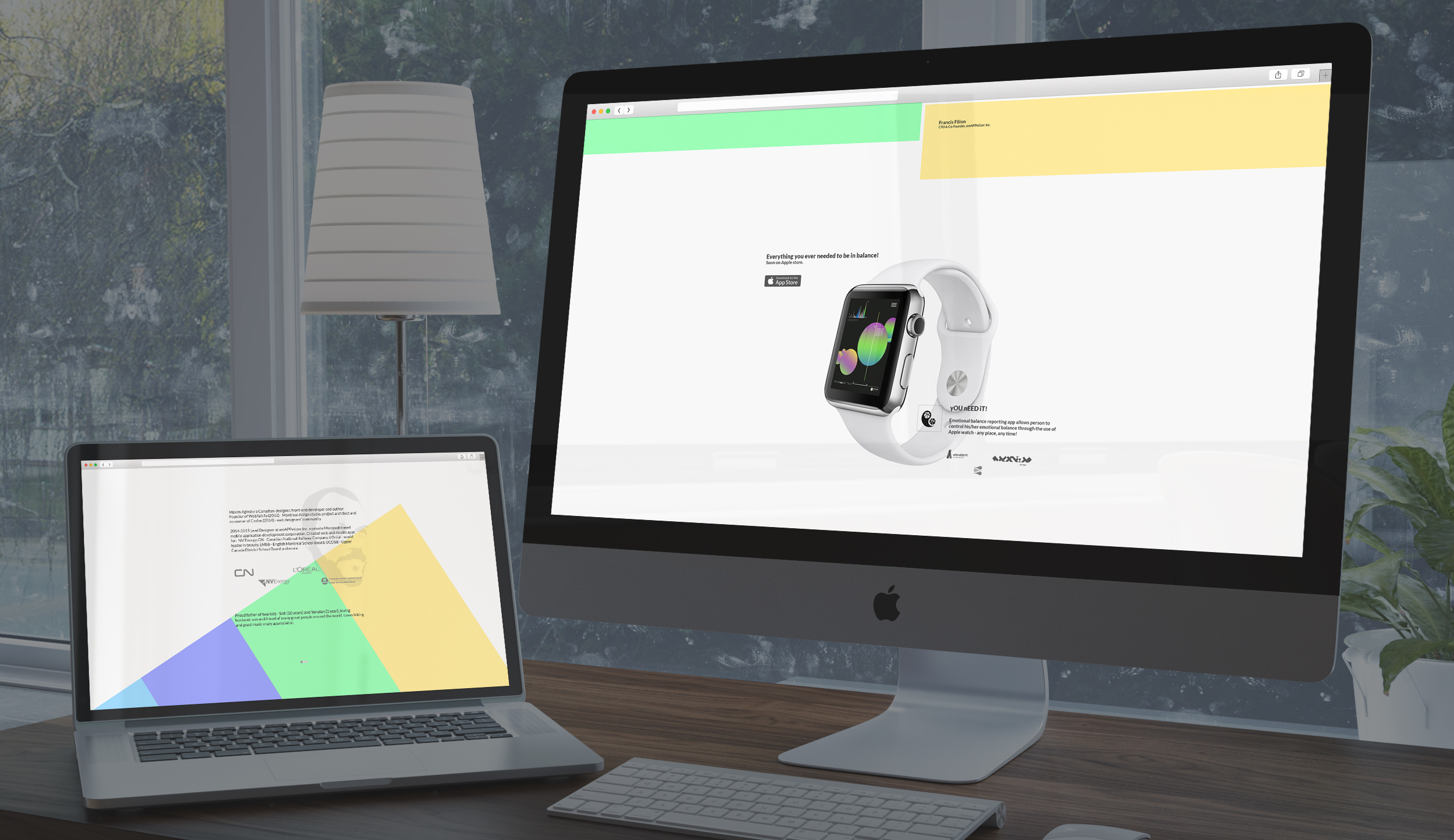
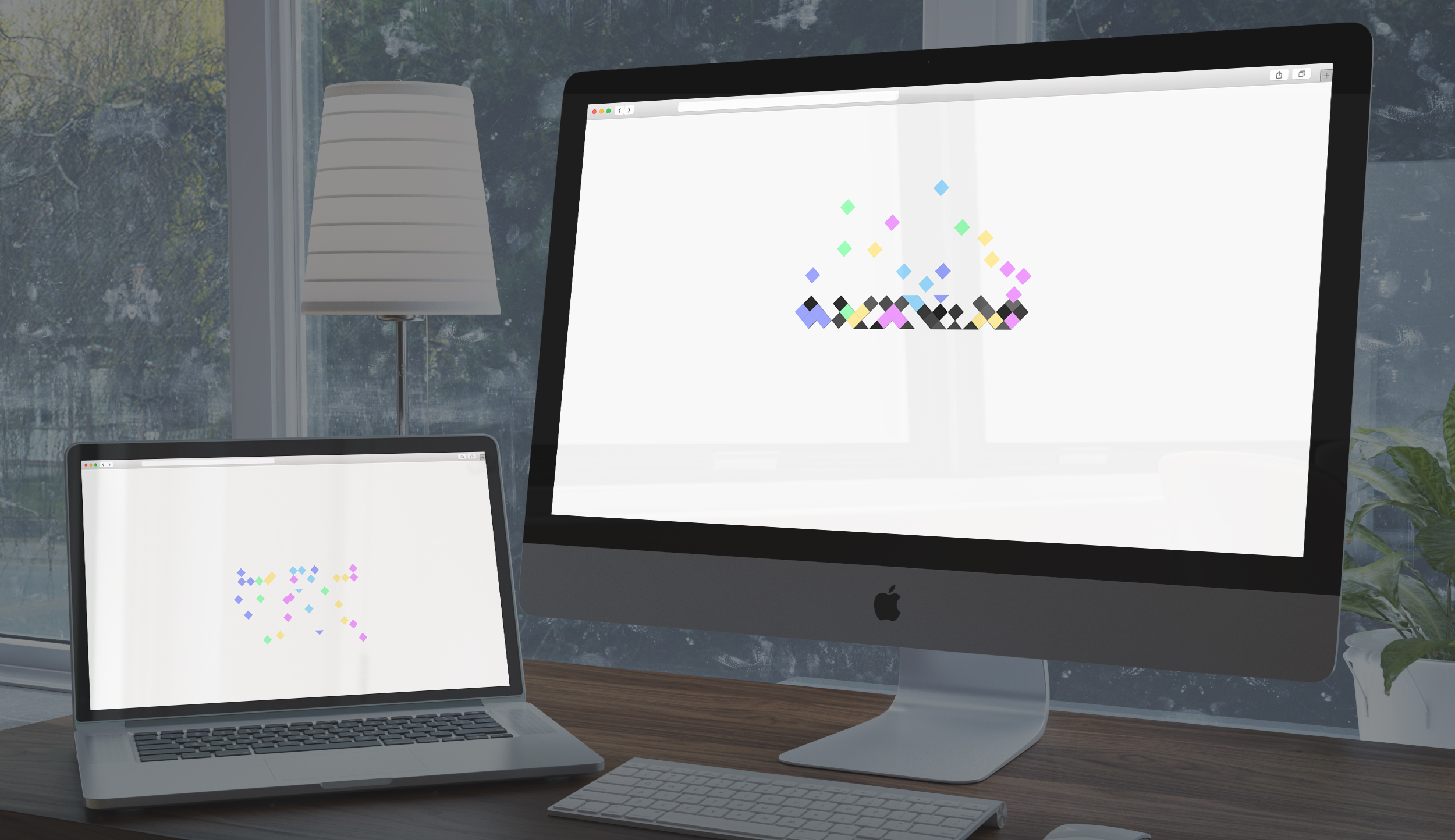
Here are some images that I have saved for myself (... and you) that should show/map the steps my mind went through.

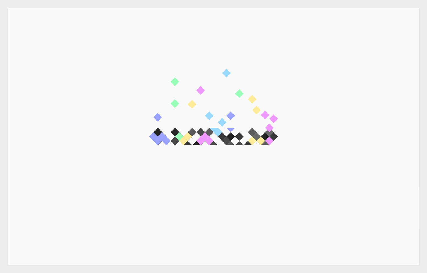
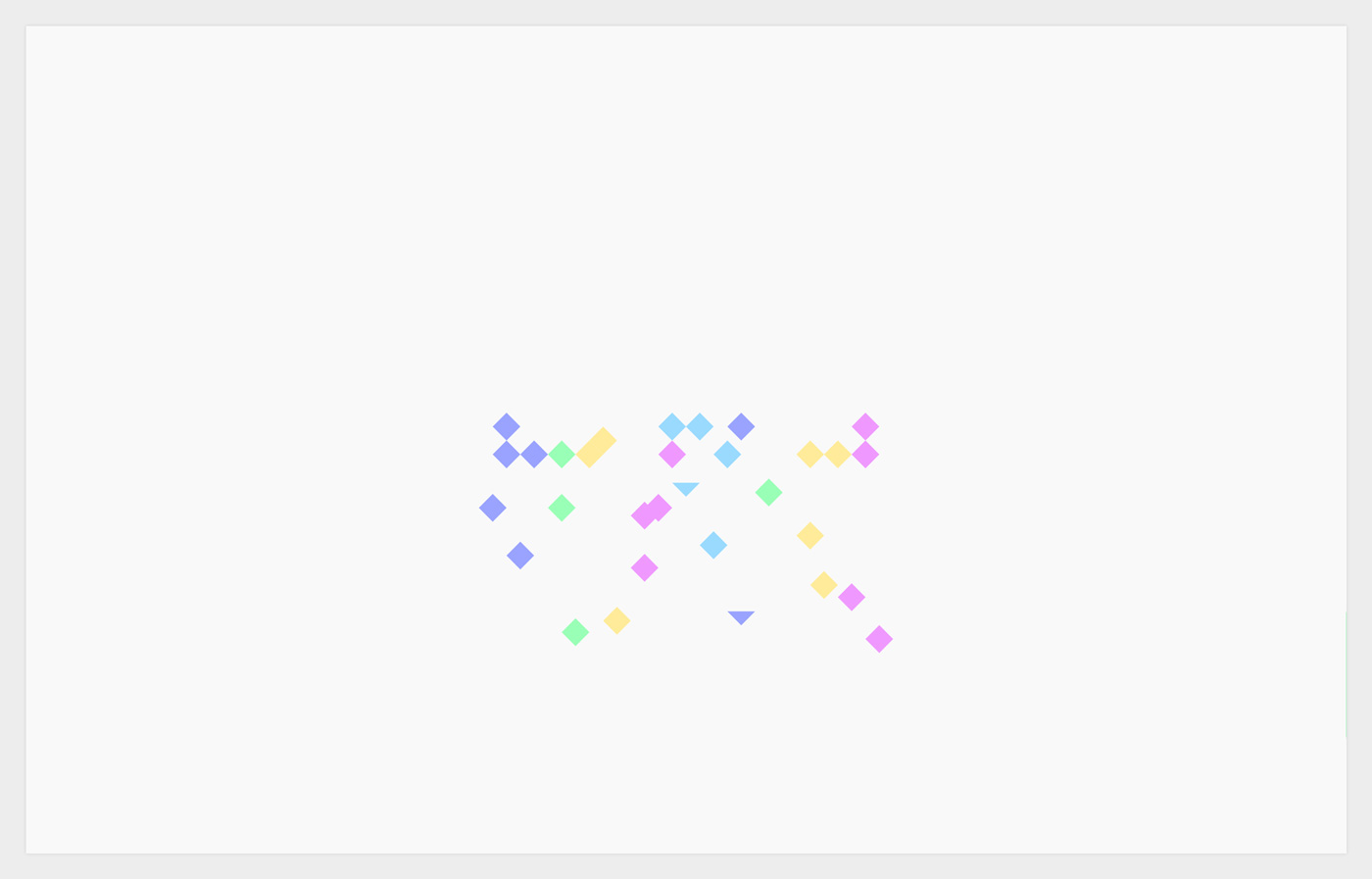
Logo tests
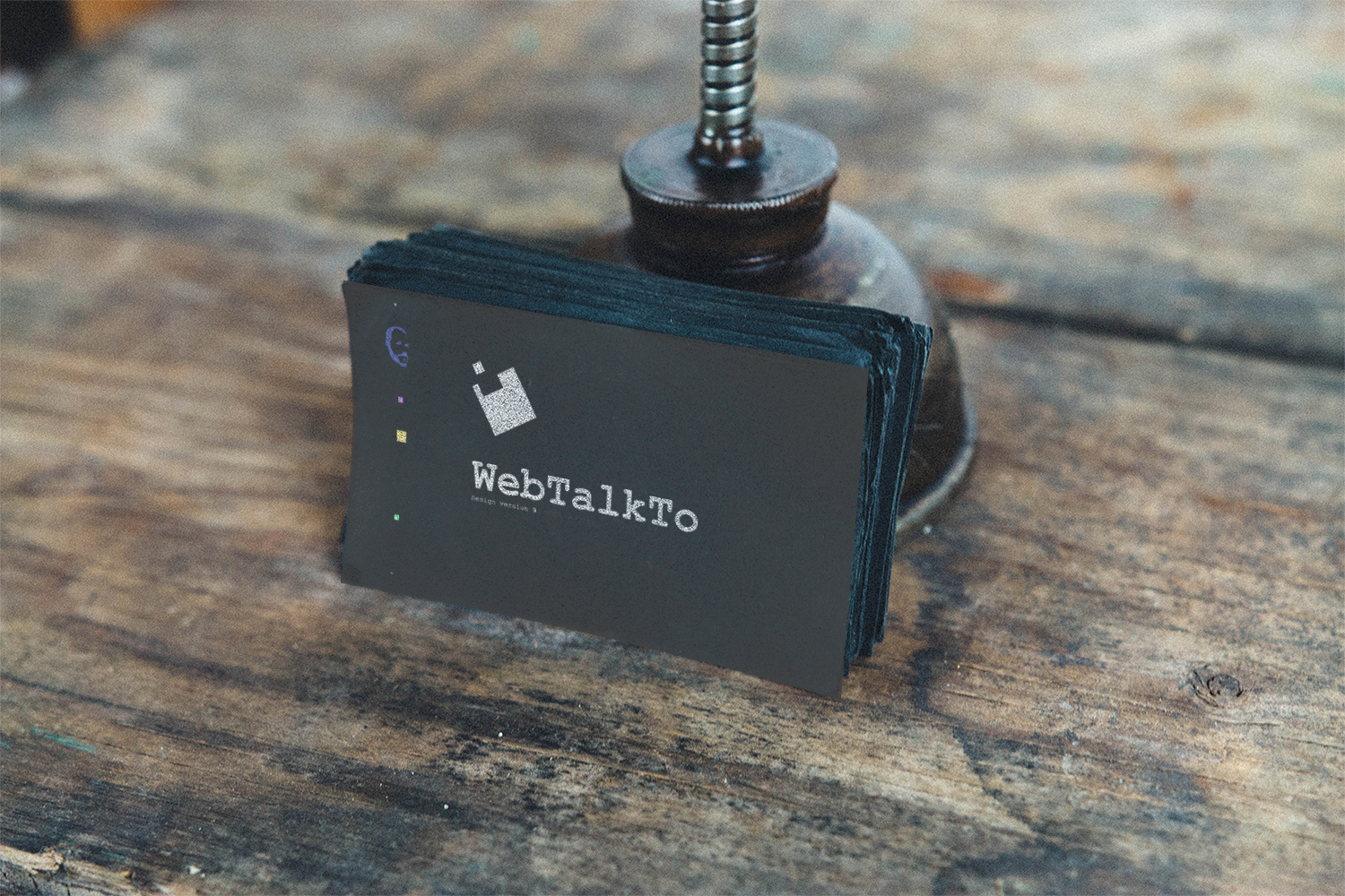
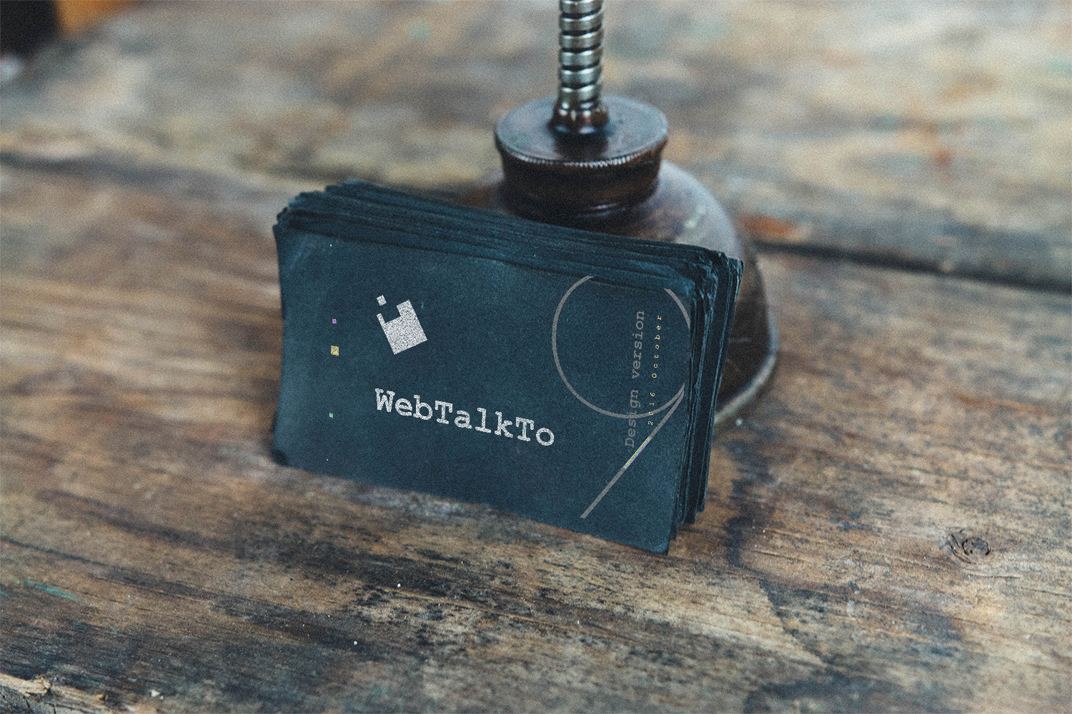
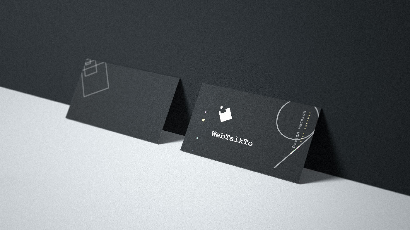
Business card
Second part
The golden center of the overall composition is going to be the new logos. Nothing really to say :) simply watch what happens.
Logo test
Logo guidelines
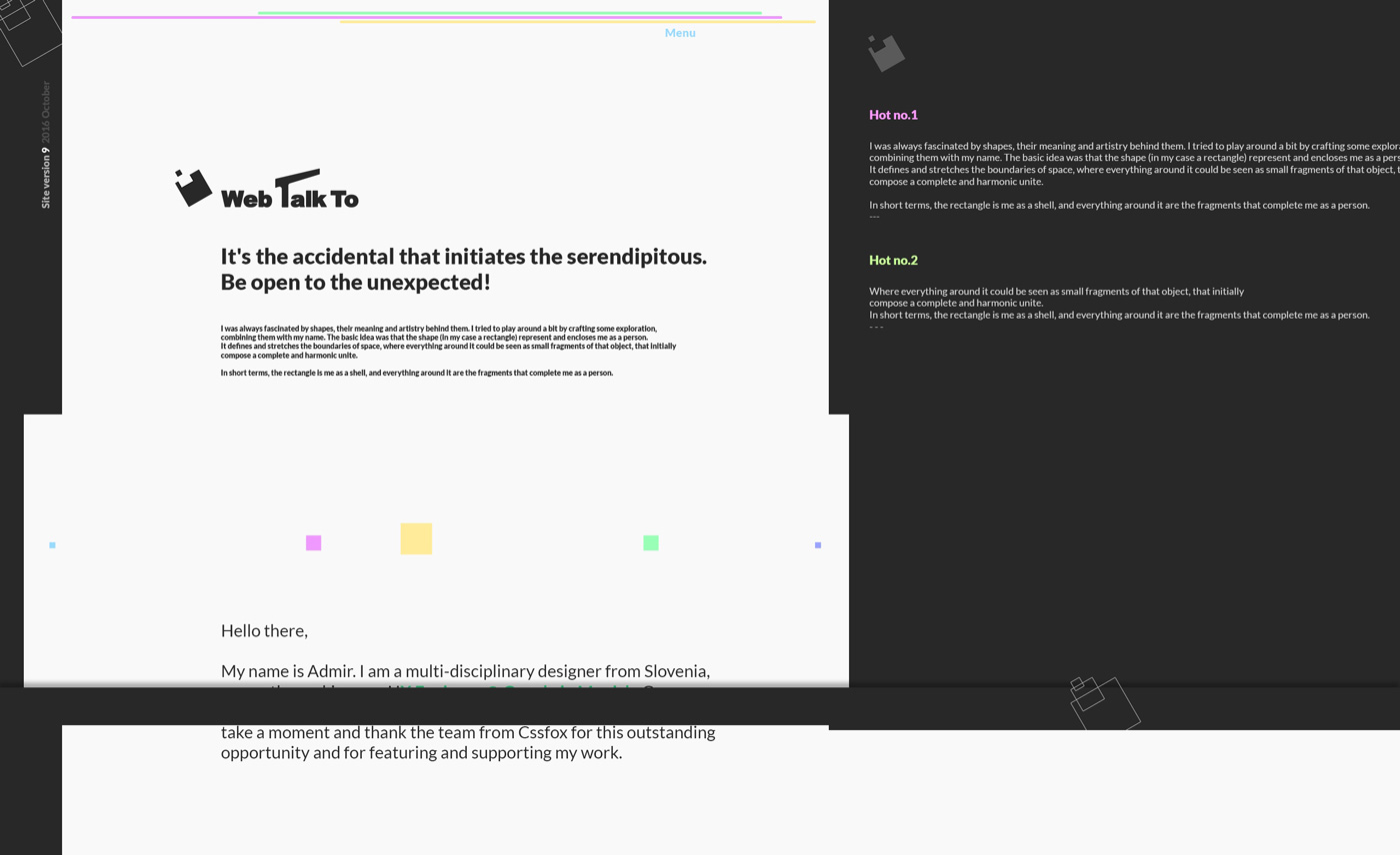
Intro animation
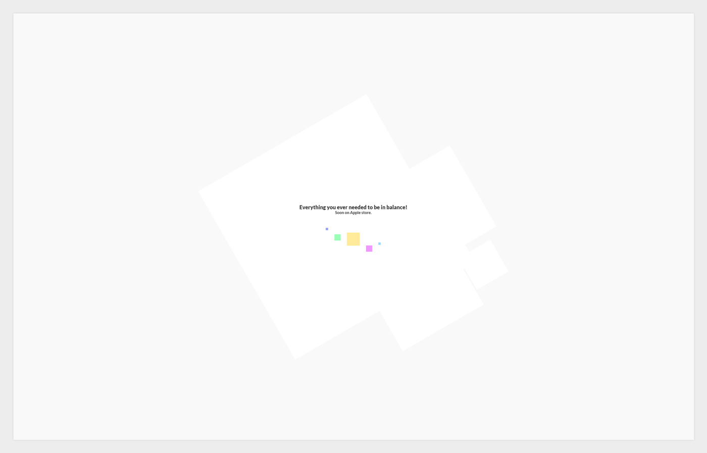
Loading screen
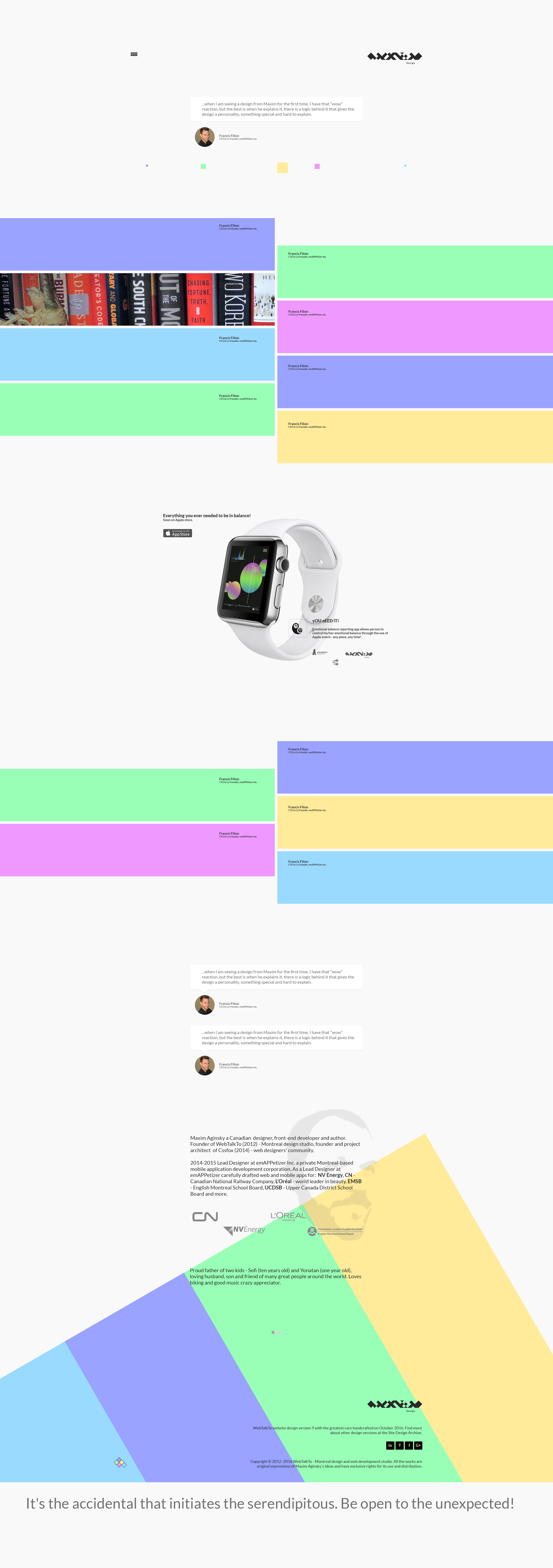
Footer
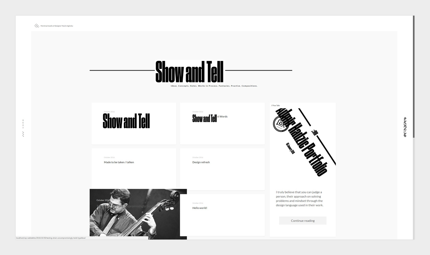
Font type for the Blog template titles test
Footer