Web Site for Zichron Kedoshim

Just finished working on website for Zichron Kedoshim Congregation – huge, beautiful and hospitable place.
The Design
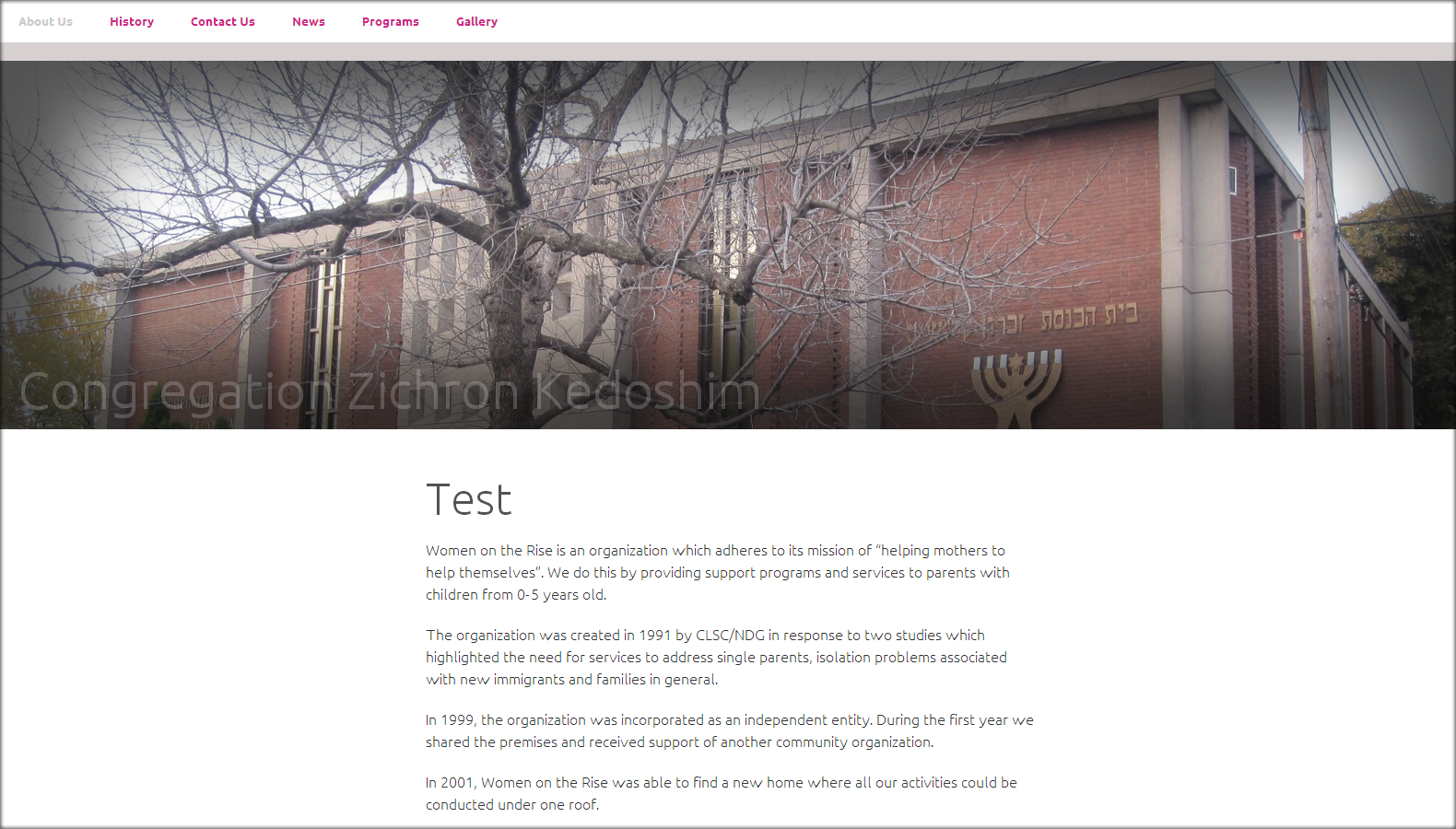
CSS3 animated navigation menu.
Two images on top and bottom with some effect of deepness, created using inset – box-shadow CSS property.
Titles using negative latter-spacing and opacity effect. The main site title (on top) also animated using CSS3 transition property.
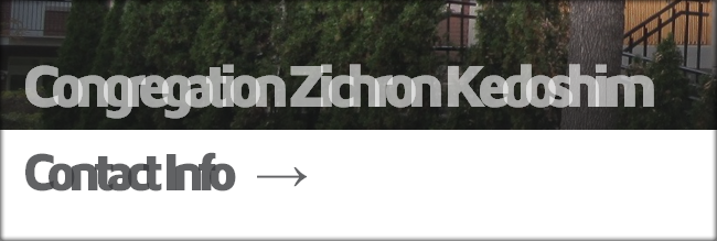
When scrolling down and the header image disappearing under the browser window edge, the hidden div with site title is smoothly animated in (the grate power of CSS3) and stays at the top of the page during scrolling.
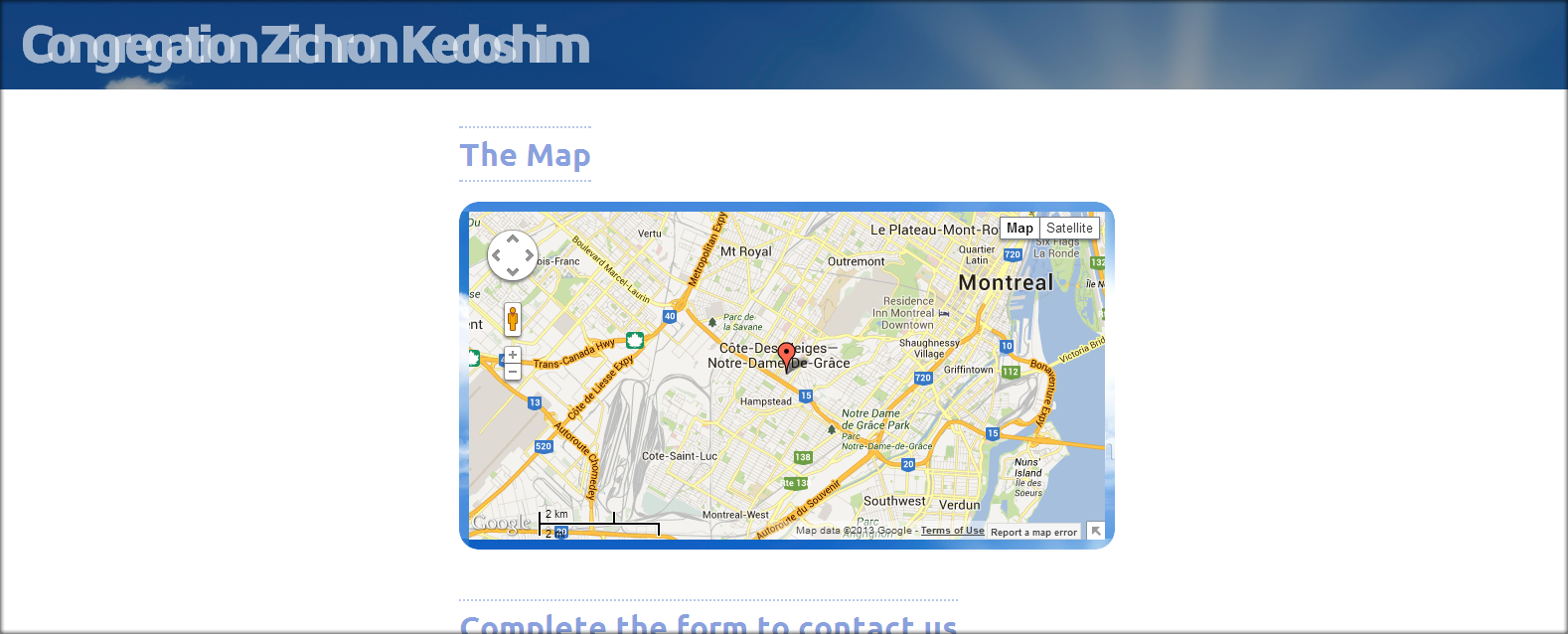
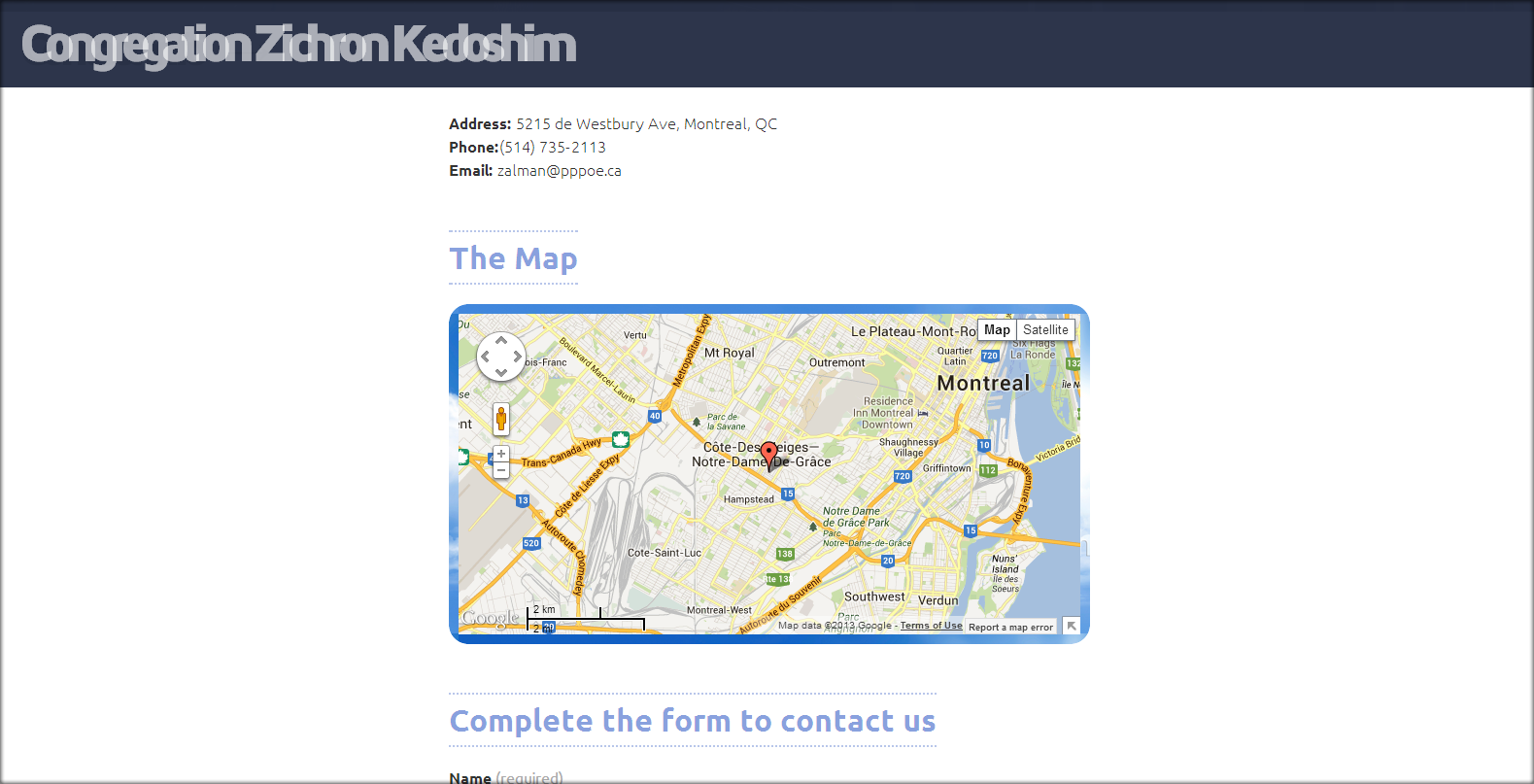
The association: memory of the Saints – the sky. When scrolling all the way down you get the sky – it is quite surprising.

And of course I transferred a piece of my heart which is the most important and necessary component of any work. Is that so?
There are two reasons for simple design.
- One – you just want to keep it simple.
- Two – when you have small amount of text and other content elements that actually fill the page and gives the material to designer.
I have it both.
Today I believe that site design should be simple – this might change tomorrow – that is quite minimize my work as a designer, but still have some difficulties to deal with.
And finally, the site use WordPress us CMS – grate and very helpful tool for both: designers and users.
Work in progress
A design for website is like a ripening fruit – to be able to get the right feeling-flavor you need to give it some time and right “weather”. This is just a first design version and I hope – if the ”weather” is good – I will be able to create a design that will match the unrepeatable “mood” of the Zichron Kedoshim congregation.