Testing Druk - uncompromisingly bold typeface


Maxim Aginsky
accidental ꩜ initiates ꩜ serendipitous
Maxim Aginsky
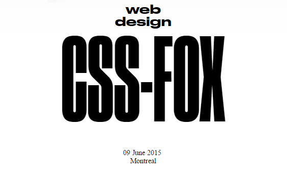
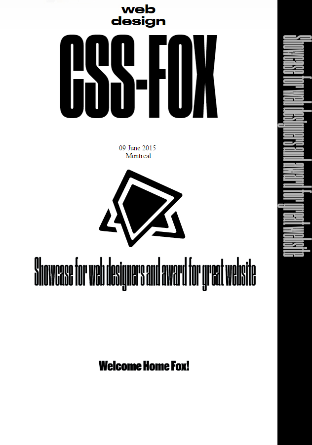
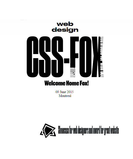
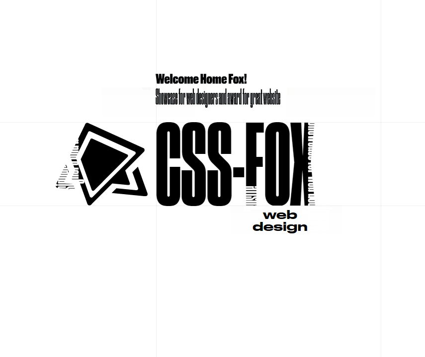
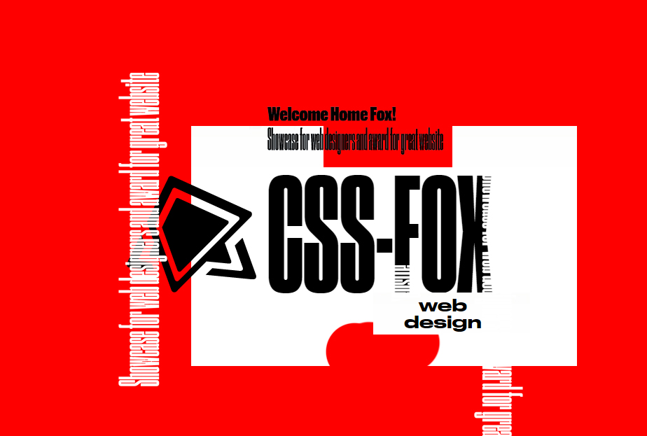
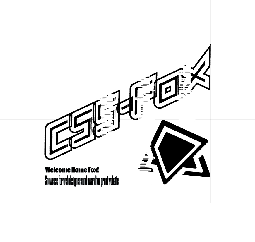
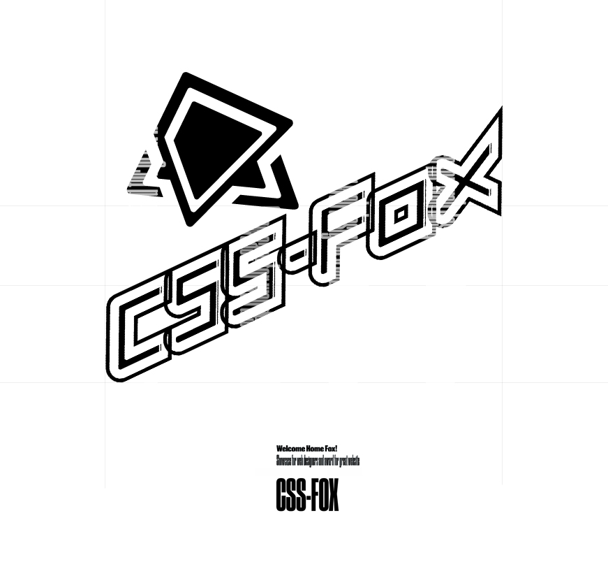
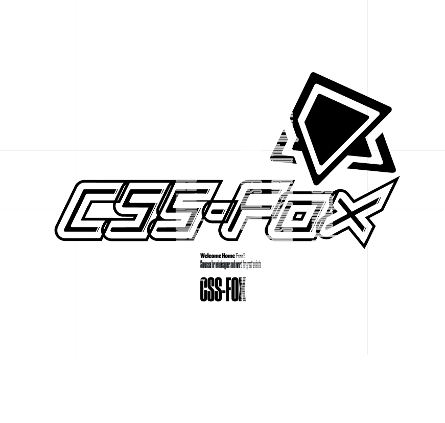
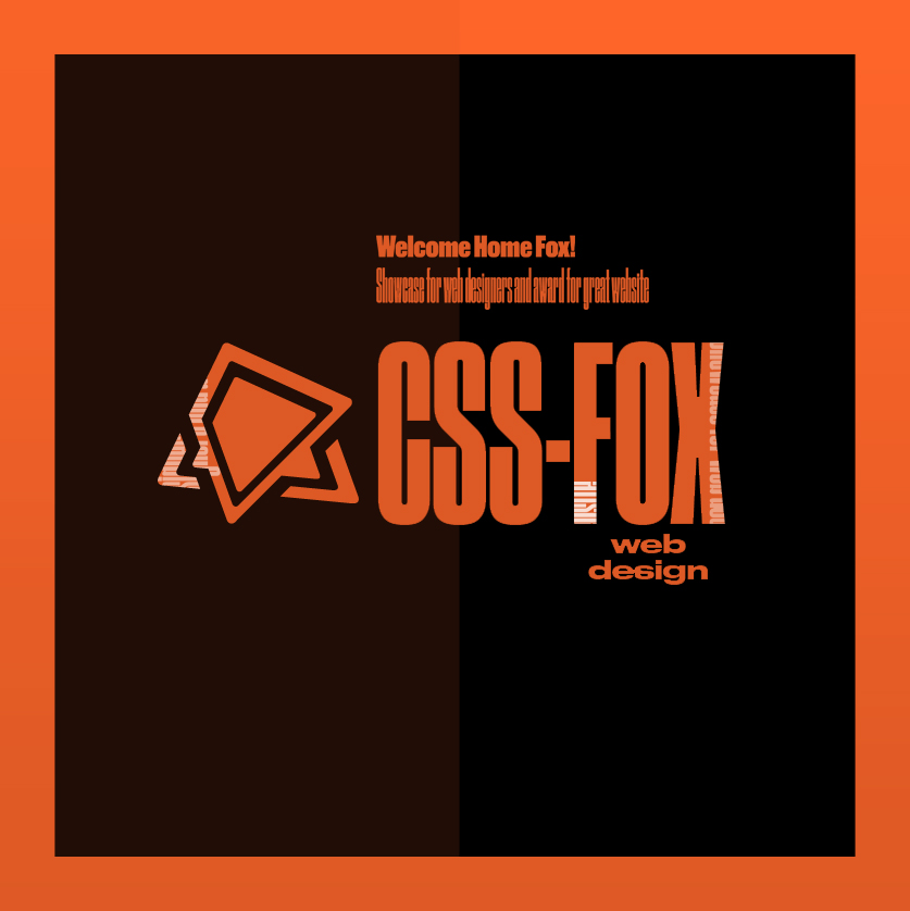
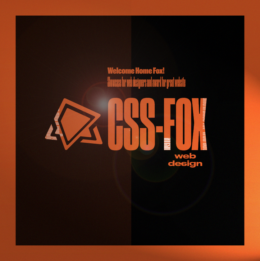
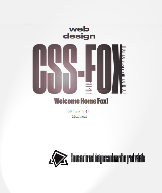
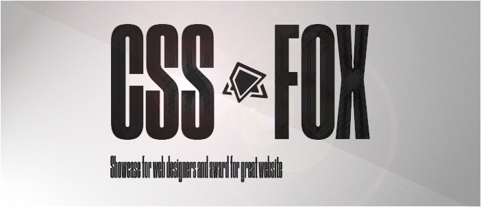
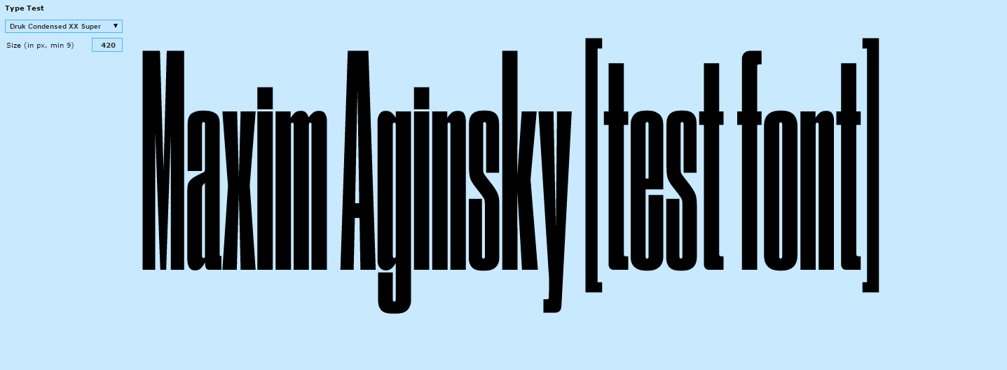
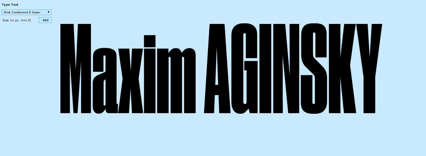
Mostly for the tests I used CSS-Fox brand attributes brand mark, logotype, slogan. I also created a few examples using my personal name. The results are pretty interesting. I am very curious to try this font family on real web page/s.
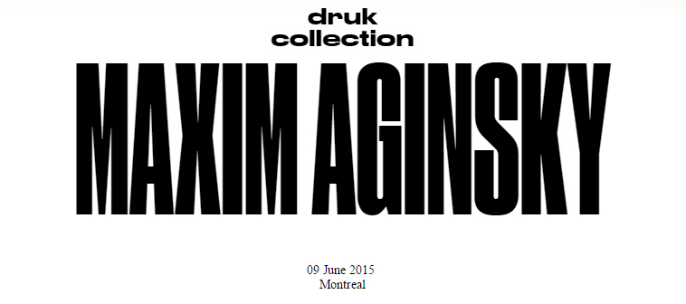
...Druk Condensed features three widths in the same Super weight. The Condensed and X Condensed are very graphic, and the XX Condensed can appear almost abstract. Designer Berton Hasebe introduced a purposeful and subtle change to the texture of the typeface by preventing terminals and crossbars from lining up too often on the horizontal axis. This keeps an emphasis on the verticality of the letterforms and prevents words and headlines from becoming monotonous. The maximum point size for this family is limited only by the size of the page; however, minimum sizes should be respected. The Condensed does not work well below 40pt; X Condensed should be used only at 48pt and above; and XX Condensed is limited to 72pt and above.
Designed by Berton Hasebe, 2014
Druk Collection on Commercial Type
exploitation MA
CSS-Fox's exploitation
