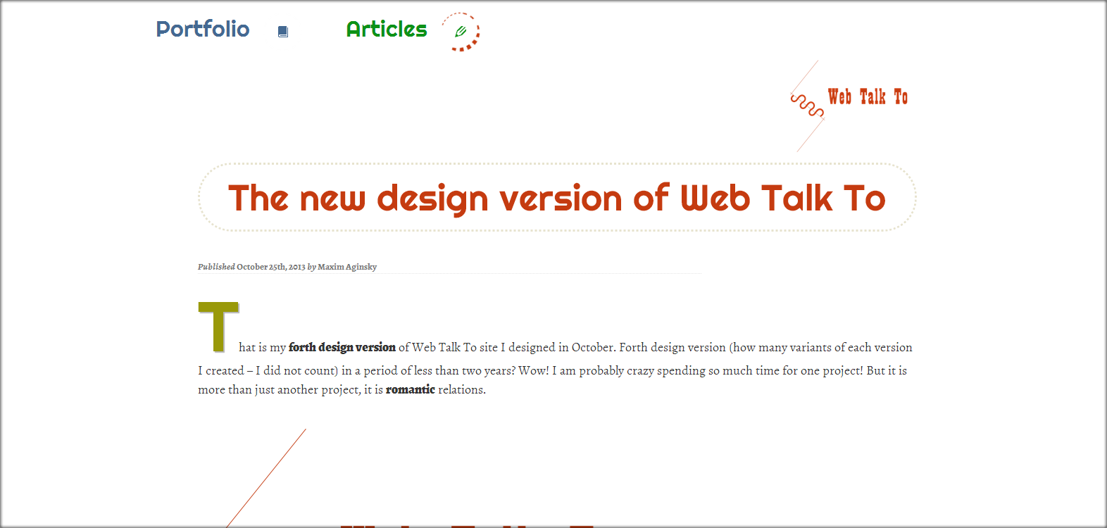
Some cool features of the forth design version of the site

Animated navigation menu
Actually I got rid of all cool features of the site design version 3. The idea of the forth version was - to create a simple for use and clear design. So the animated CSS3 menu is probably only one “cool feature” of this site version.
Content elements colors
The right choice of colors for the page elements can much improve the perception of the content information.
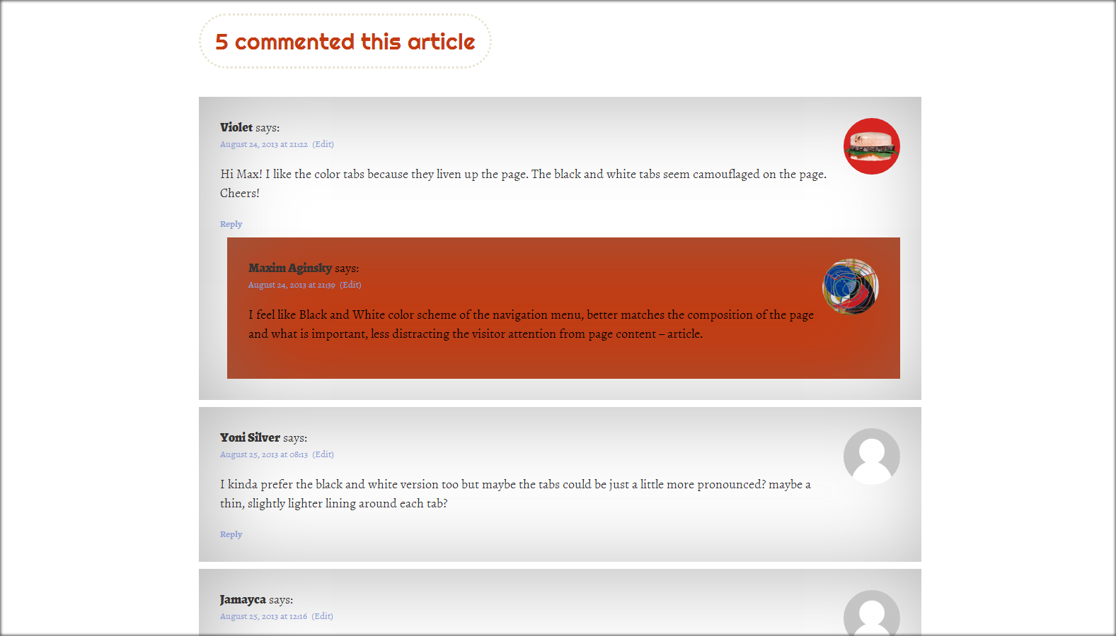
Comments template design
Clean and clear – is the motto of this design version.
Links
I decided to provide a dotted and thick border beneath all links for better link detection.
Font us a design tool
This version contains two different font families: one for titles and other for the texts, both taken from the Google font’s library. It is always a pleasure to experiment with the fonts – one of the main components of the site design. Ideally, my ultimate design uses just fonts nothing else.
I guess that it for now!
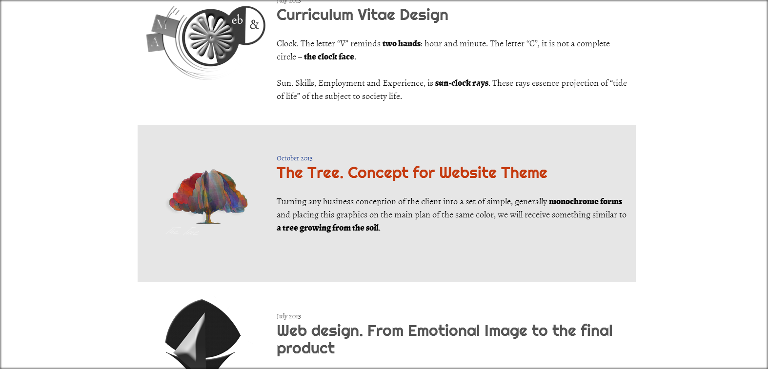
The archive of design versions of the Web Talk To site.