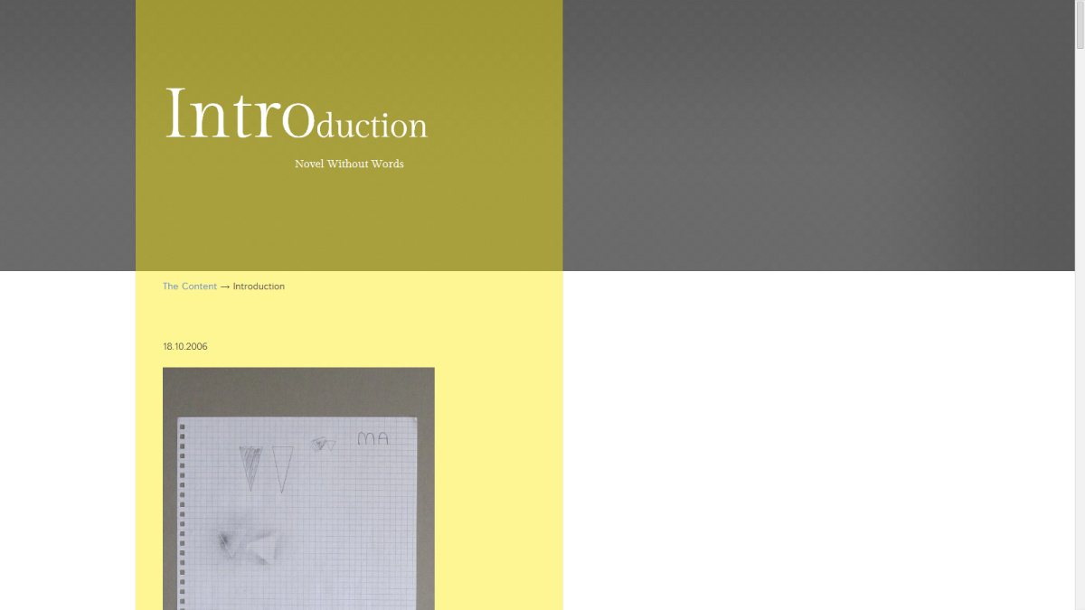
Searching for the right look of Introduction page


Maxim Aginsky
Montreal, Canada
accidental ꩜ initiates ꩜ serendipitous
Maxim Aginsky
PostApril 03, 2014
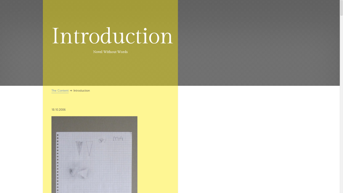
This is a few design tests for Vector’s Introduction page.
In some point I created very nice picture for the header, but at the end I removed it! I planned to use just related photos for the header design and decided to keep it this way.
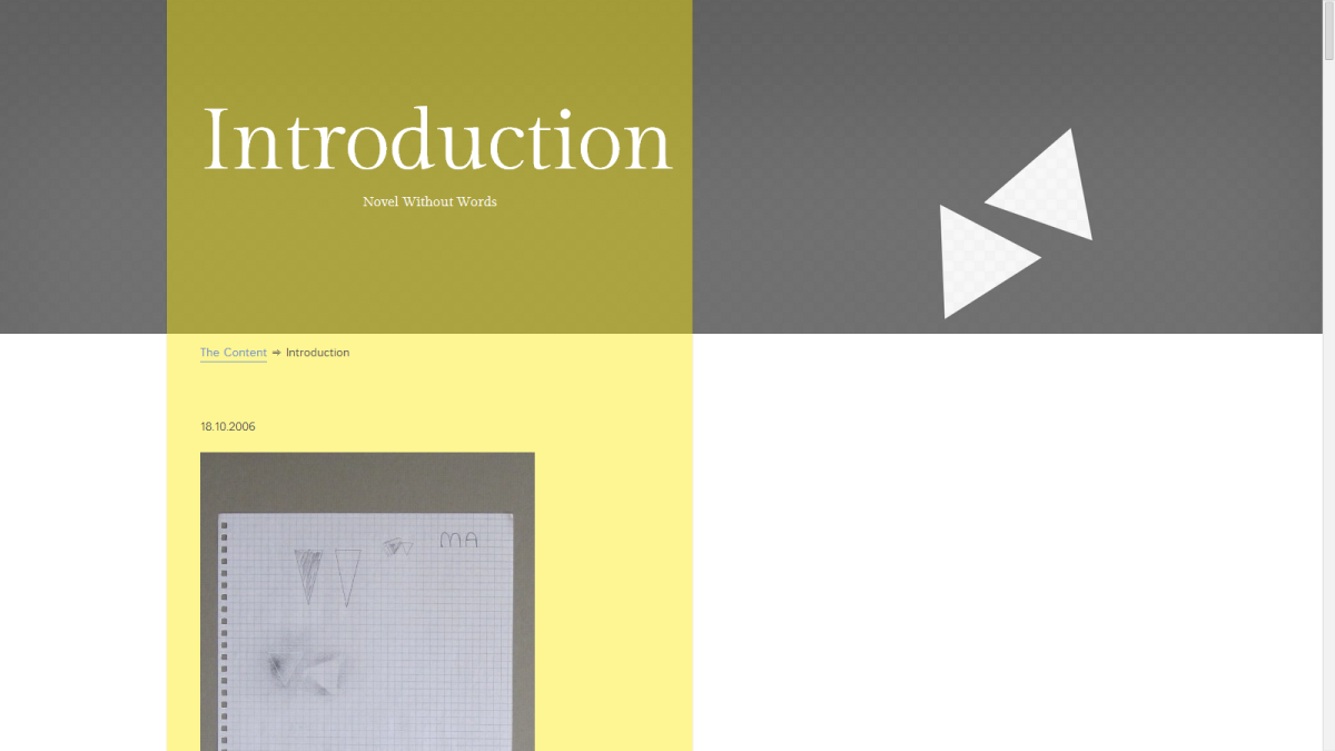
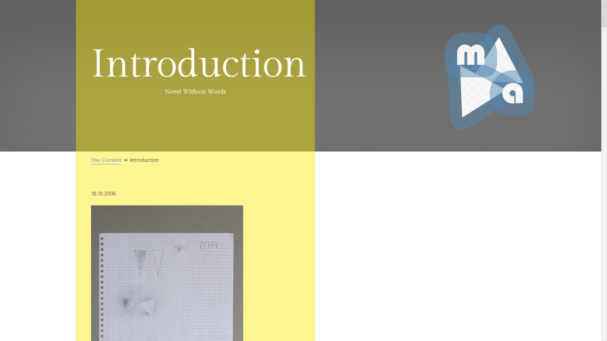
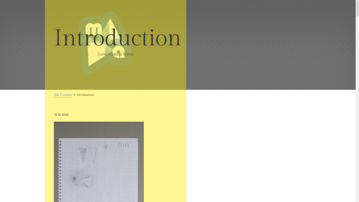

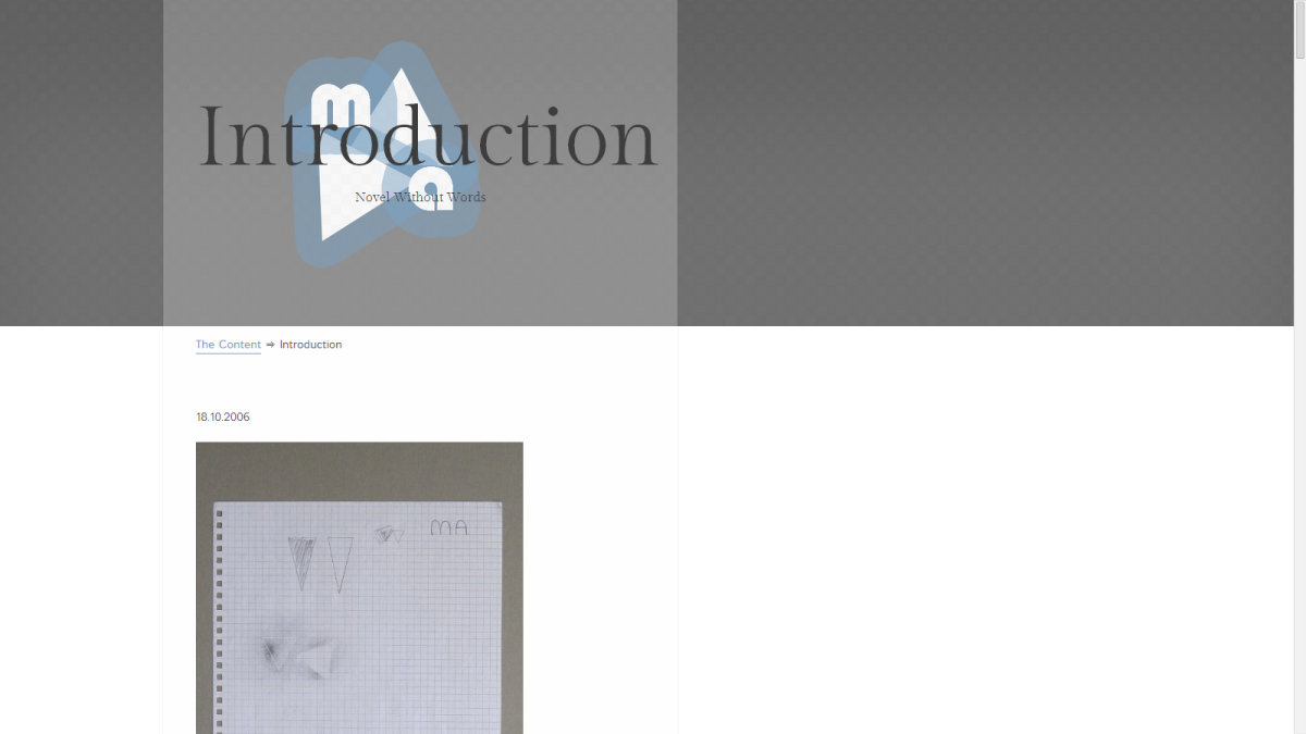
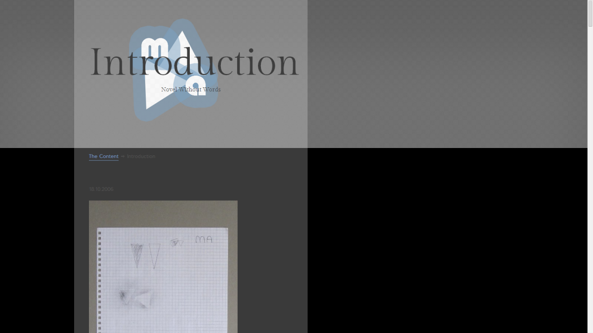
The thing is that I do not have any photos related to the creation period of this graphics, so I decided to use none.
