Notes about Proavangarda site design


Maxim Aginsky
Montreal, Canada
accidental ꩜ initiates ꩜ serendipitous
Maxim Aginsky
PostDecember 06, 2013
We are a promotional agency founded in Poland and currently based in central London. We do have a website but it doesn't look quite professional. We are looking for someone to make some changes.
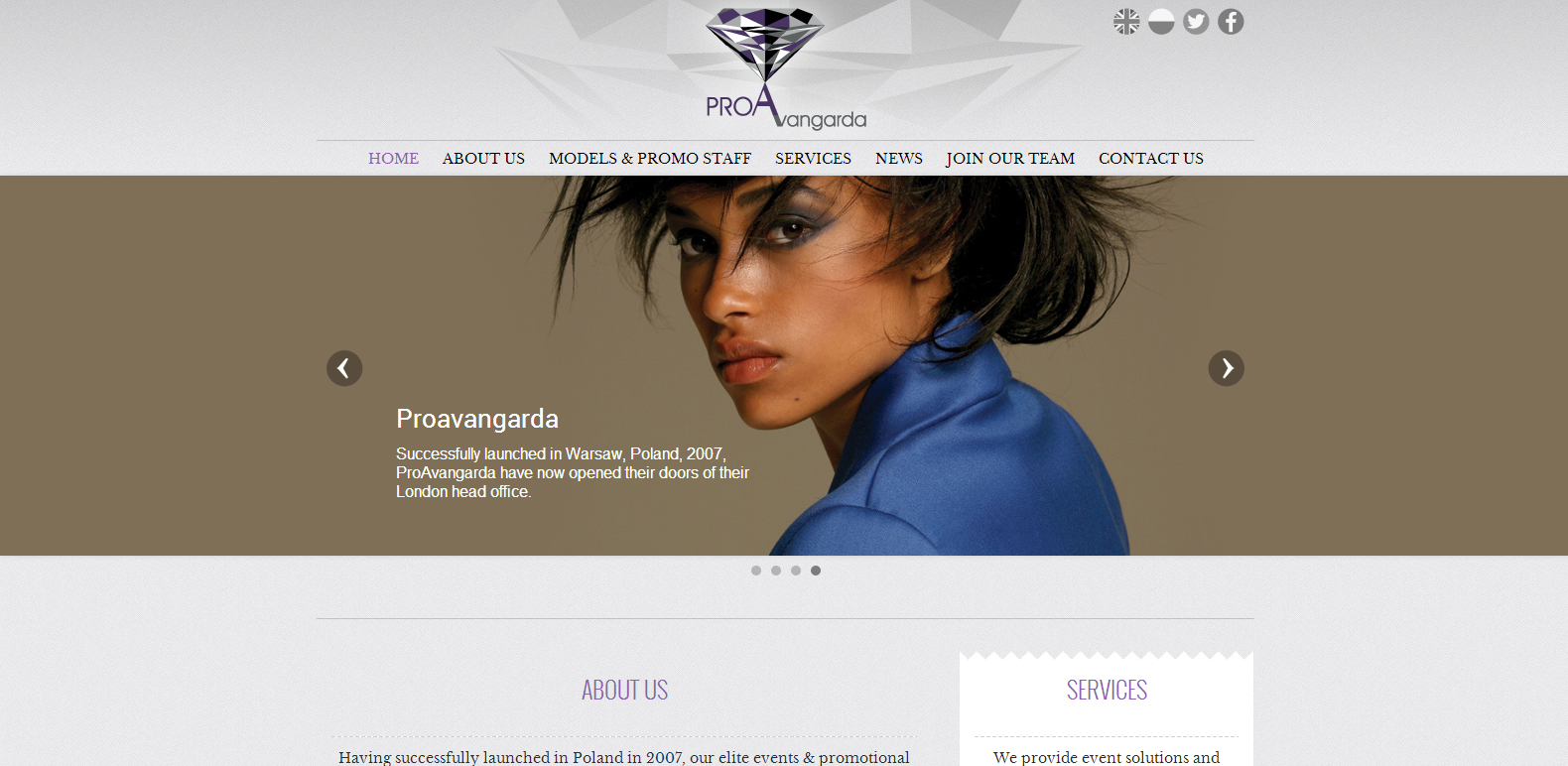
Current site design

Actually the site looks pretty good.
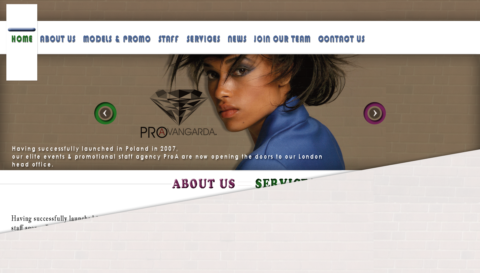
The wick spot in my opinion is header design. I would remove the logo background and also change the position of the logo itself. Navigation menu font and size of the font - changing it – will much improve the overall image of the site. It is require minimum of changes, which can be easily made for the site in terms of sight improvement.
My design version (very fast sketch)
