New design version for mobile devices

I just finished the new mobile version of the Web Talk To.
The idea was to simplify the look of the site when viewing it on small screens such: iPad and iPhone.
By making the site design simple, we are making visitor live easier.
The list of the changes I have made
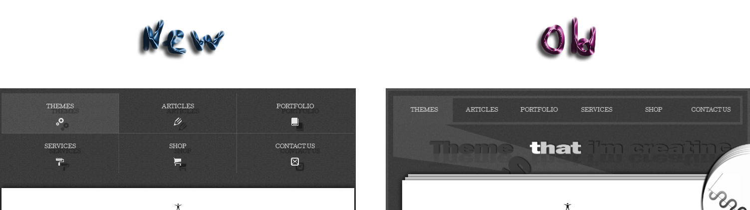
Site Header
The image on top of the page, under the navigation menu looks great on the TV, desktop or laptop screens, but on small devices screen the image's text is too small and hardly readable. So I took it off.
I created a navigation menu that will nicely fold as the screen reduces, accompanied with tiny 1px borders. Also for desktop site version I am using cool icons in navigation, so I keep them for the mobile "mood" also.
Adding the text shadow, pulling out the header as compared with main content block.
Main Content Block
First I took out all decorations: right logo image, borders and shadow.
I found that simple white block with a bit of shadow and 3px margin, stretched from left to right will provide better polygon for the content viewed on a small screen.
I made smaller: the text and titles font size, the "line-height" and also margin property of the elements.

Footer
Footer less suffered from the changes than top and middle. I added the same text shadow as I did for the header menu and also made the borders opacity of the footer navigation less.

Let's compare
