Interview with Justin Lerner


Maxim Aginsky
accidental ꩜ initiates ꩜ serendipitous
Maxim Aginsky
Interview with Justin Lerner 28 February - 06 March 2015
I am interviewing Justin Lerner, graphic designer and a seasoned programmer from Philadelphia about his outstanding website and our Favorite Fox – JLern Design.
Maxim:
Fantastic idea for the layout! How you came up with such a different layout composition?
Justin:
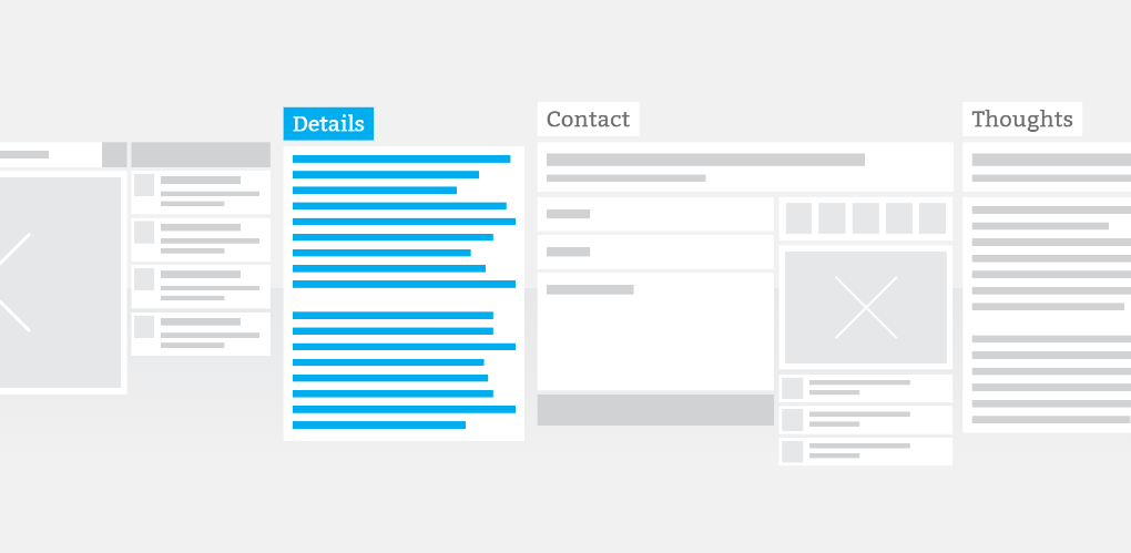
My main inspiration came from thinking about how a website wireframe looks before you begin the design phase. I like the simplicity of seeing all the building blocks of the website in a monotone color scheme before any content is added. There is beauty in the planning, and I wanted to bring that to life.
Maxim:
This design is very different from the previous design version of your site. Such a huge stylistic change, what did inspire you?
Justin:
I have always been a fan of sharp contrast in design and setting a bright color against a monotone background so it really pops. I think in general, styles change with the times. Recently there has been a shift towards flat design and minimalism and I really love this approach. My last website had more shading and texture, which I wanted to get away from in the new version.
Maxim:
How many different versions were created before you finally came up with the existing concept?
Justin:
I knew from the start the general concept I was aiming for, but it was difficult to put it down on paper. I went through about 3 different explorations of the idea in my head before settling on a layout. From there, it was 10 versions of revisions and polishing to land on the final design.
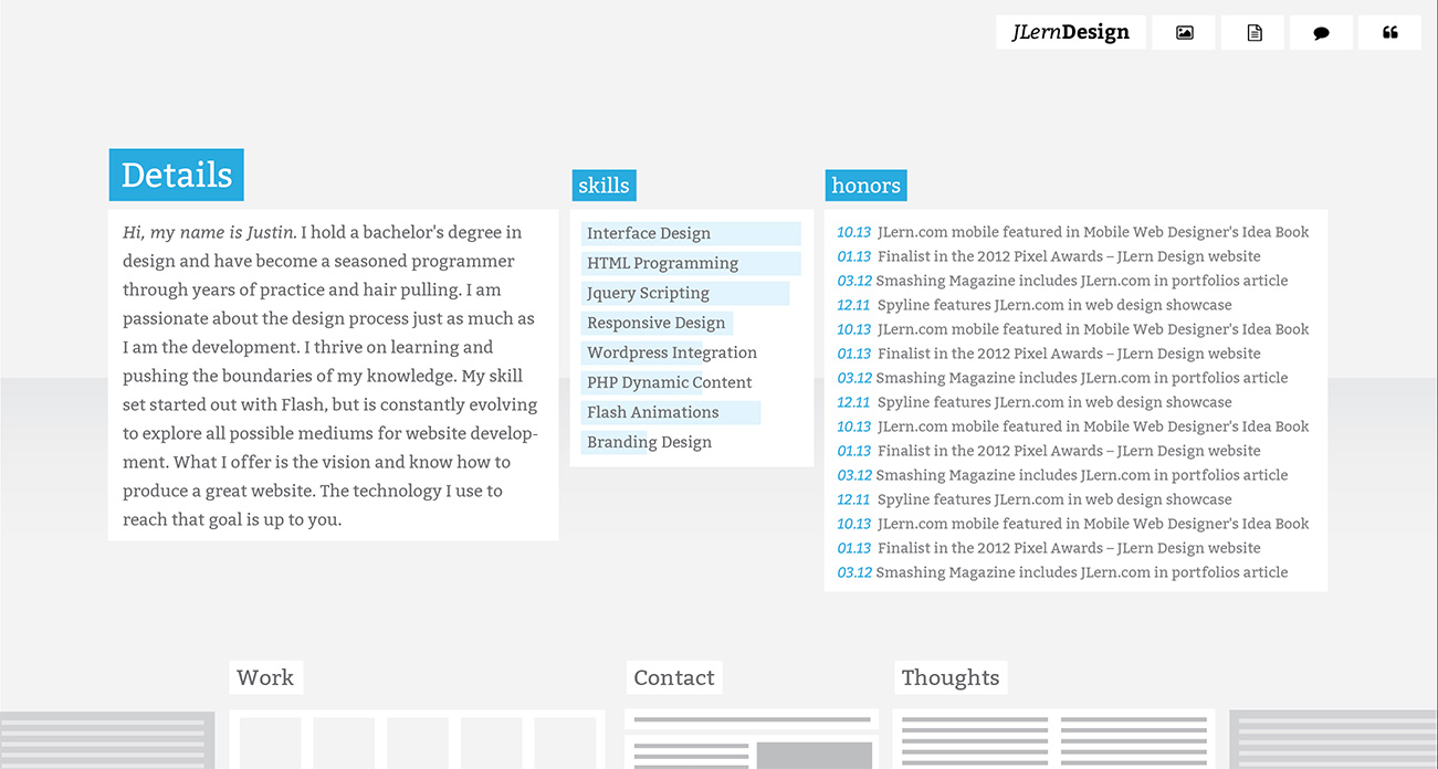
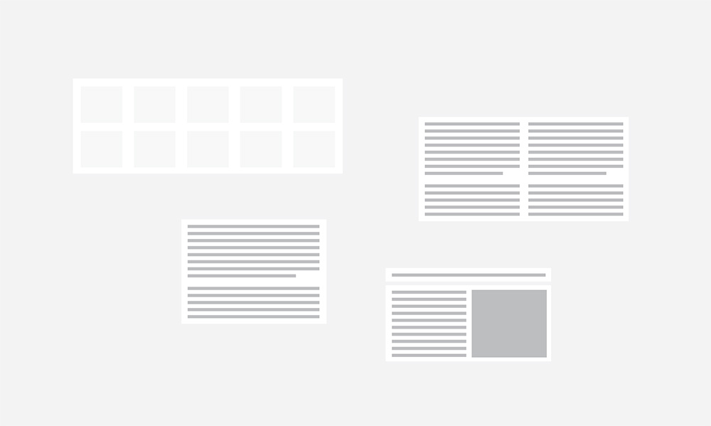
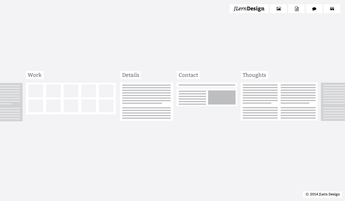
Here are a few of the earlier comps. The earlier versions are just rough layouts that needed to be revised and worked out on the screen.
Details v1
Ideas v1
Ideas v2
Maxim:
I could not find one rounded corner on your site. Was it an "easy" decision?
Justin:
Some of the earlier versions did have a few rounded corners, but they were removed. I like to focus heavily on details and consistency. It turned out to be an easy decision when I realized a few rounded corners just didn't fit with the rest of the design.
Maxim:
Four sections and four colors. Is there any logic behind the chosen color scheme?
Justin:
I wanted to keep the design very simple, so the less pages the better. I like the way a single color contrasts against a mostly gray background. The colors themselves were just chosen to be bright and stand out, while also being dark enough to anchor the page. A pale color like yellow would not have worked.
Maxim:
The main content information all aligned left, but the header placed on the right hand side. How would you explain this decision?
Justin:
This was a deliberate decision against the logo often appearing in the top left corner. I would say my design principles revolve around directing interest to various points on the page. If everything is aligned left, the menu in the top right is going to catch your attention. It also creates a balance of weight to the design.
Maxim:
What is the meaning of the extra two sections on the left and right side from the main four blocs with the content? Since they are not active, what is the idea behind having it there?
Justin:
This part took a bit of thought to work out in the design phase. I enjoy websites that fill the screen and needed a way to accomplish that in my layout. The "dummy" blocks on the end serve to fill the space and give a sense that this group of modules continues beyond the four designated sections.
Maxim:
Microsoft design layout patterns
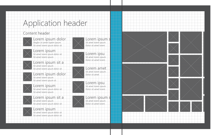
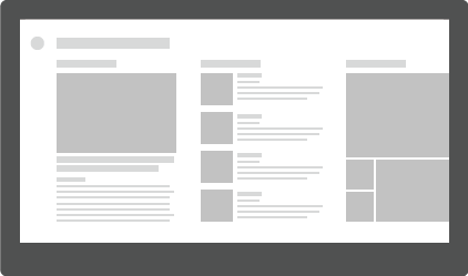
How deep the Microsoft design language (Metro design style) effected your work?
Justin:
I have not looked at any of the Microsoft design styles, so they had no impact on my design.
Maxim:
Do you use Windows 8?
Justin:
No, I use Mac Yosemite OS.
Maxim:
iOS via Windows. Few examples from your perspective of strengths and weaknesses of these two systems in term of design and functionality.
Justin:
I don't have a lot of experience with Windows OS but I've noticed in general that colors and fonts render a bit cleaner on the Mac OS.
Maxim:
What should graphic designer go through to be able to create such an artless mammal?
Justin:
I think the best way to improve as a graphic designer is to keep designing. I redo my personal website very often because I want to challenge myself and experiment with new ideas. The more ideas you explore, the better chance for something great to come out. Keep refining your design until it drives you crazy and then start all over again.
Maxim:
How would you describe the difference between design and art? Where and in what form do you think art can be used in the web design field?
Justin:
Art is more of a free-form expression, whereas design abides by some rules. Design usually has a client's interest in mind so it has to serve a general purpose to meet that client's needs. I think art is constantly used in the web design field as it should be. It requires an artist's eye to create an appealing web design. The challenge is using art in a way that it is easy to understand and interact with, unlike fine arts, which are open to interpretation.
Maxim:
Do you have any animals? What is your favourite animal?
Justin:
I have a 2 year old cat named Cliffy. I would say cats have to be my favourite animal.
Justin,
We would like to thank you for your time and for sharing with us your vision. We wish you all the best in your creative work and looking forward to see more of your great creations in the future.
Cssfox team.