User flow. Online Kotel Notes

Screens and identity elements on the dark bg. A bit different angle of view :)
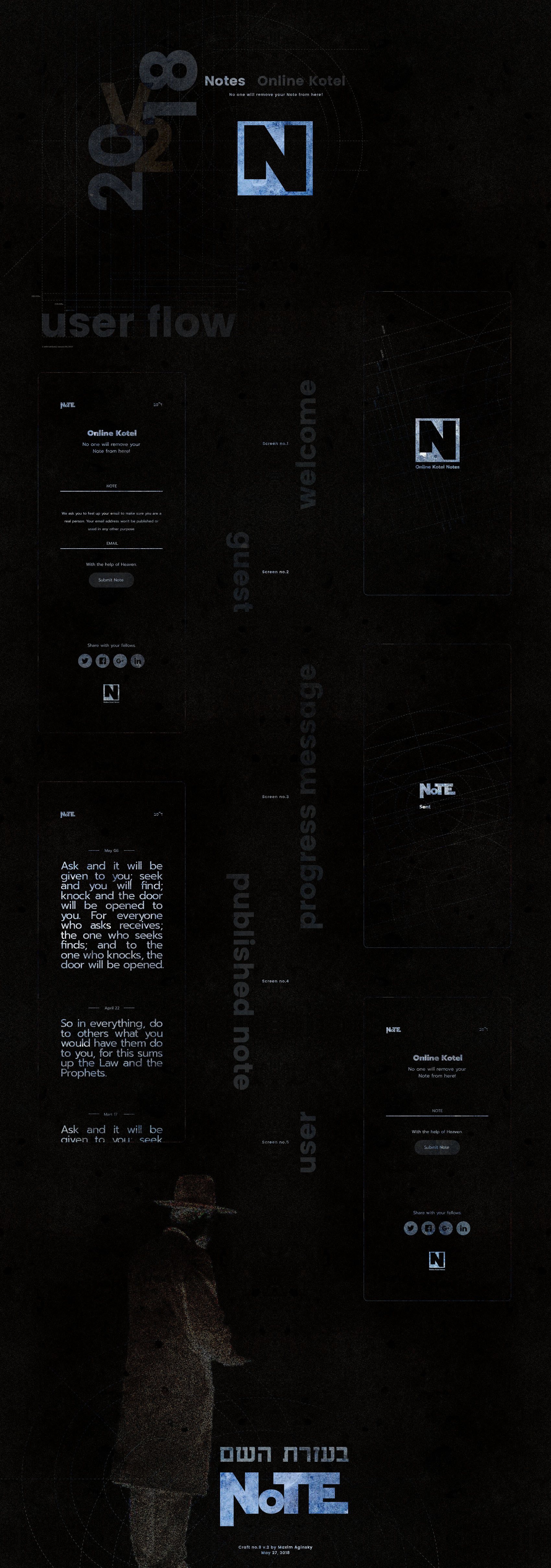
User flow for Notes. May 27
Comments 2
Thanks my friend. I agree, but remember: we ask for good, but do bad :) So the dark theme for such project is actually very realistic. The realism in the current case just not user friendly, that happens sometimes :)
Best.
I'm a Tech Lead with over 6 years of experience. Music addict. Fond of different crazy stuff, like iframes on iOS (sarcasm). Author of slash conspiracy theory. You never know when one slash will ruin your whole routing.
Still reading this? Great, so, uhm, don't take a word above seriously. Except the first sentence m...
Looks great, beyond doubt. Still, dark background texture evokes not the best associations. As far as I can tell, a website with such concept as Kotel Notes requires brighter motive. But as an experiment this is definitely a success =)